A Place for Sharing Ideas and Stories
There is plenty of media in the world already. And no matter what happens to traditional media economics, there’s nothing to stop the torrent of information rushing from smartphones, corporations, and new-fangled media startups onto the Internet, available for the world to see.
While it continues to be more and more efficient to put media-type stuff out there, we think there are big improvements to be made in a particular type of media “stuff”: That which is not necessarily personal and not necessarily news. That which we might just call ideas.
What kind of ideas? Many kinds: A particular viewpoint on the happenings of the day (or of the past), hard-earned knowledge about how to do something better, a story that makes people laugh, smile, or feel something meaningful. If you have thoughts to share that you want to impact or influence people with—beyond just your friends and beyond 140 characters—we want to provide the tools and the place.
Making Medium.com

Roundabout Beginnings
Our relationship with Obvious Corp, began when @ev started following us. It seemed only natural that the founder of Twitter would communicate this way. A few days passed and we got the DM.
It was September of 2011, and that DM quickly led to others where Ev asked if we’d be in San Francisco anytime soon. The following week Geoff Teehan found himself standing outside a most unassuming US Bank building in the city’s Mission district.
The Meeting
We didn’t really know what to expect. There wasn’t an agenda. Just an hour blocked in a calendar for a chat. Ev had hinted that we would talk about what he may be working on next. It was intimidating to meet the guy who is partly responsible for blogging (Blogger) and of course, Twitter.
For a good portion of the meeting we talked about what we did, how we did it, our company structure, who we worked with and what we were working on; We had recently released TweetMag and had a prototype of Readability for iPad that we gave a quick demo of.
The last 20 minutes were spent talking about what Obvious were thinking about. Most of it revolved around the future of publishing. It wasn’t clear to us just yet, but it would be soon enough.
Side Story
An Obvious Next Step
It may not be widely known that Obvious is the company that created Twitter.
“Twitter has a funny history. It spent its first six months as a side project of Odeo, a company I was running that didn’t have a lot of traction. Twitter didn’t have much traction either, so we shed Odeo, Inc. and pulled them both into Obvious Corp. When Twitter started to really take off, a year after it started, we spun it into its own corporation and made Jack the CEO. In theory, Obvious could then pursue new projects, but I spent more of my time as active Twitter chairman, which included everything from helping raise funds to coding. In spring of 2008, I was fully sucked in by the Twitter tornado, serving full time as chief product officer at first and then CEO, which I did for two years.”
–Ev Williams “Obvious Next Step” evhead, March 29, 2011
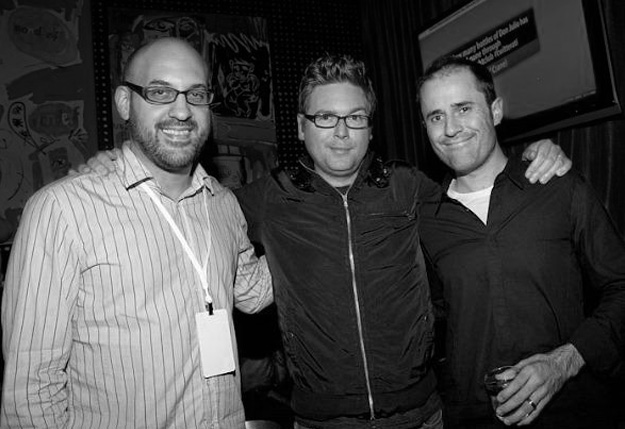
In 2011, after stepping away from the day-to-day running of Twitter, Ev “re-started” Obvious with longtime collaborators Biz Stone and Jason Goldman. The three of them all recently liberated from their senior roles at Twitter.
—
The meeting ended with Ev saying, “Well, it was great to meet you. While I don’t have anything right now, I’m excited at the prospect of finding something to work on together”. A meeting that ends without a next step is usually not a good sign, but it was hard not to be pleased (and thankful) to have spent the time chatting about things we were both passionate about.
A Second Date
A month or so passed and we eventually heard back from Obvious. This time it was about doing some work together.
Geoff and Jon Lax flew out to San Francisco to meet with Jason Goldman and Ev to hear more about what Obvious was doing and how Teehan+Lax might be able to help.
In the meeting, they explained they were exploring ideas around publishing platforms. They had been building this new product for a few months. It was incredibly sophisticated and complex and had taken on a few forms already, none of which felt quite right.
They wanted to try something new. It didn’t need to be a full working product, a prototype would suffice. Ev believes product decisions need to be made from actual usage. Even though we wouldn’t be building a fully working product, this prototype would give them a better sense if their new product idea was worth pursuing further.
Jason came to Toronto for 2 days and we began roughing out the prototype. For the next two months we worked on designing and building out various approaches. We had weekly contact with Obvious. We were working on this like a traditional client: Sprints of work presented on a weekly basis for feedback.
“prototypes allowed us to see things in one of two ways: Things that don’t work, and things that need work”
Sometimes we’d just build small elements of an interface, like a new take on a scrollbar. Other times, we were exploring completely new interfaces for consuming long-form content. These prototypes allowed us to see things in one of two ways: Things that don’t work, and things that need work.
Just before Christmas of 2011 we wrapped up the prototype. The guys at Obvious thanked us for the work and that was that.
Through the new year we waited. We watched the Obvious site, Twitter, TechCrunch and others, expecting to hear an official announcement related to what we had built. Nothing appeared.
This is always difficult for us. Doing work that we can't talk about, unsure if it will appear online or end up on the cutting room floor. All we could do was wait.
Contact
In April of 2012, Ev emailed Geoff again and said he wanted to discuss working together in a closer, more collaborative way. In the 4 months since we worked on the prototypes, Obvious had been busy. They had built something they referred to as, Medium. They had real code, a working product and a desire to ship something.
We flew back out to San Francisco. Obvious had moved into a beautiful office overlooking Market Street. There were twice as many people and they were very focused on building Medium.
There weren’t many traces of our prototype in Medium, but that was pretty understandable—it had evolved into a very different product. Ev explained that he felt there was a need for meaningful writing on the Web. There wasn’t a place for people who wanted to write something more substantive than a tweet. Blogs, while better for long-form, required a certain savviness to get up-and-running. Successful ones required constant care and feeding and typically focussed on a single subject matter. New ones lacked an audience. He went on to say that people sometimes just have one thing to say about a subject, not something every day or week. This is what Medium would solve for.
He wanted us to provide a team that would be integrated with the Medium team to help design the product. At the time, there were 3 designers; Dustin Senos, Leigh Taylor and Dann Petty. Dustin was doing double-duty as a developer and designer while Dann and Leigh focused on design. Ev had built out an amazing engineering team but needed design help, which is where we came in.
This would be unlike a typical client. It wasn’t the type of project we could just go back to Toronto with and work in isolation on like the prototype. We needed to become part of the Obvious team. Logistically, this was concerning and challenging for both of us. After lengthy discussions we agreed on the following approach:
- 6 Month Commitment
- Product design isn’t just about getting to market—it would need refinement after launch.
- SWAT Team
- Geoff would head up a team of 4 that would lead and help execute the UX of Medium with their existing team.
- Working Remotely
- A third to nearly half of our time would be spent in the Obvious office in San Francisco.
- Deep integration
- Everyone working on the team would be treated like Obvious employees. New Obvious email addresses, access to GitHub, Campfire, even access to the Anybot to ‘attend’ stand-up meetings in San Francisco when we were in Toronto.
- Absolute Focus
- This team would only work on Medium—Nothing else.
The Medium Team
As we were getting on-boarded we began to see who we would be working with. There were so many recognizable names. At one point, Chris, one of our developers, said:
“Hey! Dustin Diaz… I know this guy… He wrote the book on JavaScript… like he LITERALLY wrote a book on it. I own the book. Fuck me.”
Jon Lax replied “Welcome to the NFL.”
“it quickly became clear that egos played no role”
The entire team that was working on Medium were smart. Most of them had built some of the best sites, services and software on the planet. Again, we felt a bit intimidated going in on day one, but it quickly became clear that egos played no role.
At one point in the project, we were sketching an idea for a voting/rating system. Part of it included a button similar to Twitter’s favourite or Facebook’s like. We were debating how the button should behave and what information it should display. Jason Stirman, the product lead, said we should call over David, since he was on the team that created Google's +1. David came into the conversation and told us more about how people recommend content then we could process.
We felt pretty honoured to be a part of such an elite team. We joked that, aside from a time-machine-made-of-meat, we could probably build anything with these guys.
What is Medium?
Medium is a system for reading and writing. A place where you can find and share knowledge, ideas, and stories—specifically, ones that need more than 140 characters and are not just for your friends. It’s a place where you can work with others to create something better than you can on your own.
–Ev Williams “Welcome to Medium” Medium
It’s a distraction free interface for writing
It’s knowledge, ideas and stories
Organized into collections of similar articles
Diving In
There were two separate tracks going on: What was being built today, and what was being concepted for the future.
There was a very rudimentary version of Medium running internally. It was actually called Cupstep (they were into cup-stacking and dubstep at one point, hence the name, but we’ll just keep calling it Medium to keep things simple). This early working version reflected some of the core ideas Ev had around the product. It was being built on a nightly basis and we were able to effectively move from Photoshop to internal server deployment seamlessly thanks to the front-end developers and back-end engineers. This allowed us to explore ideas and determine how they worked—by using them.
What They Had Built
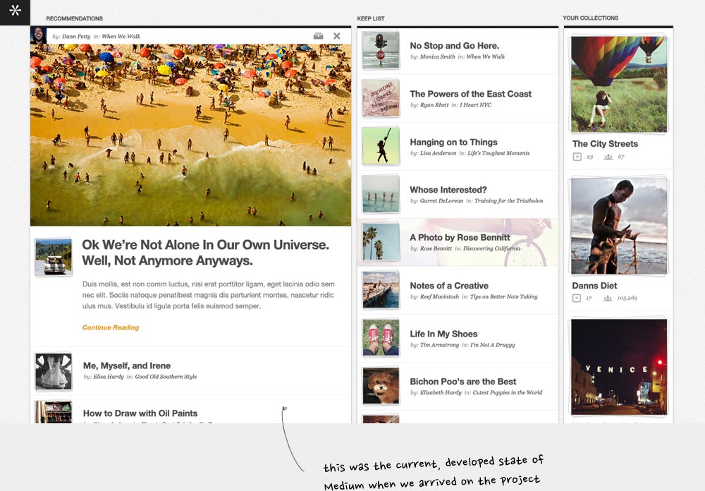
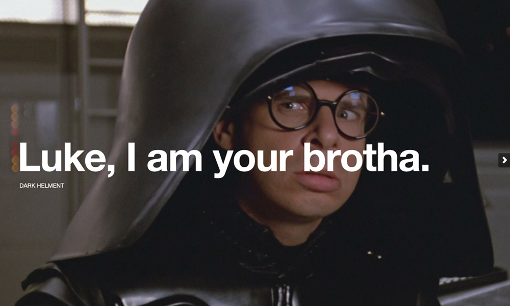
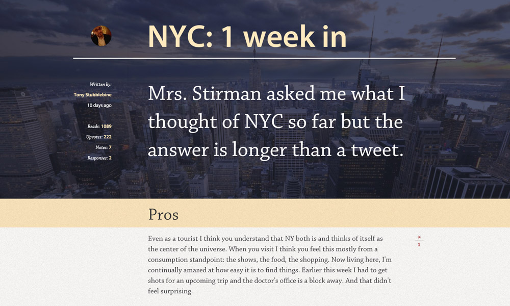
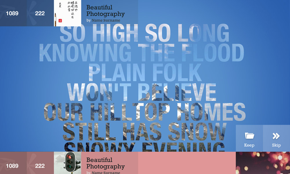
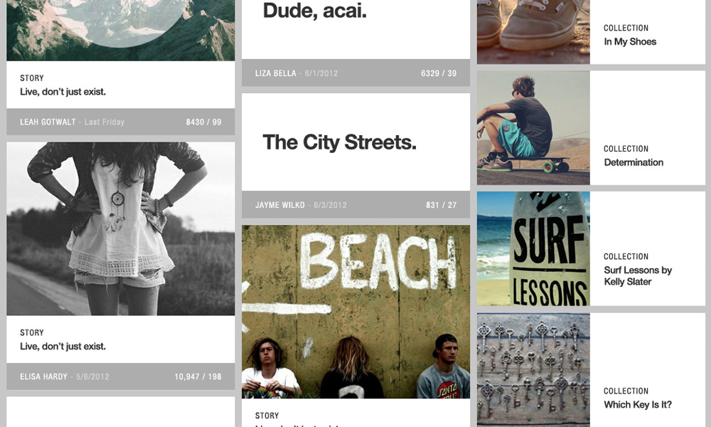
The other track was conceptual designs. There were literally hundreds of mock-ups that had been created. At the time, Medium wasn’t just about text articles, it was about many different content types; photos, short posts, long-form articles and more. It was also exploring giving publishers the ability to choose different design themes to suit their content. Most of these concepts pushed the boundaries of what content looked like today. They featured large images, big type and forward-thinking layouts. The concepts were more or less grouped into posts and collections.
What They Had Concepted
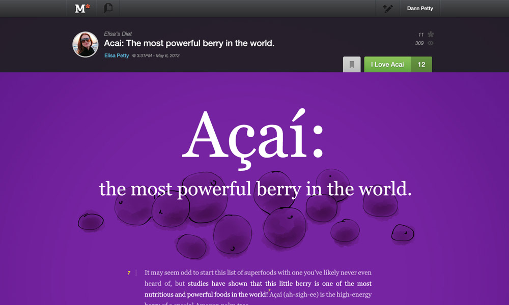
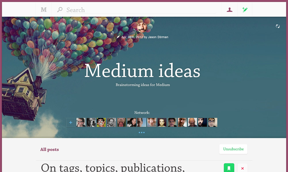

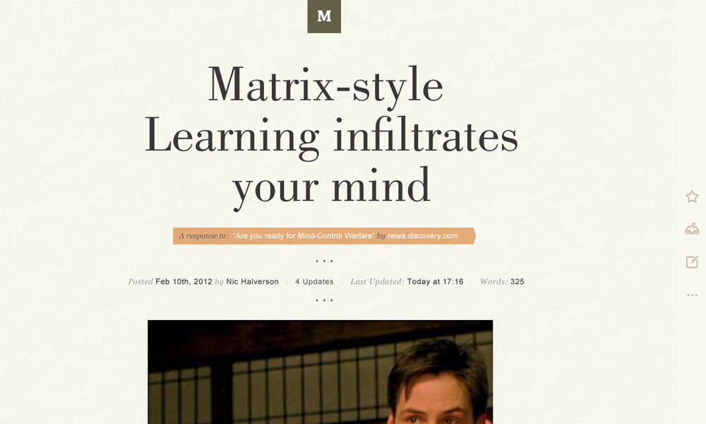
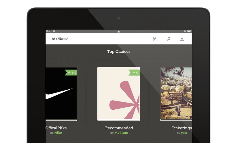
The team got together and we decided to focus on the following areas:
- A brand and UI system
- Collections
- Article with image (and editor)
- Text only article (and editor)
- Image and Caption (and editor)
The Early Approach
At first, we worked fast and loose. Designers and engineers would sit in close proximity, working in teams on the areas of focus we’d outlined. We would convene as a group to review sketches, loose blockings designs and prototypes. We’d discuss their strengths and weaknesses, make decisions and get back to work. This would happen a half-dozen times a day. As the internal product progressed and its features and capabilities became clearer, we would reduce the amount of ad hoc meetings and focus on getting stuff built into the product so we could actually use it. Talking about work is great at first, but usage is what breathes life into the product.
Sometimes it’s difficult to remember to actually use the product when there is so much to actually do. To try and combat this, each week we asked the design team to post at least one article and log at least two bugs to GitHub. It was a very low-effort ask that ensured we were using the product we were designing.
Examples of Early Prototypes
 Photo Stack
 Blur Pop
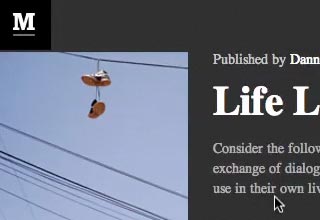 Squishy Header
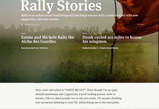 Peeler
 Feature Header
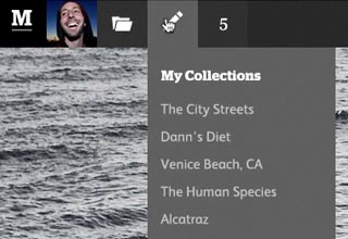 Top Chrome
Version 1
Ev stood before the entire team. He showed a few simple slides—cheesy, laugh-provoking transitions included. He talked about what would be in; what would be out. It would be simple—not even a homepage. The timeline was very aggressive: July 31, 2012 was the day Medium.com would be live. Only a hundred or so users would be able publish to it, but anyone with a Twitter account could read what Medium had to offer. His presentation was short and simple. It was an incredibly inspirational presentation that got the whole team excited.
During the weeks between that presentation and the launch the team laboured day and night. Things were moving so fast that it was difficult to take time to step back and see what Medium actually was becoming. We missed the 31st and would launch on August 14th. There were still a number of gaps and some rough edges, but the team was happy with the product.
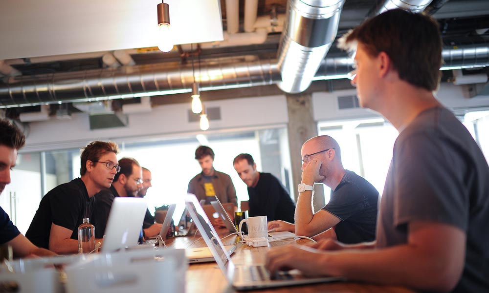
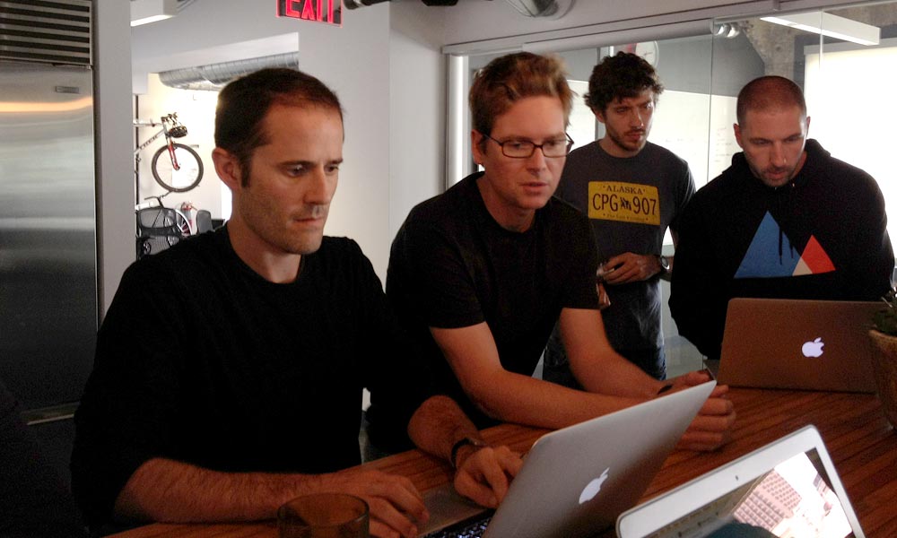
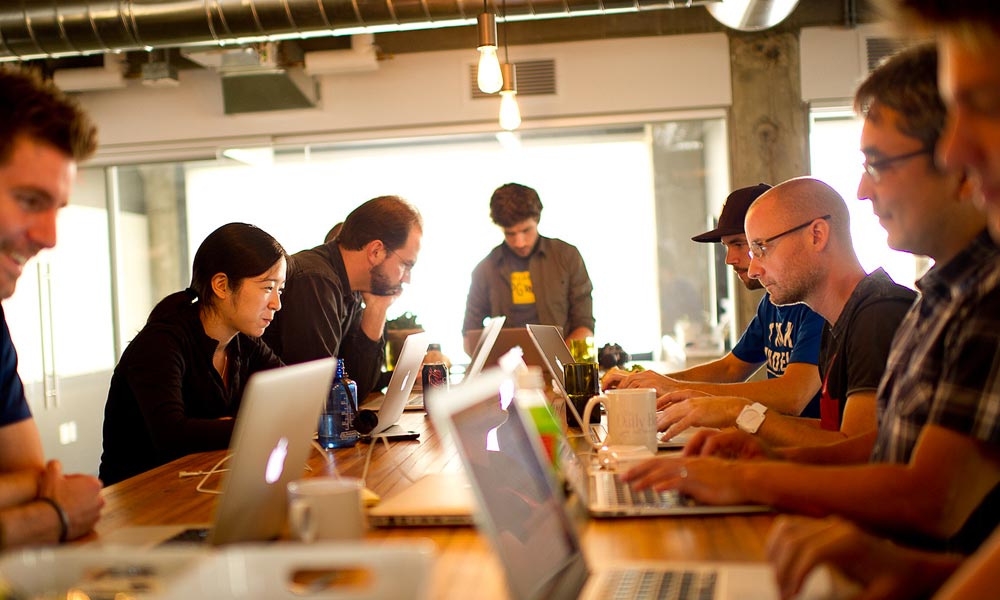
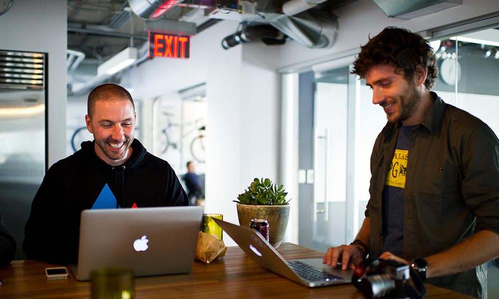
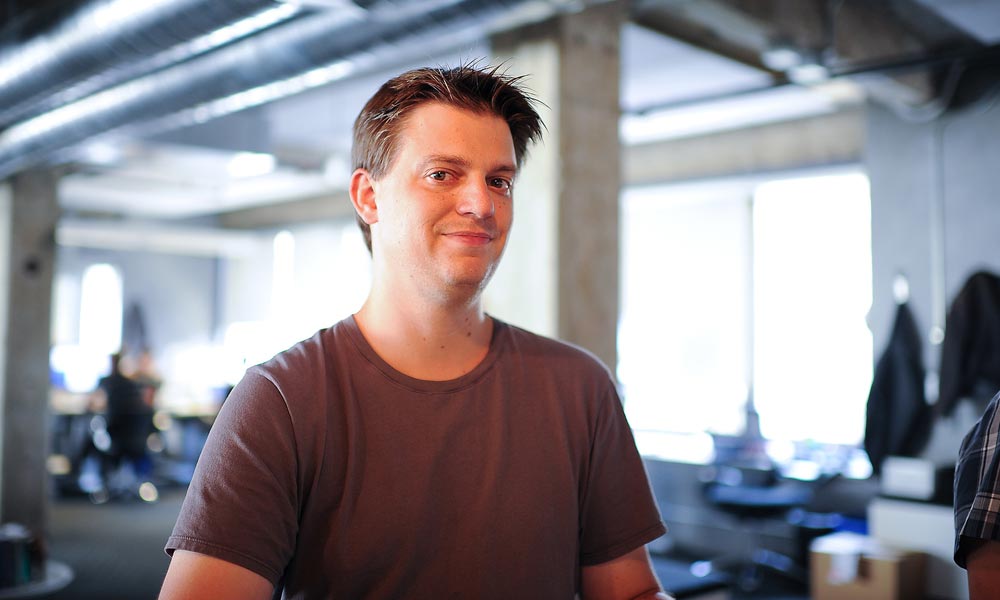
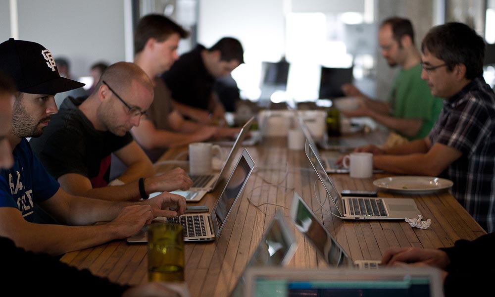
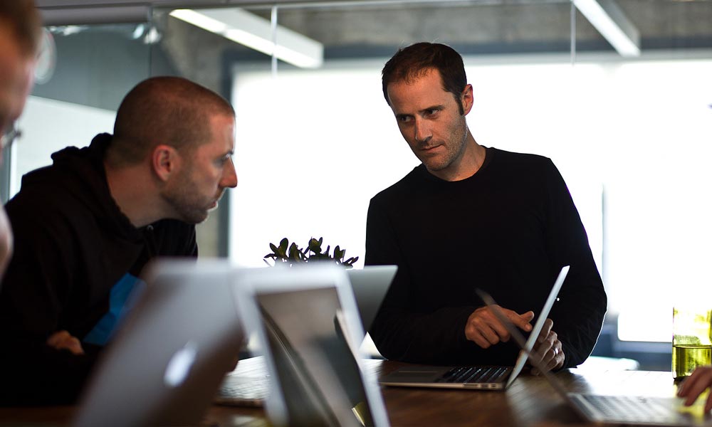
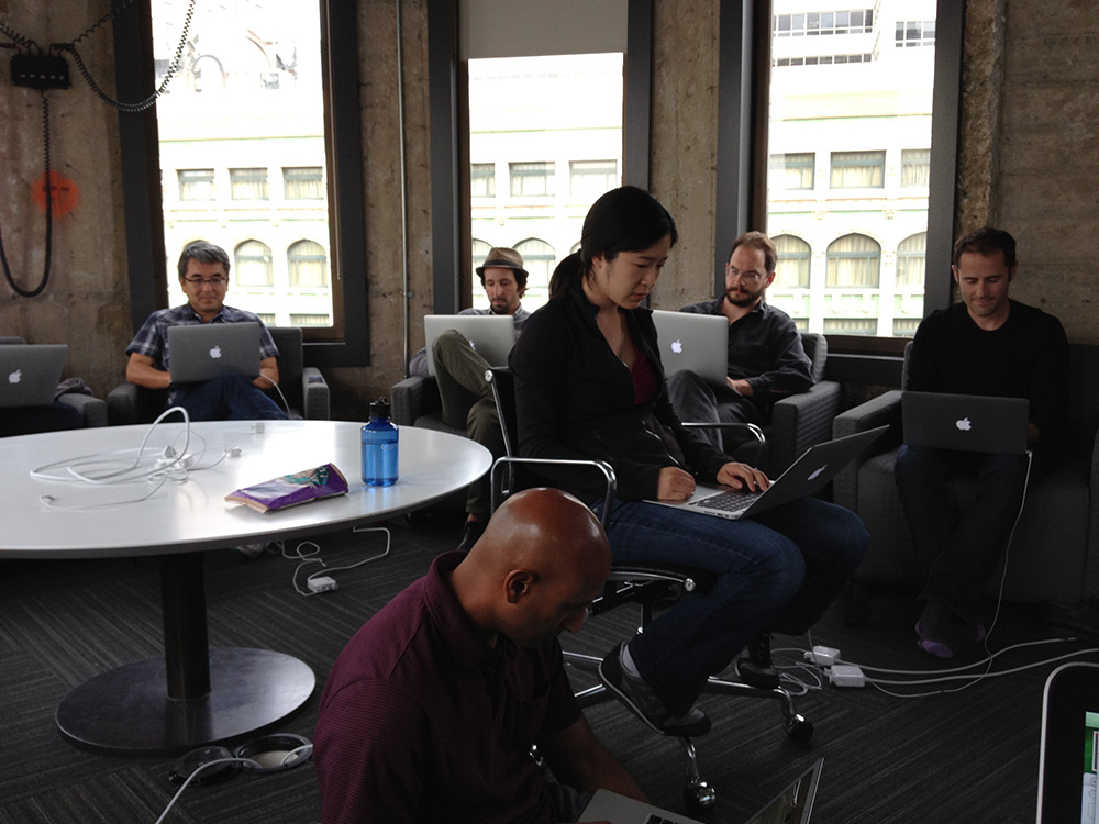
Launch day, as you’d expect, was chaotic. When it went live we gathered in the main meeting room and watched Twitter and real-time analytics on the projector as engineers stared at their laptops and monitored whatever it is they monitor to make sure the site was speedy and stable. It never went down and was always fast as hell—Engineering teams like that rarely get the credit they deserve, so kudos to them.
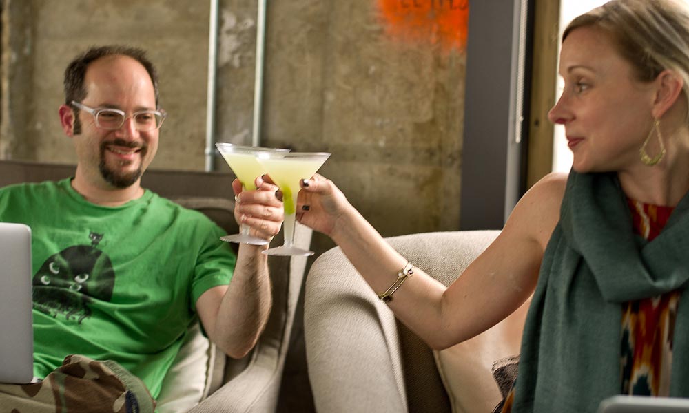
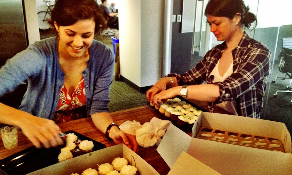
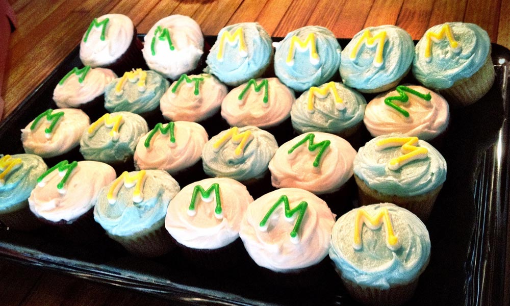
As the sun began to set the martinis began to rise. The next day, we’d begin the second-half of our journey.
Launch Day Photos
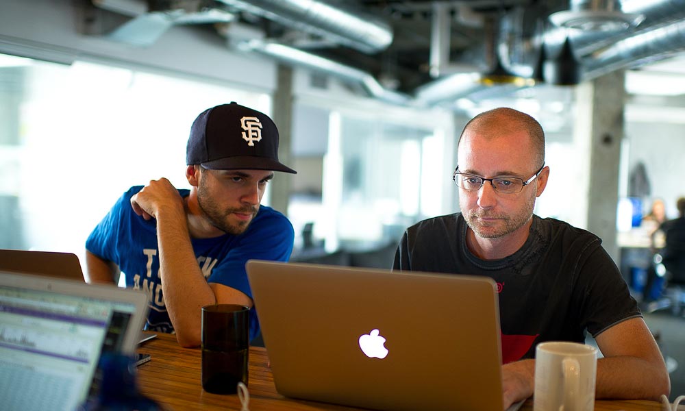


Forging ahead
It was great to be live. The fact that we still had 3 months left in our contract meant we could help improve upon what we had launched. Aside from the obvious shortcomings (like no homepage), the site lacked polish and some features we had held off on.
We reset by breaking the team up into new feature teams. Each feature team would have at least one designer, one front-end developer and a back-end developer. Some teams would take on multiple features depending on their complexity. We used one page briefs that were easy to write, easy to understand and helped guide the teams when working through their feature(s).
They consisted of questions like:
- Who is this page for?
- What problem does this page solve for the user?
- How do we know they need it?
- What is the primary action we want users to take on this page?
- What might prompt a user to take this action?
- How will we know that this page is doing what we want it to do?
A common problem when working in separate teams like this was maintaining some sort of design integrity across the entire product.
We were still moving incredibly fast. We were also experimenting and trying to do a lot of new things. In addition to improving what existed, we were working on new features like profile pages, notes, cross-posting, stats and a few others. At the time, we were also still committed to different post types: Photos, photos with captions, text only, text and image, short text and a slew of others had been slated for design.
This thing was about to get full of user choices (read: complexity) in a hurry—The product was now at a critical point in its life.
Those were the two choices. Continue to go down the road of multiple post types, or focus on writing. The choice seems clear now to make it about writing, but then, when you’re blinded by the effort you’ve put in, it was a hard choice. Thankfully Ev made the call. We hated to see some of the stuff we’d designed (and even built) not go live, but it needed to die so the product could grow through simplification.
What ‘we’ made
We (Teehan+Lax) struggled with the telling of this story because it isn’t just about us. When we say ‘we’, it consists of the team at Obvious and the team at Teehan+Lax. We’ve tried our best to show the stuff that we were most involved on or that we influenced, but in each and every case we need to acknowledge the Medium guys were right beside us. Here’s some of what ‘we’ made.
Branding


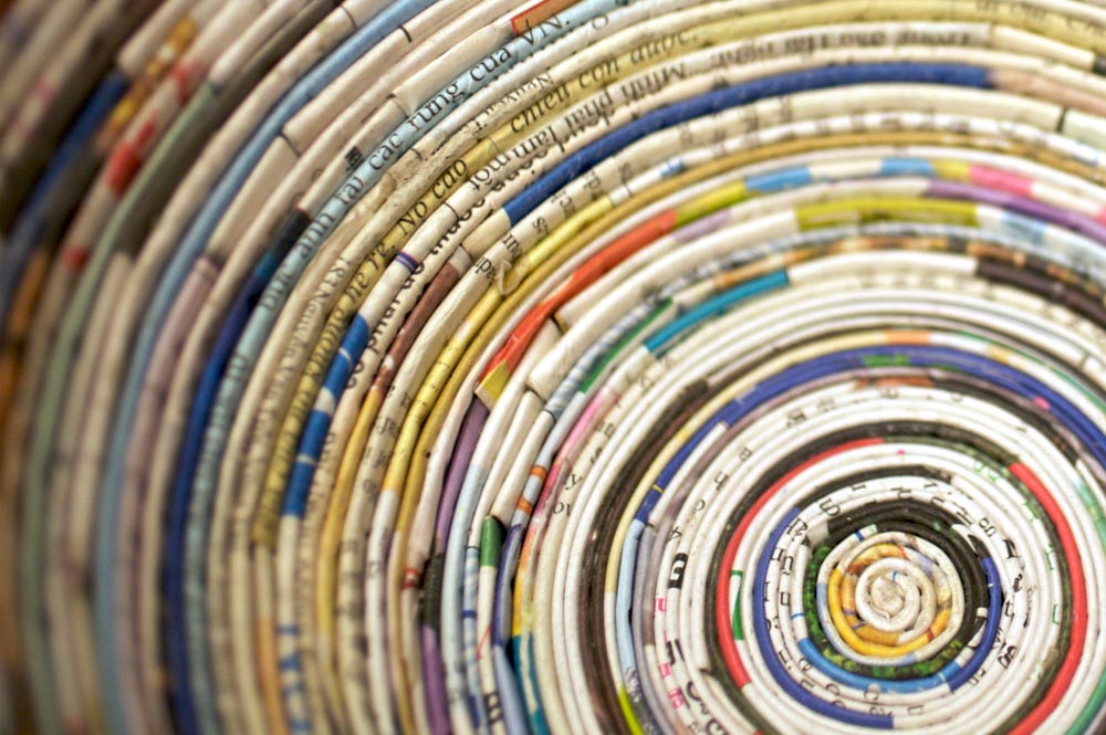


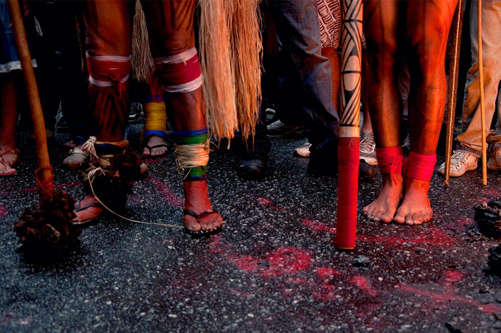
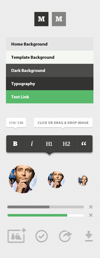
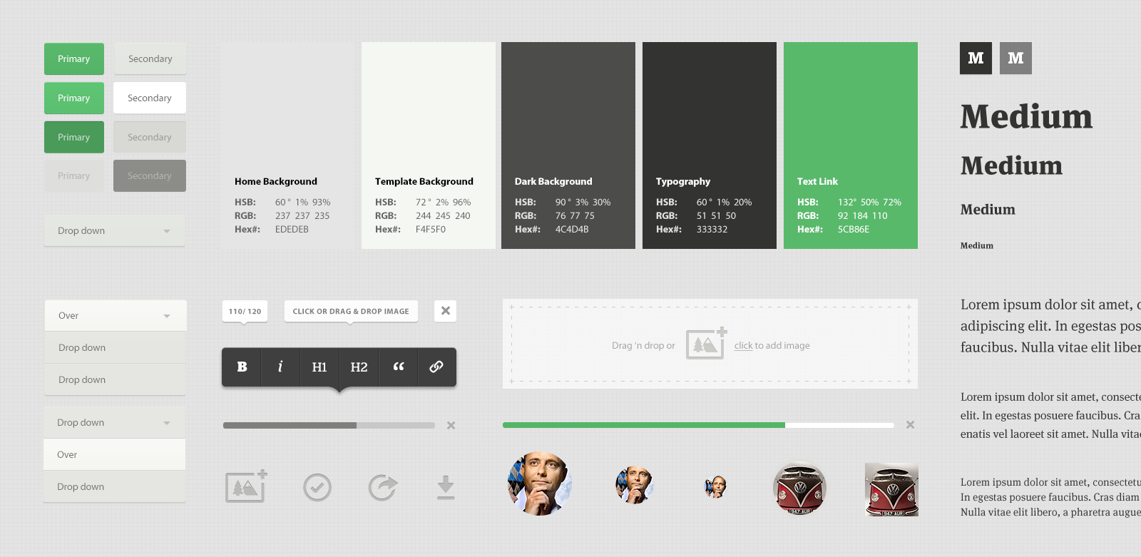
UI Guide
The interface elements changed numerous times over the duration of the project. We strived to keep PSDs and CSS files up-to-date with the latest elements.
Templates
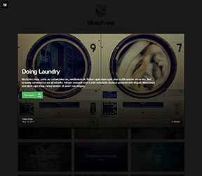
The gallery below shows the progression of post types. You can see at the bottom, the result of opting to focus on writing.
we started with three templates
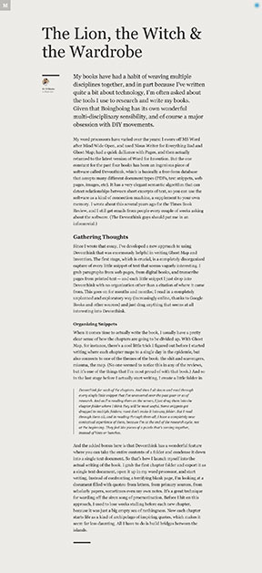 text only
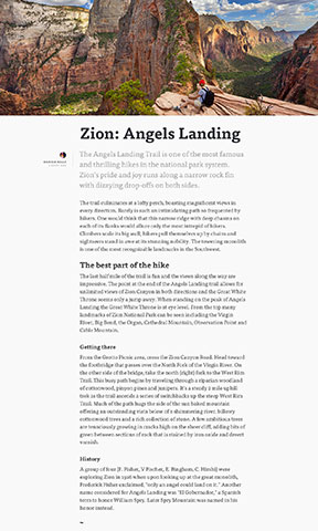 text and image
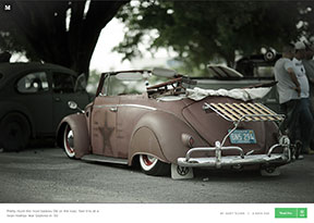 image and caption
we then moved on to more concepts
 text and image 2
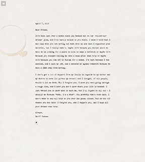 “Dear_”
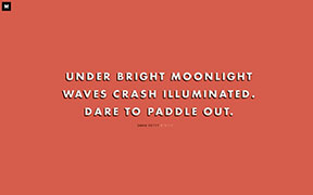 haiku
haiku
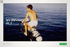 “When we were kids”
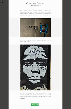 text and image 3
 video
video
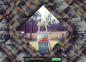 kaleidoscope
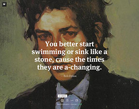 “Big text”
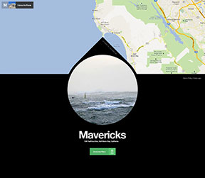 Map
Map
yet, in the end, cut it down to one ‘Flexible’ template
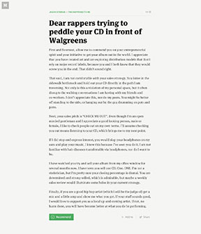 just text
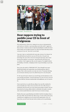 ‘fit’ feature image
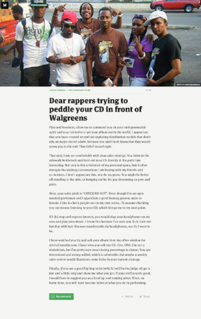 ‘cover’ feature image
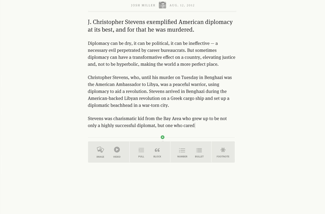
Creation (The editor)
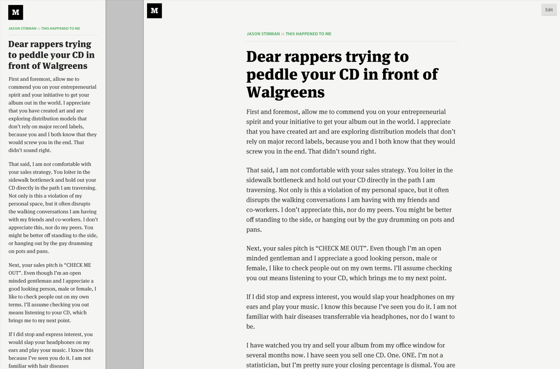
The editor is one of Medium’s best assets. It’s a distraction free writing environment that feels far more like an application than it does a Web interface.
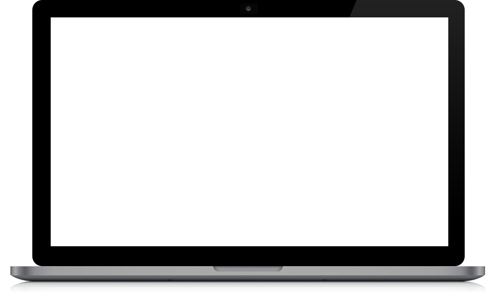
Recommending
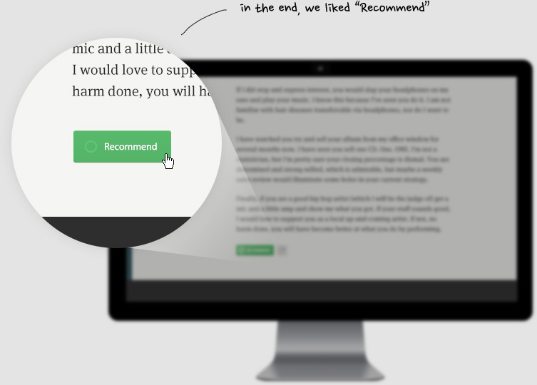
Initially, the vote button text was customizable by the author. It too, was one of the many elements that we simplified.
Responsiveness
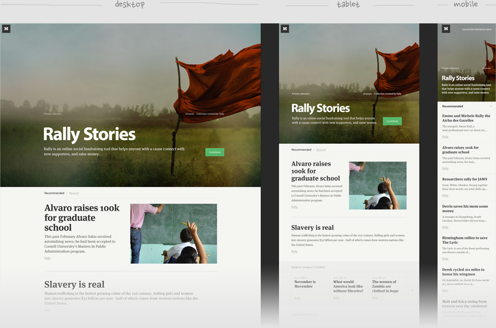
We created a Photoshop template to help us design across multiple screens.
Maybe it could help you too – Download PSD (1.9mb)
A Sampling of Screens
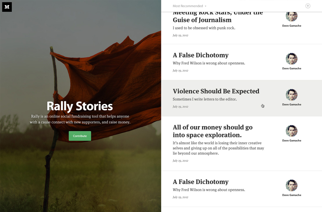
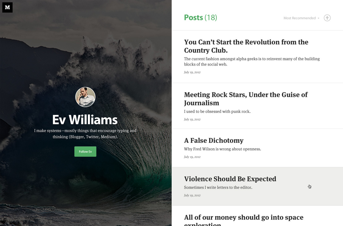
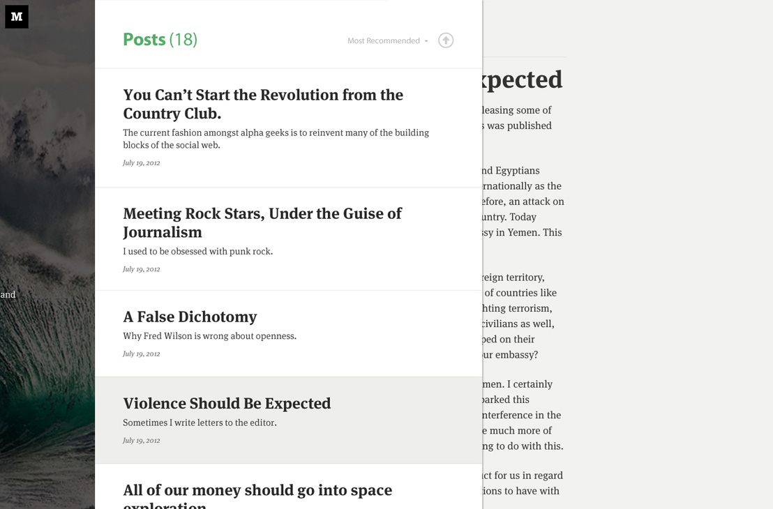
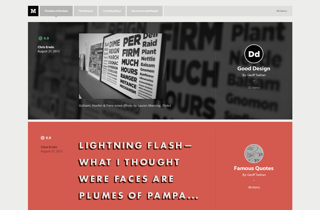
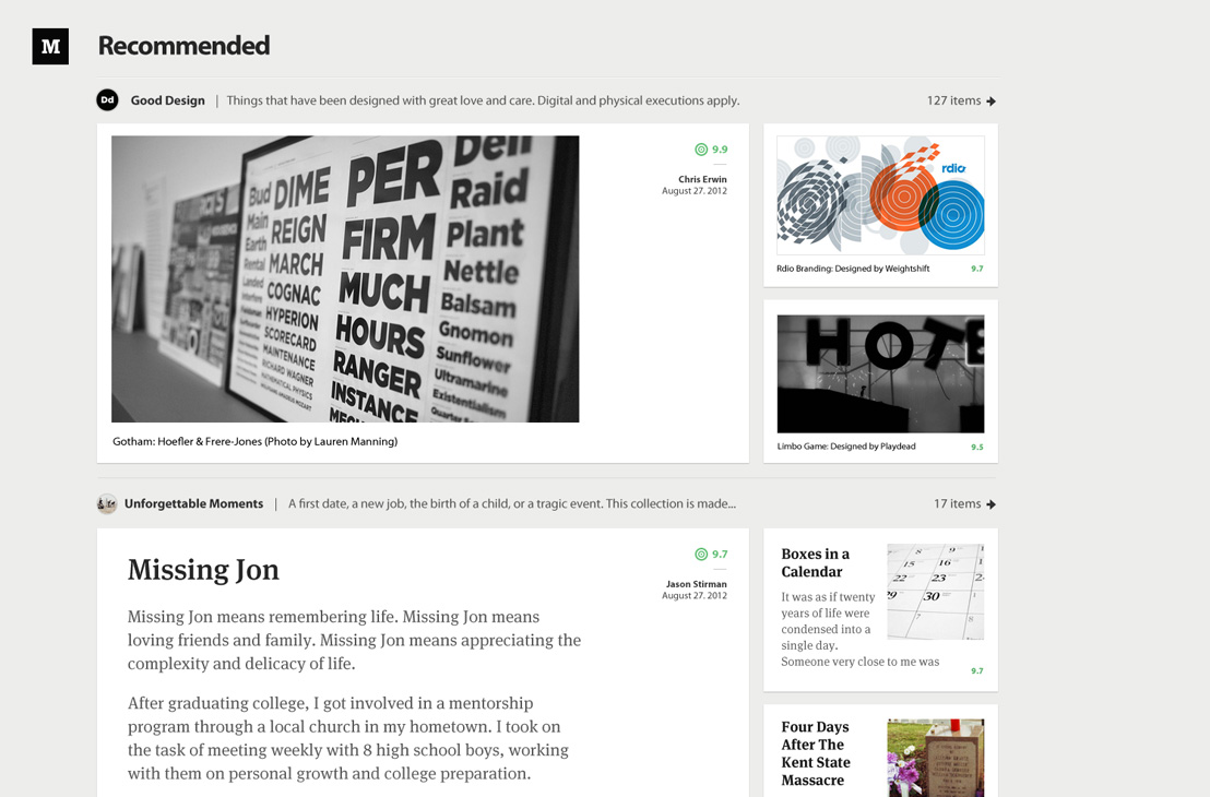
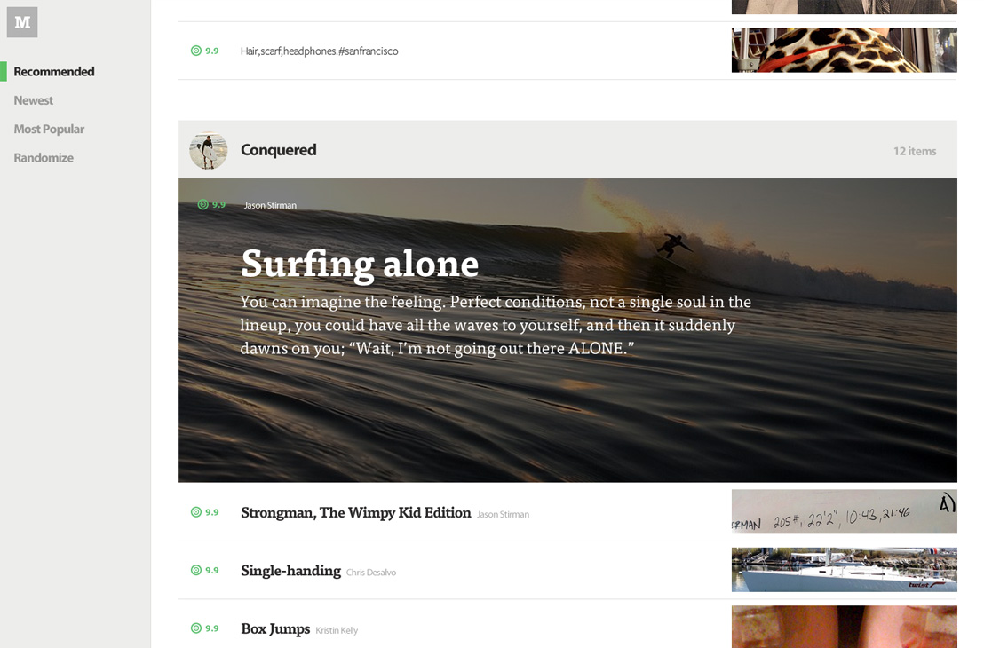
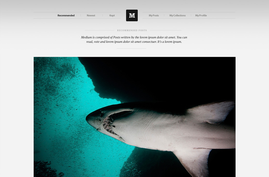
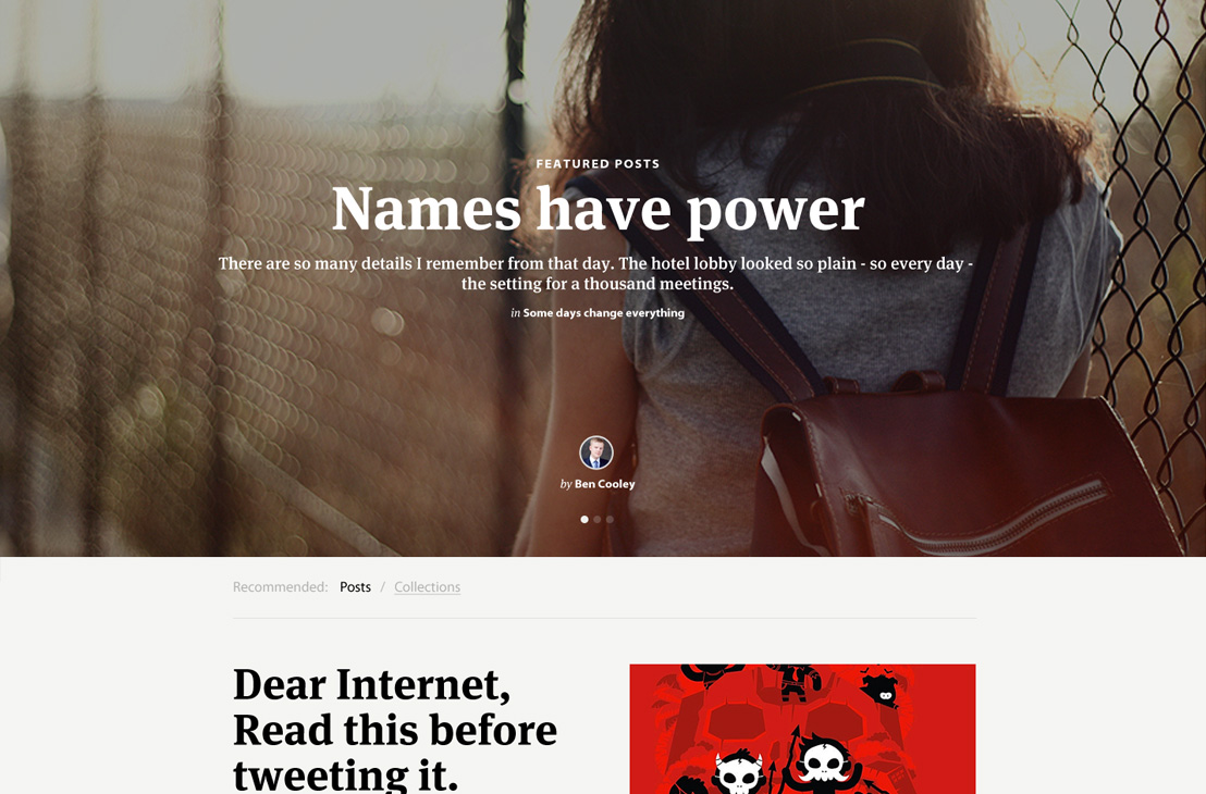
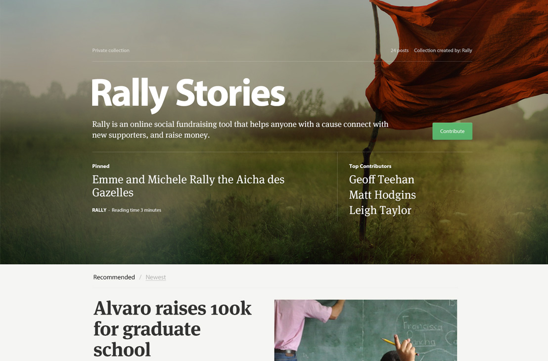
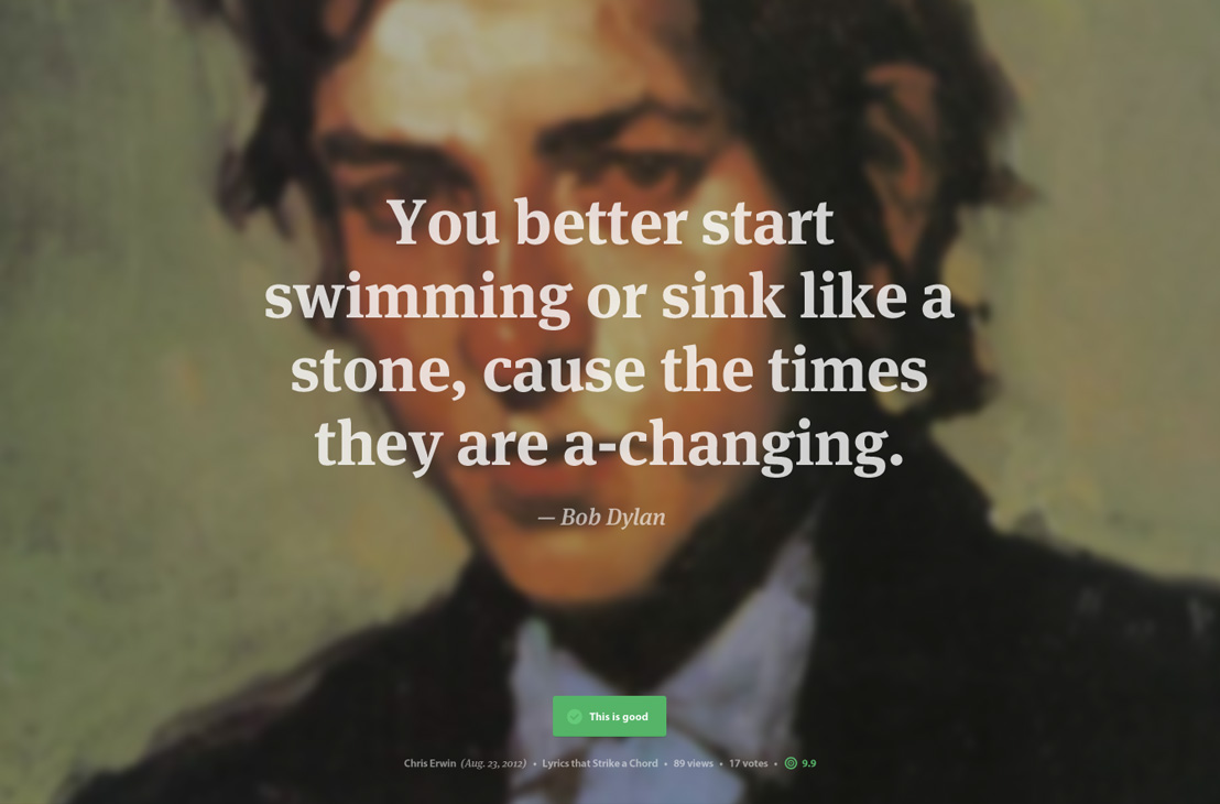
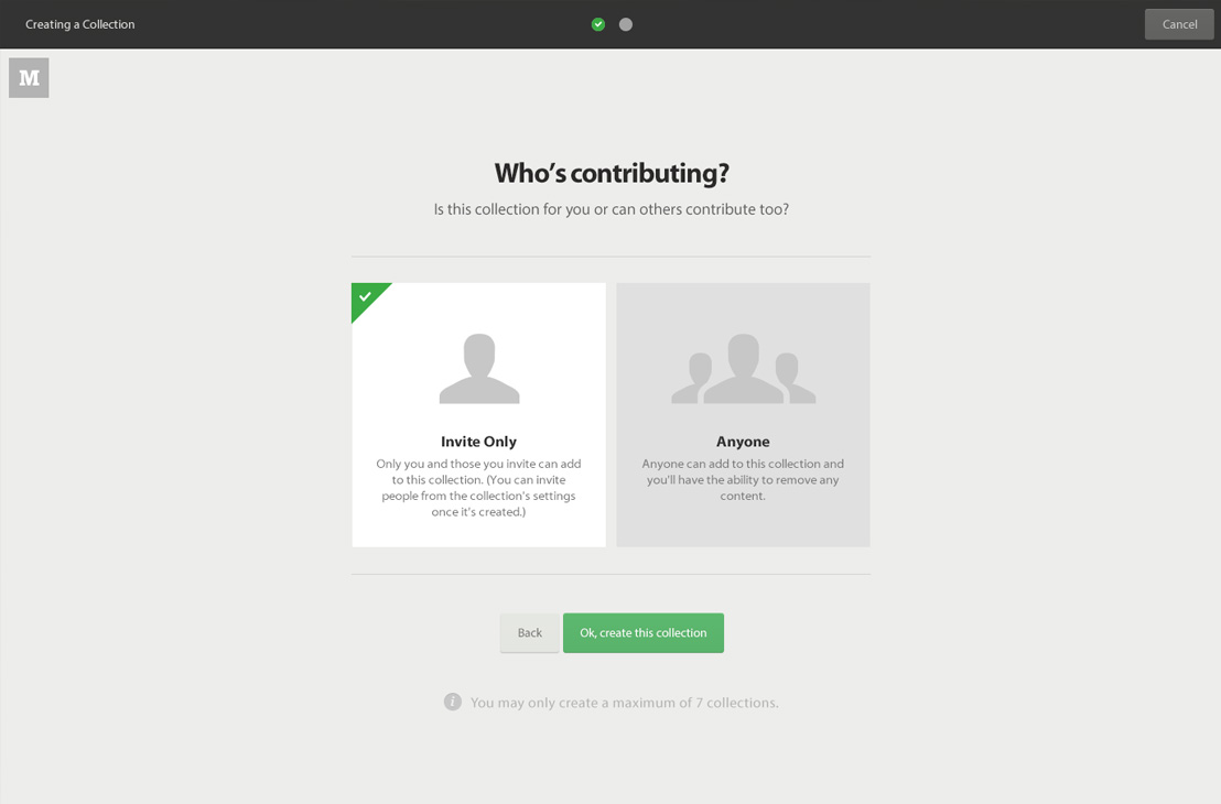
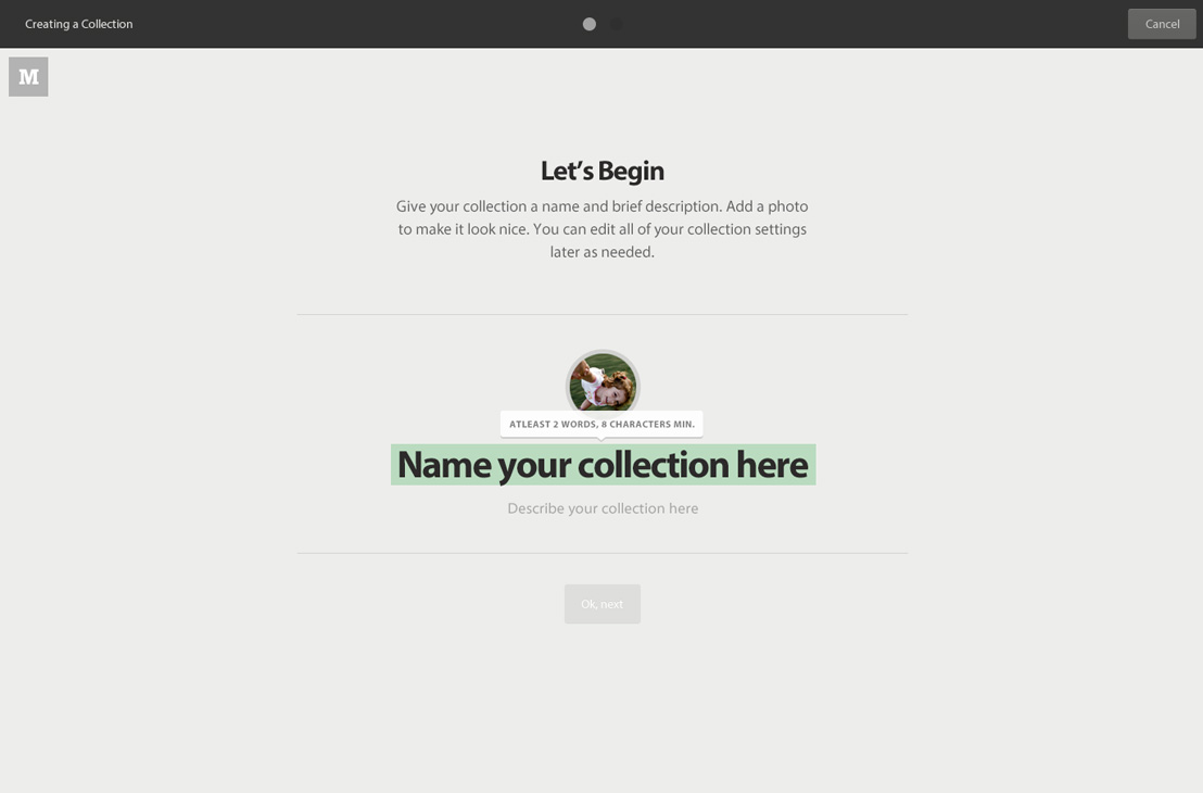
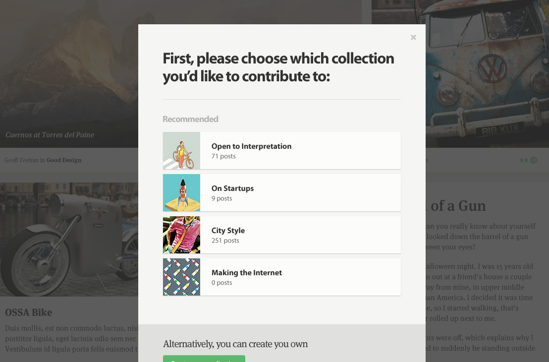
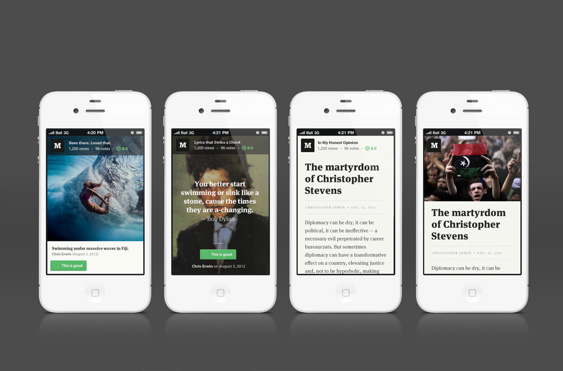
Near the end of our contract we started to feel the project was losing its way in terms of the overall UI. It was simply the result of multiple teams working hard on specific areas and those areas not fitting together as well as they could. We took a week off current fixes and features and focused on redesigning three pages from scratch: Home, Collection and Post. Some of it went live, some of it went away. The gallery below includes some of the last stuff we worked on for Medium. In addition, it has some older, more interesting, screens as well.

What We Learned
Sometimes even good ideas need to be killed.
 Geoff Teehan, Partner
We did this many, many times over the course of this project. Sometimes we were just killing an idea, other times we were throwing out something we’d built.
It takes a great deal of perspective and courage to kill something for the betterment of a product. Even before we came on, this product took on different forms multiple times. It can be frustrating at times, but in the end, if you don’t make difficult cuts the product becomes complex and lacks direction.
Working on a product at a distance is hard
 Chris Erwin, Developer
We really struggled when we left to come home for a couple weeks away from the broader team. Even though we were connected digitally, nothing could replace the close proximity and face-to-face communication we had when we were in San Francisco. Our weeks in Toronto, were without exception, less productive than those in SF. We looked to technology to bridge the gap, using Google Hangouts, Campfire chats, Anybot and the usual means like emails and phone calls.
Maybe we were doing it wrong, but I just can’t imagine working at a distance ever being nearly as good as work side-by-side—Especially when working on a version 1.
Using the product
 Geoff Teehan, Partner
If you’re spending the bulk of your time looking at sketches or discussing static pages you’re making way too many assumptions. A great product or service works well, it doesn’t just look good. Many UX issues are invisible. They need to be used to be discovered. For this project, mandating usage through posting articles and issuing bugs helped ensure we were using the product.
Moving fast means you’re probably never satisfied
 Matt Hodgins, Designer
Medium evolved at such a pace that we had little time to take a step back to look at it holistically, or, dive deep and make it pixel-perfect. This isn’t always a bad thing. It just means you make tradeoffs to advance the product in more functional ways.
