Getting Down
to Business
In a fuzzy and frenetic age of media disruption, sub-compact publishing, and post-industrial journalism, one thing is clear: our relationship to “the news” is fundamentally and forever changed.
But it is precisely because our world is now so connected—and we are now so empowered by the internet to move from passive consumption to active participation in a global conversation—that staying on top of and engaged with the news is all the more essential.
This is true for everyone, from the general public to economic citizens and business leaders, but for these two latter groups, the decisions they make at work and within their portfolios everyday rely on sound business journalism.
MAKING A BETTER REPORT ON BUSINESS

Quality Journalism
Since 1844
The Globe and Mail is Canada’s national newspaper of record. It serves millions of readers everyday with in-depth journalism and informed comment.
The Report on Business section—or ROB for short—is the nation’s leading source of business, financial and economic news and insight.

In 2012, the Globe decided to create a digital subscription product worth buying. In order to do this, they asked us to help them refresh and enrich the way users experience and engage with the news in the ROB online.
How do you take ROB’s reputation and heritage and bring it to life online?
We had some ideas, but we needed to do our homework first…
Dear Readers,
We knew that we couldn’t truly design a better experience for ROB online users without getting to really know them.
So we met up over coffee.
We conducted in-depth interviews with casual readers, die-hard Globe loyalists, and all sorts of folks in between. And we dug deep to answer essentially one question:
“What job do you hire the ROB to do in your life?”
At a high level, we discovered they were looking for 3 main things:
- Empowerment through functional tools. "Don’t just tell me what the news is, let me experiment and take action."
- Recognition through a place they can call their own. “This is a place that I can belong.”
- Personal enrichment through a depth and diversity of perspectives. “Don’t just give me a single, institutional, hedged point of view.”
Embedded Journalism
Now that we had our primary user goals in mind, we shifted our focus to The Globe’s news organization. We quickly realized that we couldn’t be successful at our job without helping editors up their game. This meant shifting to a deeply collaborative working style.
We camped out in the newsroom, crashed story and laydown meetings, learning as much as we could about their process as we went.
We ran working sessions in both offices to develop new ideas and flesh them out together.
Unburying the Lead
We sketched, we experimented, we built prototypes.

We iterated and refactored our design ideas, over and over, until we realized that there was one central problem that we were trying to solve:
We needed to unbury the lead.
ROB online stories come jam-packed with elements of insight and elucidation—little ah-ha moments where an expert opinion speaks out, or a salient statistic pops up, or a clever combination of data and editorial opinion sparks new understanding.
But are often embedded, buried, in the text.
We asked ourselves: How can we make these elements really stand out? Could we leverage the power of live data, layer-in analysis and commentary, and situate these within the broader context of the story itself, to unbury the lead?


Awesome Story Formats
Turning to the ROB print edition, we started to catalog all of the ways that visual elements like infographics, photography, charting, data highlights etc. were being put to use.
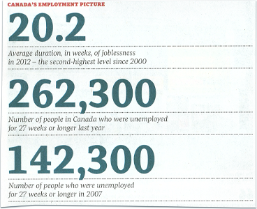
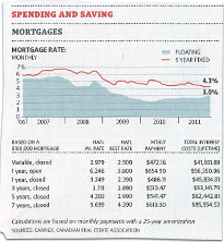


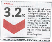
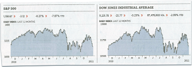

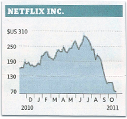

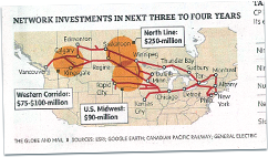

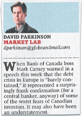
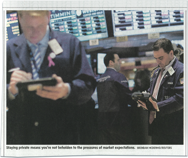


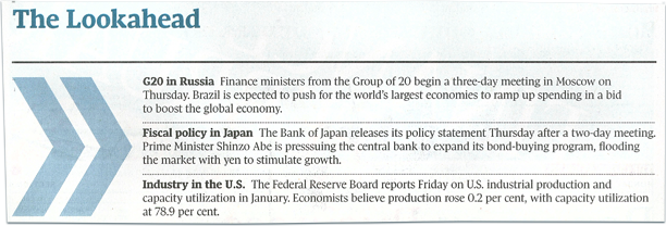


These alternate story formats (or, ASFs) add a lot of depth and richness to the storytelling experience. But, because they are custom-crafted pieces they take a lot of time to build.
We needed to develop a whole new toolbox for our digital editor friends: one that gave them the kind of expressive power we saw in the ASFs, but in a much more rapid workflow.

A Comprehensive System of Digital ASFs
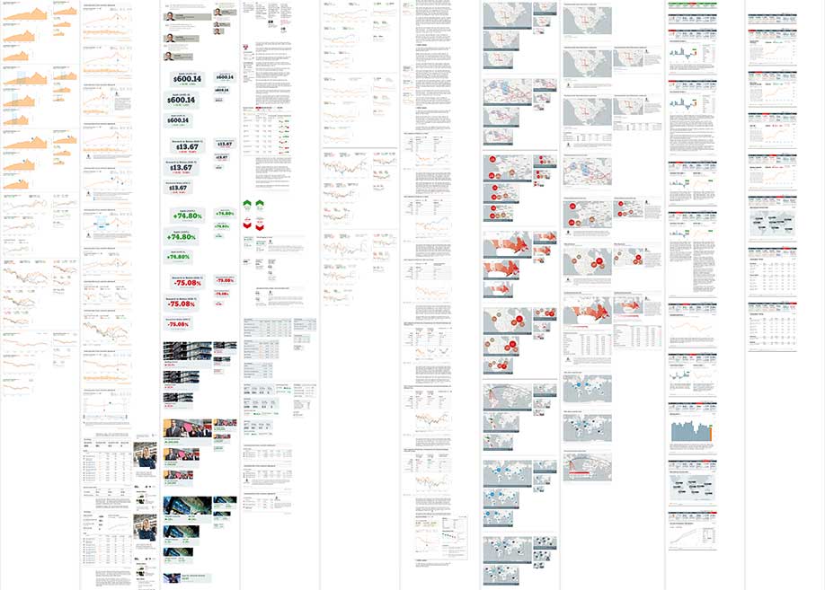
So, we created a comprehensive system of digital ASF elements.
These are designed to work on their own, or in combination with one-another, to tell mini-stories—and of course augment and enhance the articles they appear within.
There are…quite a few of these:
Note: pricing and performance data is for placement-only

A Streamlined Reading Experience
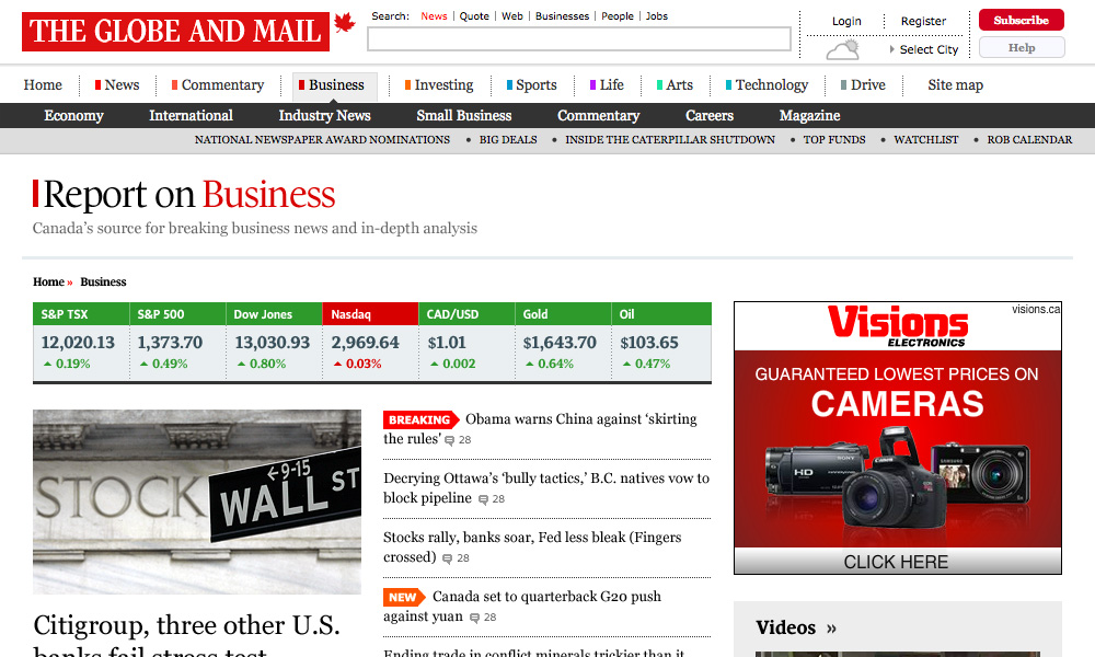
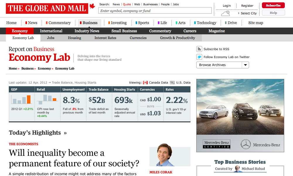
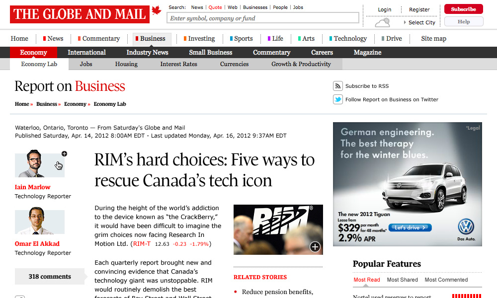
Now that we had this massive inventory of storytelling elements, we set to work on infusing them into a more streamlined reading experience. We did so at two fundamental levels: story and section.
Designing ASFs at two levels
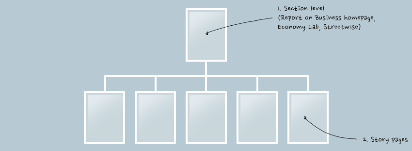
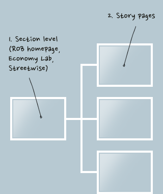
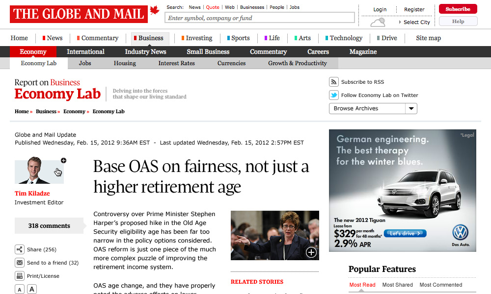
In our template designs, we sought to find a balance between fluidity, flexibility, and expressiveness. We wanted to allow the digital ASF elements we had created to speak out for themselves, yet fit into and help convey the larger picture.


What We Learned
Get To a Minimum Viable Strategy.
 Kim Lawless, Digital Content Strategist
When making digital products and services, it can be tempting to spend a lot of time up-front trying to formulate a flawless strategy. But what we really need to do is get to a simple, actionable statement about what problem we are going to solve for the user as soon as possible, so that the design process can proceed. In fact, a lean strategic process can happen in concert with design, allowing us to test our ideas in practice, figure out what’s working and what isn’t, adapt and move on. In this project, there were a lot of twists and turns that made a flexible and fluid planning process absolutely essential.
Sometimes UX Alone Isn’t Enough.
 Dave Gillis, Partner
If I have one regret about this project, it’s that we didn’t engage with the sales and advertising people more. That’s a tough admission—UX professionals by default want to advocate for users, and leave the marketing and sales piece for someone else to take care of later. But this, almost purist, mentality can work against us sometimes.
In retrospect, we were really working on 3 projects at the same time:
- "Make the best possible news consumption platform for readers"
- “Make a more capable and robust publishing platform for editors”
- “Make a more innovative marketing platform for sponsors and partners.”
Great journalism has always been subsidized…and in an age where the internet is disrupting that model, UX specialists and marketers need to work together to figure out what’s next.
Insist on Collaboration
 Pierre Marly, Designer
As a designer, creating a digital experience based on business news and financial data meant understanding the issues at stake. But it wasn’t until we started to meld our team with The Globe and Mail editors and IT team that we gained significant traction. They were able to tap our potential in a much more direct way—and in-turn, we were able to leverage their domain knowledge and experience to go much deeper in our own thinking. We developed a working relationship with our client that was a perfect example of collaboration.


