A Social Shopping
Experience
Spoiler alert: the story of Krush isn’t over, and to be totally honest we’re not sure how it will turn out. Make no mistake, we are extremely proud of what we have made, and believe in this product’s vision and potential. But it’s one thing to be stoked about something you’ve crafted, and quite another to see people take it up and make it their own.
So, this is a story about the start—about seeing an opportunity and diving in after it. But most of all, it’s a story about working hard to put a digital product out into the world that, with a little luck, has the potential to become something great.
Making Krush
Humble Beginnings
In the Spring of 2013, Jon Lax met up with Harry DeMott of Raptor Ventures. They didn’t have a strict agenda for their conversation, and spoke at length about a range of topics. One of these topics was an early-stage startup called Krush.
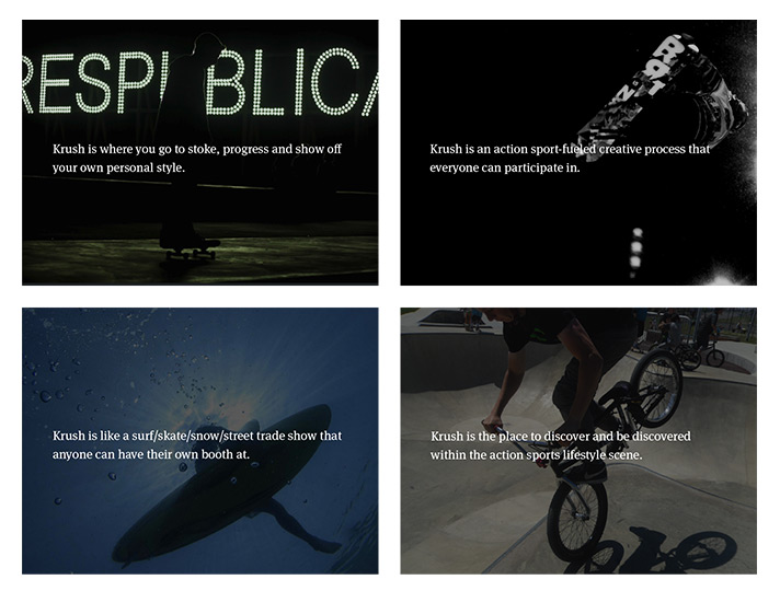
At the time, Krush was slated as a “predictive analytics” company aimed at action sports, street-wear and outdoor culture …Basically, it was a website and ancillary mobile app where you could post and browse new and upcoming skate/surf/snow/outdoor/street-related products.
Harry explained to Jon that they were thinking of shutting Krush down. After going through a number of incarnations, the product hadn’t caught on and was beginning to drift.
Double-Down
However, Harry and Raptor still believed in the larger opportunity that Krush represented: a singular online destination for a growing lifestyle vertical.
This vertical manifests itself online as a fragmented collection of media company and amateur-enthusiast blogs, brand-owned social media streams, retail and e-commerce sites etc. For someone trying to navigate this world—particularly on mobile—the experience isn’t great. Moreover, these channels under-serve the growing community of new and independent brands seeking to connect with a massive potential online fanbase.
Several months later, a plan to reboot Krush emerged. There would be a new core team, Raptor would step into a more active product ownership role, and we would engage over the course of 90 days to help them completely redefine and rebuild the Krush experience from the ground-up.
But what problem
would the new
Krush solve?
The original version of Krush was a solution in search of a problem. It had evolved through several major iterations that had failed to connect. So before figuring out what we were going to make, we needed to decide why Krush should exist in the first place. What problem was it going to solve?
After running several working sessions where we were able to tap the collective experience and vision of both Krush and Raptor’s amazing team (folks like Phil Shalala and Silas Dunham, Harry DeMott and Greg Rosen, all of whom we’d continue to lean on throughout the design process), we began to circle around the idea of a vastly-improved mobile shopping experience—one that would be social at its core.
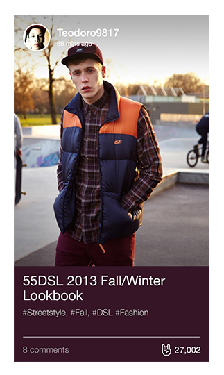
Photo courtesy of Bo Bridges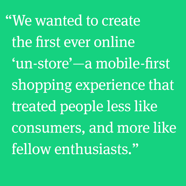
Side Story
Investing in Identity
For people in the action sports/street-wear scene, their gear, fashion, entertainment, art, the brands they support and the products they endorse are all tangible expressions of their lifestyle.
Now think about where they go (in real life) to buy this stuff: the surf shops, the REIs of the world, the independent skate store with a ramp in the back. These function more as gathering places and third spaces than mere retail outlets.
But, most online shopping experiences are like leafing through a Sears catalog. They completely miss the lifestyle aspect. What’s more, most of these experiences fundamentally breakdown on mobile, where more and more consumers are spending their time. So there is a lot of room for improvement.
We wanted to create the first ever online “un-store”: a mobile-first shopping experience that treated people less like consumers, and more like fellow enthusiasts.
We would do this by making Krush a vehicle for building and expressing identity—by connecting with brands, products and peers who share your passion.
—
Conceive. Make. Improve.
When you set out to bring something new into the world, there’s a strange tension: You need to be bold and opinionated about what you’re making, or else you’ll just fall back into the conventional solutions and superficial trends. But, precisely because you’re trying to buck the status quo, you also need to accept that you’re going to mess up. A lot.
So, we needed to make sure our process gave us the flexibility to try things out, make mistakes, learn and improve.
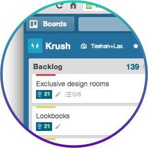
We started with a jointly-created backlog
This was used to estimate and prioritize our work effort over 90 days. We worked through our backlog in weekly sprints, building the product out, experimenting with different design directions, and gradually refining the experience as we went.
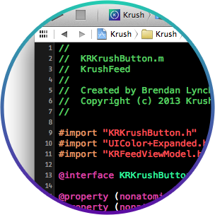
We designed in code
It was important for us to get to working software as quickly as possible. Ideas that seemed great in theory, and even looked great in flat comps, often broke down once we tried them out in code. By having our developers engaged from the very beginning, we were able to short-circuit this process, accelerating design cycles and buying more time for iteration. Not only that, some of our favourite design touches in Krush made their debuts in code!
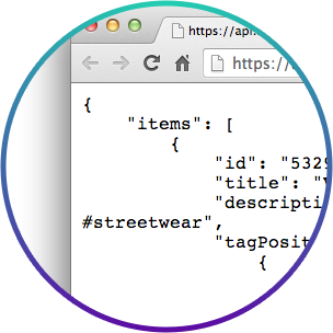
We worked from the API-out
We like to think about making digital products from the API-up and -down. Typically, we work above the API (which allows us to work in tandem with client-side or third party development resources), but in this case we also did the backend. Defining the API was an important part of our design process. In fact, many critical areas of Krush’s design and functionality emanated out from the API. For the brand-admin area, we chose to use the CMS Contentful precisely because of it’s API-centric design philosophy.
What We Made
From the get-go, Phil (Krush’s CEO) made it clear to us: this wasn’t a redesign, it was a re-do. He wanted to take learnings from previous versions of Krush, blow everything up and start over from scratch. Everything from branding and visual identity to the core feature-set and UI would need to be rethought.
We created art boards to formulate and gain consensus around high-level visual direction. We eventually chose a design system that was distinctive, but not too overbearing.
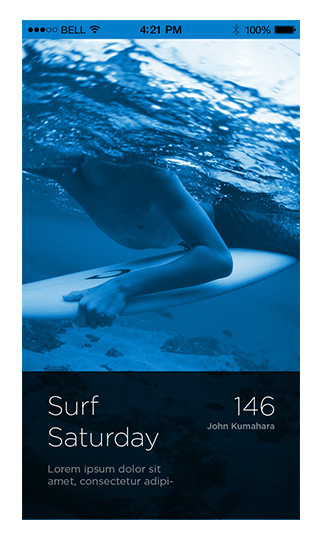
Early versions of the feed experience were based on a continuous scroll and typical image aspect ratios. But as we played around with real assets, we realized that we could go full bleed for a much greater effect.
The app icon design process started with a few major variations and then moved into incremental refinements of the final version.
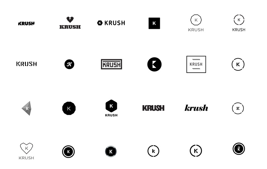
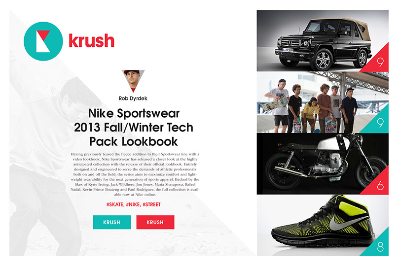
Rethinking the logo happened relatively early-on. We eventually settled on a version that could be superimposed on top of images as a watermark and serve a primary element in the UI.
The core user experience loop for Krush revolves around discovery, endorsement, and building up your profile. These three pillars define the foundation that e-commerce is layered on top of.
From the beginning, we thought of Krush as an ecosystem that would serve both enthusiasts and brands. So there is a symbiotic, reciprocal aspect to this loop.
Deep Discovery
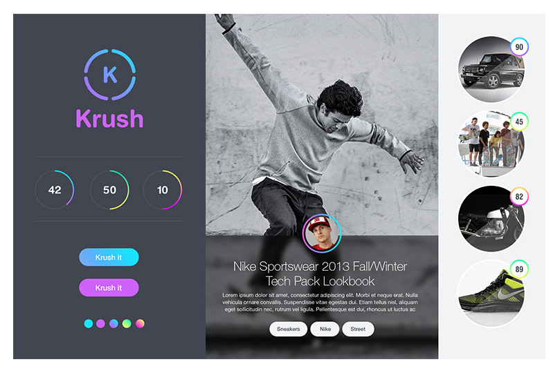
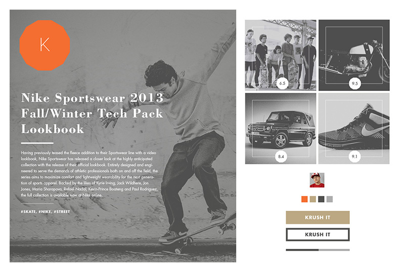
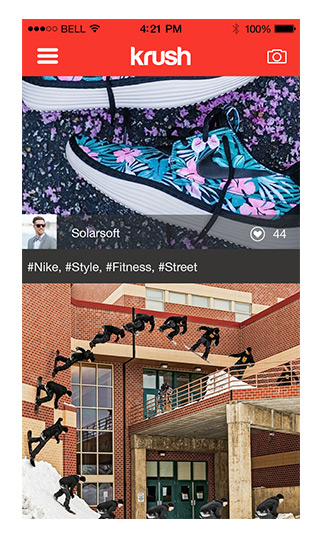
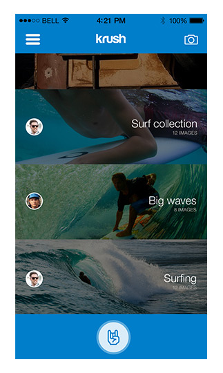
The Krush experience starts with a beautiful stream of fresh-new brands and products. We crafted the UI with as little chrome as possible, so that this content could take centre stage.
But designing for discovery meant more than polishing pixels. We wanted every session with Krush to be a bit like a treasure hunt. And this was more about flow—quick ways for people to fork off into #tag feeds, related items, brand-centric storefronts, and other places, then easily track back to their personal feed and keep going.
Endorsement
Endorsing stuff is the fundamental thing that you do in Krush. Almost all other parts of the experience hinge on this one action. So we wanted endorsement to have an intentional, weighted feel to it. Such a deceptively simple challenge took a ton of work to get right. After several dozen iterations of the conceptual model and UI (many of which made it to near-production code), we finally settled on the current press-and-hold mechanic.
When you endorse a product on Krush, it’s like you’re investing a little bit of your own personal influence into that thing. That’s the idea behind an integrated currency system called Krush Kreds. Kreds would tie into brand benefits and promotional opportunities for ecommerce later, but their genesis was in looking for a way to make endorsement feel more meaningful.
A Profile to Take Pride In
Krush is a place to build your personal style—and so it was super important that, right from the very beginning, your profile was something that you could take pride in and feel ownership over.
We pursued this goal again by sweating the visual details (e.g. The default wallpapers were selected from a set of beautiful lifestyle scenes by SoCal photographer Bo Bridges), but also by implementing functional ways to highlight your influence and brand affinity.
Making it Better
As soon as possible, we got a working beta version of the app out to several dozen people in our trusted network. We asked them for brutally honest feedback, which was totally invaluable down the home stretch.
We then went on to soft-launch the new Krush with a measurement plan in place to help us optimize over a 60 day period. It was incredibly humbling to see where some of our major convictions and assumptions had broken down. But improving Krush based on real user data was also one of the most rewarding parts of the project. Here are some of the things we changed up:
Private Saves
To clear up confusion, we made saves private and reserved public expression for endorsements.
Onboarding Cards
Our original onboarding flow wasn’t working at all. So we killed it and instead baked a set of interactive onboarding cards into the main feed.
Email Sign-In
We were getting feedback from people who didn’t want to use their social credentials to create an account on Krush.
Background Threading
We were able to boost startup time by a factor of 5 by moving processes like jpeg decompression to background threads.
Homepage Refresh
We retooled the design for Krush.com to make it a little more streamlined and self-explanatory.
Demo Mode
There were a lot of people bouncing off the sign-in screen, so we added a demo mode that lets you try the app out.
Better Brand Support
We worked with Contentful to make it easier for brands to plug their content into Krush.
Endorsement Tweaks
We sped up the endorse UI and changed the Krush Kreds algorithm to achieve a better feedback loop for our core mechanic.
More Backlog Items
At the end of our initial 90-days, we still had key items in our backlog: things like the mobile posting, find friends, and e-comm fulfillment.

What We Learned
Developers are designers.
 Brendan Lynch, Developer
For digital products, “design is how it works” is one of those truisms that quickly becomes cliché. But we’ve found that there is nothing trivial about putting this idea into practice. There are no shortcuts. You have to literally make stuff work in order to understand the merit of your ideas and creative vision. Countless times, we coded up concepts that seemed great in theory, only to realize that they fundamentally broke down in practice. An interaction mechanic would turn out to be awkward, the mental model would start to get cloudy, patterns of use would start to veer off in problematic directions.
But designing in code also opened us up to serendipitous discoveries. Designers were able to play off the things we were building, and collectively we were able to improvise better ways of solving problems. We believed that people would be fitting an app like Krush into fleeting idle moments in their lives. It needed to behave in a responsive, tangible, seamless and fun way. Those were the kind of “how it works” design goals that Ash, Dave and I worked closely together with our designer counterparts to solve every day.
Get it out there!
 John Kumahara, Designer
As designers, we love to polish every last pixel and obsessively finesse every single interaction. That’s why taking something that you know isn’t finished and putting it out there for feedback can be excruciatingly tough. Your instincts kick in: you want to hold it back until it’s perfect. But determining to ship—first internally, then to a closed beta, then to the world in a soft-launch mode—forced us to focus on what mattered now and what could wait. It also helped us come to terms with gaps in the experience that we had ignored or overlooked. In fact, in reflecting back on this project as a team, we realized that we were more productive, more focused, and more proud about the things that we changed post-launch.
Simple beats clever.
 Dave Gillis, Partner
In a lot of ways, designing products is like solving a puzzle. So it’s easy to become invested in cleverness. Novel interaction mechanics, elegant ideas, technical accomplishments, and signature design flourishes are all great—but when we fall in love with these things, we can shoot right over the heads of everyone we are supposed to be designing for!
The thought that we’ve outsmarted ourselves in areas of this product is what keeps me up at night. There’s strange tension here: being bold and opinionated at the outset helps us overcome the inertia of the status quo and do things differently. But as we actually make something and begin to learn from it, these opinions must become testable assertions to be proven out one way or another. That’s the humbling part—but it’s also where simplicity can finally start to emerge.