A Platform for Reading
When it comes to reading, the Web has become less than ideal. Hard to read type, bad layouts and increasingly larger format ads distract you from the content. It’s too common a feeling that sites try to get us to focus on everything on the page except what we came to the site to do… read the content.
We’re also facing an increasing number of content sources. We receive links to great content by email, RSS, Twitter, Facebook and other sites we regularly visit. How many interesting links do you see during your day but don’t have the time to look at them in that moment?
Readability is the platform for reading on the Web.
Making Readability
From infancy to extraordinary
Readability started as an open source JavaScript library. In its earliest forms, it was code that let anyone take a web page and create a “clean” reading view of the page. Its code became widely adopted, finding its way into a range of Web apps and even software, like Safari’s “Reading List” function.
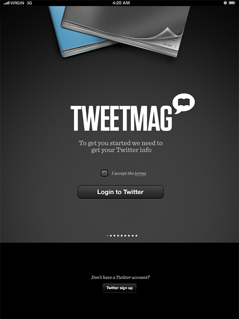
Readability started as a hobby project inside New York based Arc90. We had known about Readability since its earliest days. In 2009 we started working with their code when we were developing our app, TweetMag. By this time, Arc90 had separated Readability off into its own business. Readability was no longer an open source JavaScript library, but a full featured Web service. Its ability to take any Web page and parse it into a clean view was incredible. Its parser was, and still is the best available.
We were friends
before we dated
At the time, we were having some major issues with how TweetMag was performing. We were using Readability’s API, and decided to reach out and ask them if they might have any solutions to our performance problems.
They responded immediately. Within 24 hours we had solved a major technical problem that had plagued us for weeks.
That initial email led to them giving us some amazing support on our app, which led to a meeting at SXSW 2011, which led to more conversations, which leads us to this story.
United Front
Readability are really good at platform building. Their API and infrastructure that powers Readability is an amazing feat of architecture. Readability is integrated into popular applications like TweetBot, Reeder, Flipboard, Pulse, Longform and hundreds of others. It parses millions of articles a day, and does it faster than any other parser available.

When we worked together on TweetMag we developed an effortless collaboration and partnership. These words get thrown around alot, but here is why we feel we can use them in this case.
Mutual respect: The team at Readability knew what they did well already, and where they could be made better by us. We knew we could never build a platform as well as they could. Being able to recognize each other’s strengths and weaknesses without ego. This mutual respect let us each do what we love and do best.
We liked each other: From the first time we met, we just liked each other. Let’s ignore for a moment that a lot of beer was involved at SXSW. We’ve spent time with the Readability team, socially and professionally. It is so much easier to work with people you genuinely like.
Shared vision: We both wanted to create the best and most beautiful reading app possible. Having the same goal of quality ensured that discussions were never wasted on politics or arguing over the direction of the product. All our energy went into making something we were both proud of—and tried to benefit both readers and publishers.
Ownership: In order for this to succeed, we couldn’t treat this like a one-off project. We needed to have true ownership over the mobile product. It needed to be a long-term engagement, as it would require ongoing design and development beyond just the app submission.
They weren’t just a client and we weren’t just an agency. We came to the conclusion that the best approach for this type of relationship was for us to literally buy into their company—so we became a shareholder. In return, we would create the iOS, and subsequently, the Android applications.
“They weren’t just a client and we weren’t just an agency.”
Get to a Working Product
We started by focussing on getting the basics right on iOS before moving on to any new features or platforms. We wanted to get to working software quickly so that we could make design decisions based on real-world usage. So much of creating things, especially those that seem simple, is about using them and then improving them. It’s hard to experience wireframes and Photoshop docs.
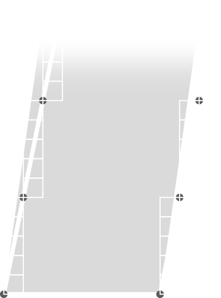
an example of some high-fidelity IA flows for the mobile app
There were dozens if not hundreds of ideas that didn’t make the cut. This folder system was one of them. It felt overly complicated and finicky.
A Focused Experience
Over the initial design and build period, we constantly built things up and refined the experience down to its core elements. With each iteration we’d find ourselves removing more and more—sometimes interface elements, other times features. This constant ‘go-wide’ exploration, followed by an intense period of selection and refinement allowed us to create a focused experience where the primary goal was to make a great reading experience.
“With each iteration we’d find ourselves removing more and more”
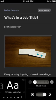
Content as Interface
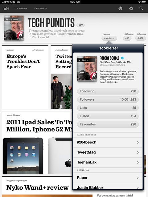
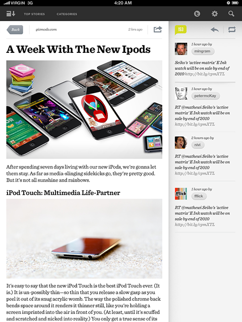
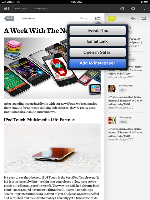
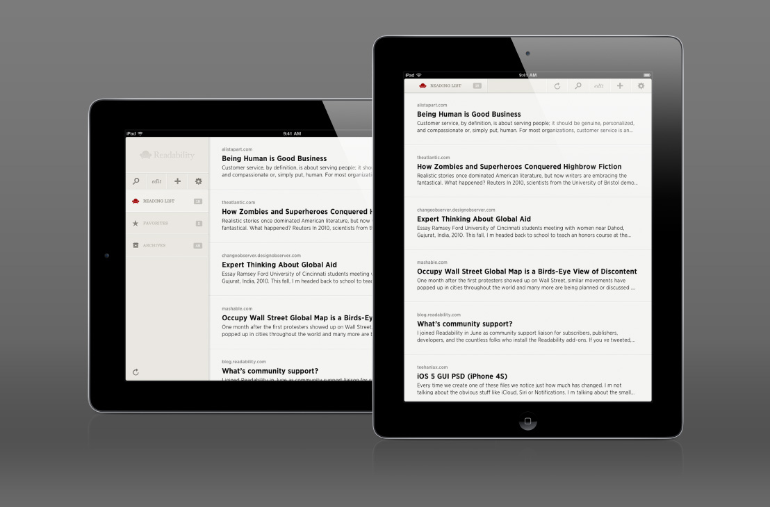
When you’re using the app, you’ll notice there are very few elements like buttons. The content is the interface. We wanted the interface elements that help you manage or share the articles you’re reading to only appear when needed. A simple tap on an article will bring up an actions bar where you can share, archive or customize the article.

Pulling up or down at the beginning or end of an article lets you quickly get to the previous or next article. We used swipe gestures to let you go back to your reading list. This approach to the user interface removed the visual noise and distraction so you can read in peace.
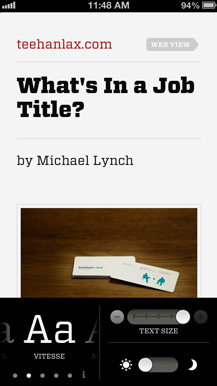
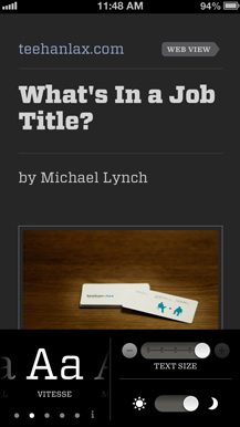
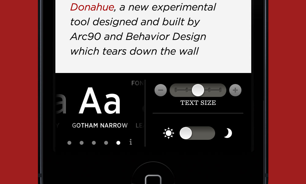
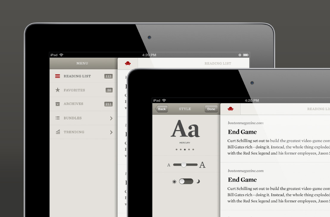
‘Just Enough’ Customization
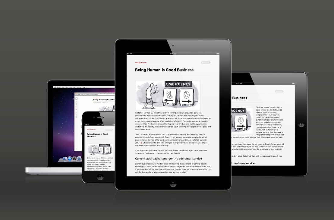
While we always think the defaults should be best, we also appreciate that some people like larger fonts or differing styles. There is a balance that needs to be found when offering up any type of customization. Offering too much is typically where things get messy. We didn’t want to overwhelm the user with controls to learn. We also didn’t want a user to be able to create a combination that wasn’t great. We were able to achieve this by allowing a user to change just a few variables. The app allows you to control the font family, size, and on iPad, the column width. There’s even a night mode for when you’re reading in the dark.


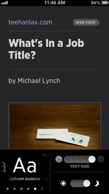
Innovating Type
One thing we knew going in was that the app would need to have beautiful typography. At the time, we were dealing with low density displays like the original iPad and iPhone 3GS. Most fonts on the market rendered poorly on these displays—the fonts are simply not optimized for screen reading. We needed to source fonts that were. This is where Hoefler & Frere-Jones came in.
Get these fonts at typography.com


H&FJ’s experience designing typefaces for demanding environments made them a natural choice for Readability’s mobile apps. Not only were these fonts created by a world-class type foundry, but they were properly designed and hinted to render perfectly at lower densities. In this AIGA presentation, Jonathan Hoefler talks about the ScreenSmart fonts we used in Readability.
 subtle changes to weight, proportion and angles to these new versions of the fonts meant they read better on screen than anything else available.
Pixel Perfection
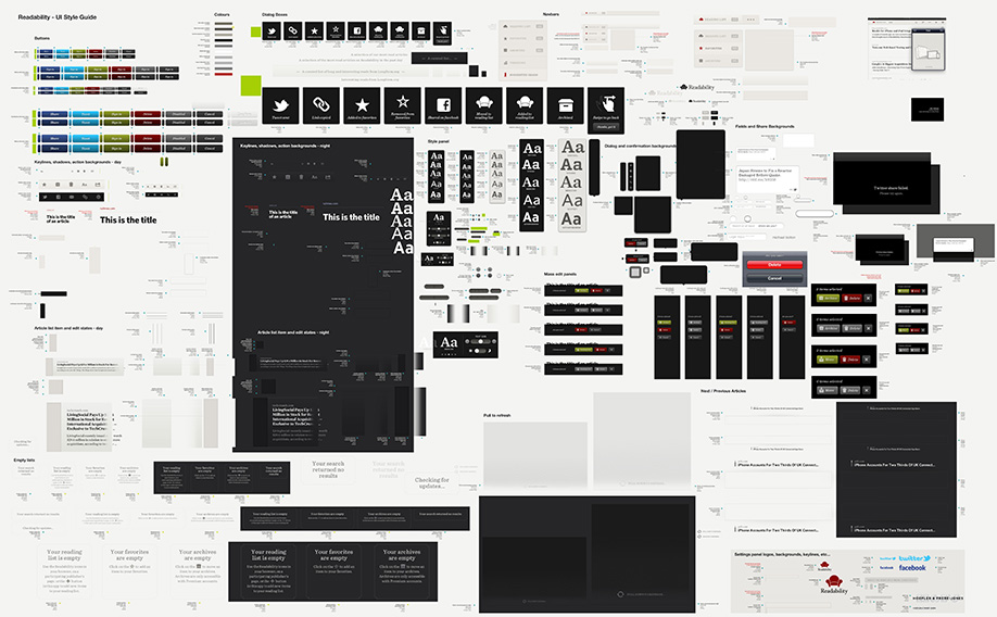
We painstakingly created a custom UI that was pixel perfect across multiple devices and pixel densities. We are designing in a fragemented world, so things can get out of hand in a hurry. You can get a sense for how crazy it can get when you explore the graphic below (The full view canvas is 10,000 x 12,000 pixels). We use this PSD to create and manage the assets for iOS and Android.
There are over 6000 images in the Readability apps (iOS and Android). 6000 images for an app that is primarily text. When you use Readability you don't think it is very complex from a UI perspecitve, but great design should be invisible to a user. We use this image to explain to clients why mobile apps take so much time to do properly.
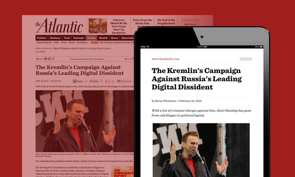
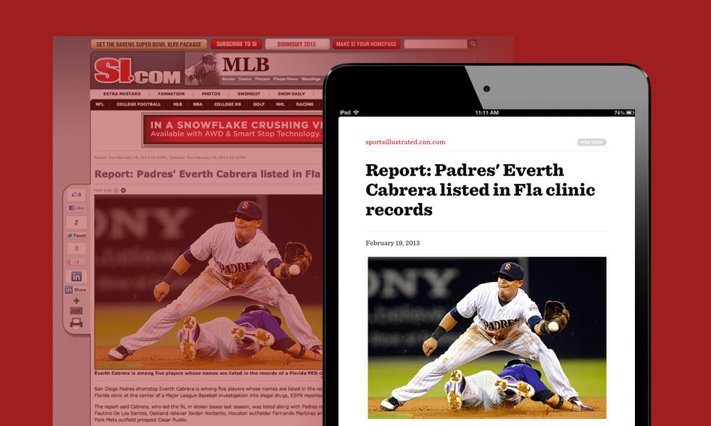
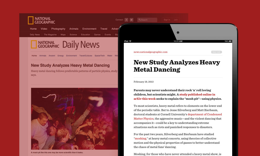
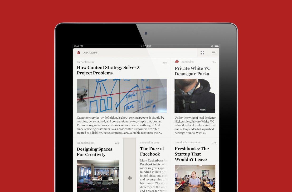
Final Product
The gallery below shows some final screens of the app and the launch. To really get a sense of the product you can download Readability for iOS or Readability for Android and enjoy reading again.

What We Learned
Never give a release date. Ever.
 Geoff Teehan, Partner
Thankfully we didn’t fall into this trap, but so many do. Often times it’s a classic case of underestimating the effort it takes to put something of quality in market. But when you’re putting something in the App Store, you’re not in control, Apple is.
At the time, Readability had been experimenting with a controversial payment model. Readers could assign a monthly dollar amount they could afford to pay for content. As they added stories to their reading list, the system would divide their monthly payments amongst the publishers. For example, if you assigned $5 a month to Readability, and you saved 5 articles to your reading list, each of those five publishers would receive 1/5th of your monthly payment minus 30% which went to Readability to fund the business.
Aside from the model being controversial, it created issues in the App Store since Apple was trying to understand how it related to their own subscription and payment models.
It took over 100 days for it to be approved. Imagine if we had have submitted the app and stated a launch date based on the app being a week or two ‘in review’. People would have been waiting literally months for its actual release.
Fact: During the iOS versions ‘in review’ time, we were able to completely build the Android version.
The Internet can be an echo chamber
 Jon Lax, Partner
Readability took a lot of criticism from very popular and loud voices on the Internet for its payment model. We are passionate about the work we did on Readability and disagreed with a lot of the criticism. We felt like we had to respond. We felt like we had to defend our work. This led to us getting dragged into several online debates that we never should have gotten into. Not because healthy debate isn’t positive, but because it was a no win argument. We weren’t going to convince our critics of our point of view, and it devolved into name calling pretty quickly.
At one point in the debate, Geoff came into my office very stressed. His Twitter feed was blowing up with criticism and debate. He wanted to wade into the fight. In Geoff’s Twitter feed, it was all people were talking about. In mine, it was quiet. We follow different people and I was not experiencieng what he was experienceing. He was in an echo chamber of the vocal minority.
We learned that our social network can amplify something very effectively. You then mistakenly think that because you are experiencing this maelstrom, everyone is... this is probably not true. When you respond, you can add to the noise just compounding the issue.
Pixel perfection in a fragmented world takes more than you think
 Brendan Lynch, Developer
Because we were working on multiple platforms, we needed to ensure the application looked amazing on all screen sizes and densities—not just the very newest or best. Scaling the UI elements of your design and understanding how an asset at one density would scale to another can be confusing. Things don’t just scale natively, nor can you rely on software to export them crisply. It’s a laborious job that spirals out of control REALLY fast.
Readability is comprised of only a few views yet still uses over 6000 individual assets between Android and iOS. It takes an extraordinary amount of time to make them all look great.
After the first release was done, we created a tool to help us calculate assets across different densities. We call it the Density Converter - check it out.