Painting
A Social Portrait
The making of
Bell Social Portrait

First Time
for Everything
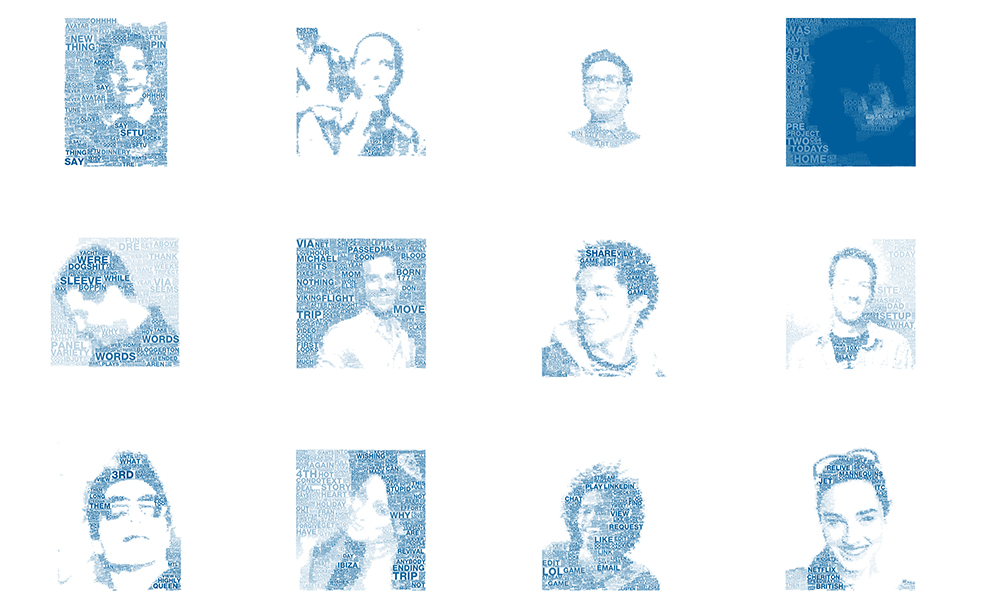
In December of 2010, Jeremy Bell, a Partner at Teehan+Lax, came back to the office after a briefing from our client, Bell Mobility. Bell had briefed us and their other agencies on the next quarter's objectives. The brief presented the insight that people were increasingly using social media to establish and form their identities online. Our tweets, status updates, and pictures all contribute to presenting ourselves to the people inside our networks. Bell asked their agencies to come up with ideas that could demonstrate this phenomenon.
Back at the office, Jeremy talked to the team about the brief. The idea that our identity is integrated to our social persona was philosophically an interesting one. One of the agencies was kicking around the tagline "I tweet therefore I am".
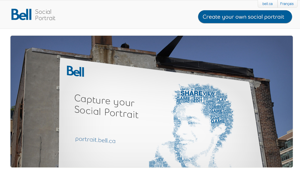
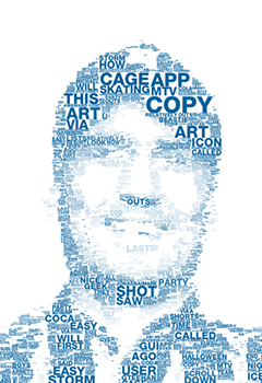
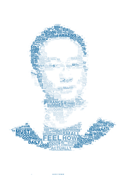
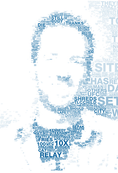
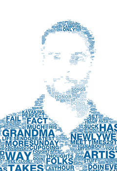
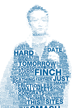
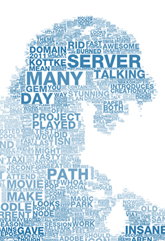
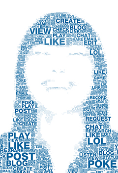
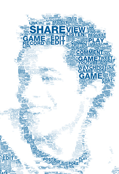
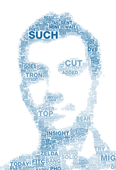
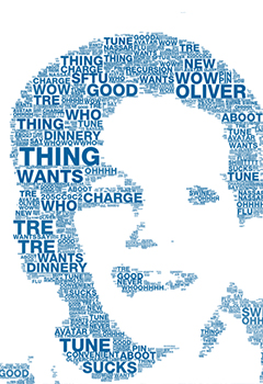
One of our initial ideas was to create a visualization using the data contained within one's Facebook or Twitter account. Something abstract but compelling. While we brainstormed different approaches, Duncan Porter, an Art Director, showed Jeremy a link to a series of typographic posters. These posters used type to comprise an image.
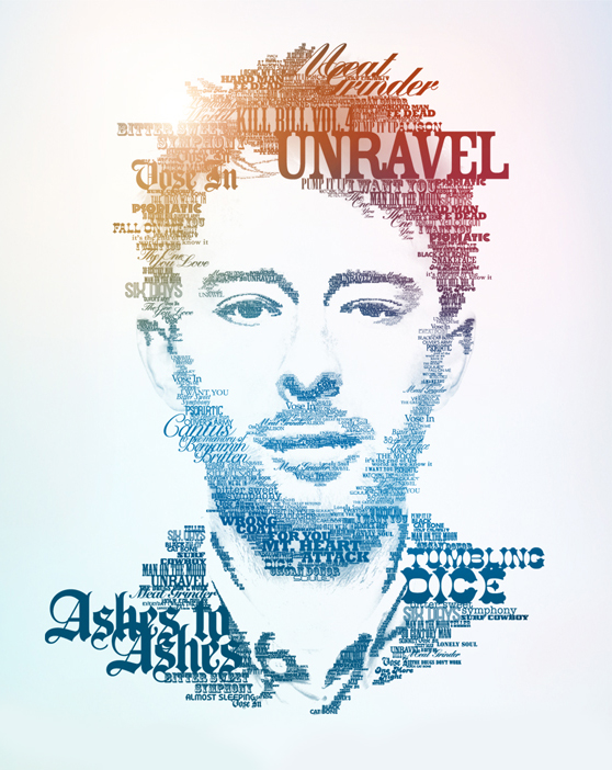
Duncan had an idea. "What if we could have you make one of these but with your own image and using your own words?"


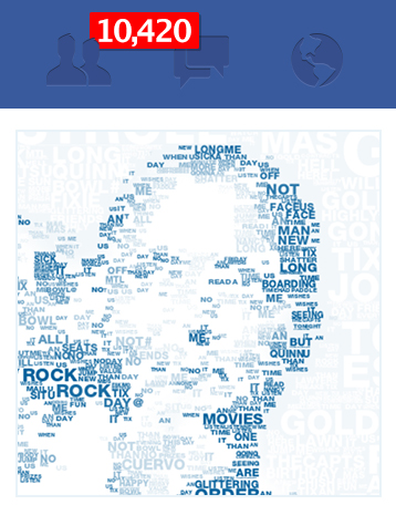
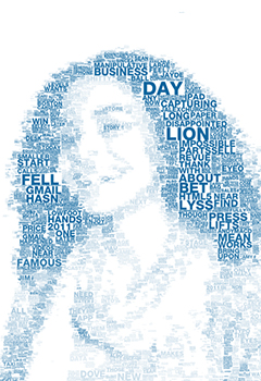
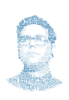
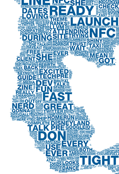
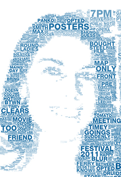
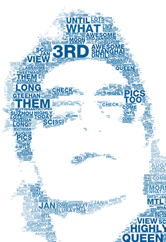
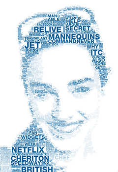
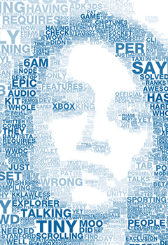
What started as a simple concept became a technically ambitious idea for Bell Mobility that - little did we know at the time - would leave us faced with hurdles we had never jumped before. This is the story of how Bell's Social Portrait came to be. Over the course of a bumpy programming ride complete with loops and all, our ambitious idea eventually had users create over 100,000 Social Portraits.
“The things I share on Facebook and Twitter are a reflection of
who I am.”
Finding the
Right Canvas
Duncan's idea was interesting but the problem was the style he wanted to emulate was painstakingly done by hand.
These types of typographic portraits are typically constructed using graphic design software like Illustrator or Photoshop. We knew that simulating the process programmatically would be a challenge - let alone deployment with the many varying browsers and devices users may have. We did some early research and prototyping using the Canvas tag as a drawing surface. At the time, HTML5 and Canvas were fairly new and still unexplored, and we weren't exactly sure how we were going to do what we wanted to do. But we did have our idea. We knew what we wanted it to do. We didn't even know if it was technically possible. But we had a client who believed in us and was willing to let us try.
Our first task was to see if this was even possible. Could you feed an image to a Web page, feed the same page a "dictionary" of words from a Twitter account and then make a typographic poster? Jeremy approached Peter Nitsch, the Director of T+L Labs and explained what he wanted to do. Within a week he had constructed a proof of concept using, of all things, a picture of Octocat.
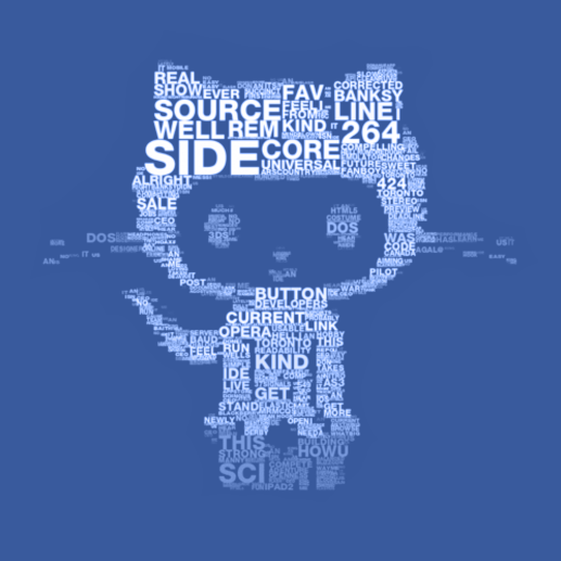
Our intent was to generate as much reusable code as we could for the finished product. This meant that all image segmentation routines were written in Javascript - a task made easy thanks to some code Peter had written earlier called BitmapData.
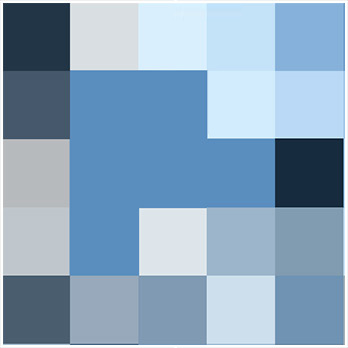
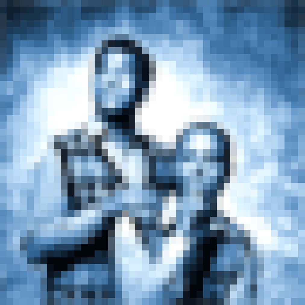
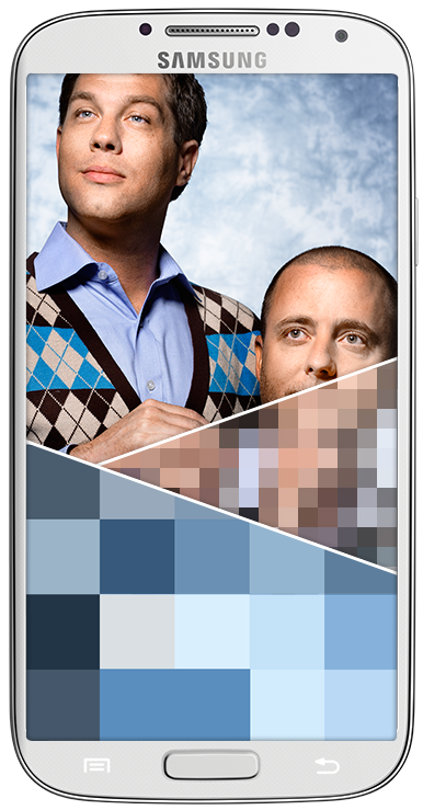
Typical ASCII art uses a quadrant based colour weighted lookup to match character glyphs. The process is actually simpler than it sounds. Take, for example, the letter “L” - it could be mapped to a region with bright colour in the top-left/ bottom-right/ bottom-left quadrants. We used this same quadrant splitting practice in order to segment images into a cell grid of varying sizes, or quadtree. This involves recursively splitting an image with one simple condition:
Stop splitting if the
region contains only
one colour.
Next, we merged all of the adjacent cells of the same dimensions. This gave us a useful grid for mapping words, but aesthetically we weren't happy yet. It still wasn't share-worthy art. Cells appeared too organized and symmetrically positioned, and we wanted an element of chaos, and this meant a new approach was required.
You Missed
A Spot
We began investigating various box fitting strategies, and quickly began building our own algorithm. The approach was fairly simple:
1
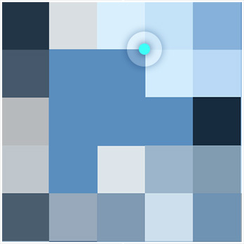
Pick a random point from an array of active pixels (other than white).
2
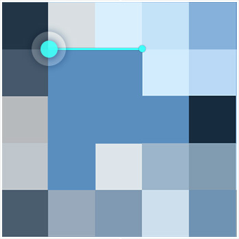
Move that point horizontally left or right until a null pixel (edge of the image, white pixel, or another cell) is hit.
3
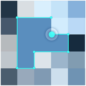
Move vertically up or down until the same condition is true.
4
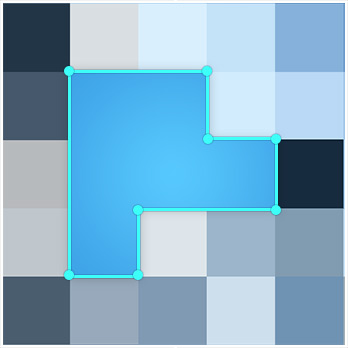
Expand a rectangle, with a width to height ratio chosen randomly from a predetermined set, until any of its pixels hits a null pixel. Mark that rectangle as a cell.
5
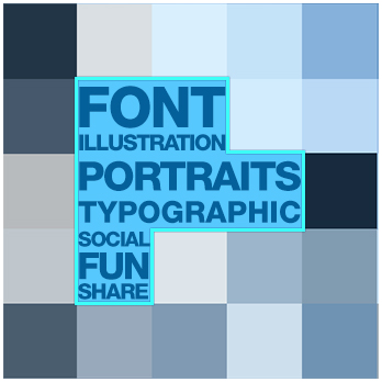
Typography can be flowed into the cells.
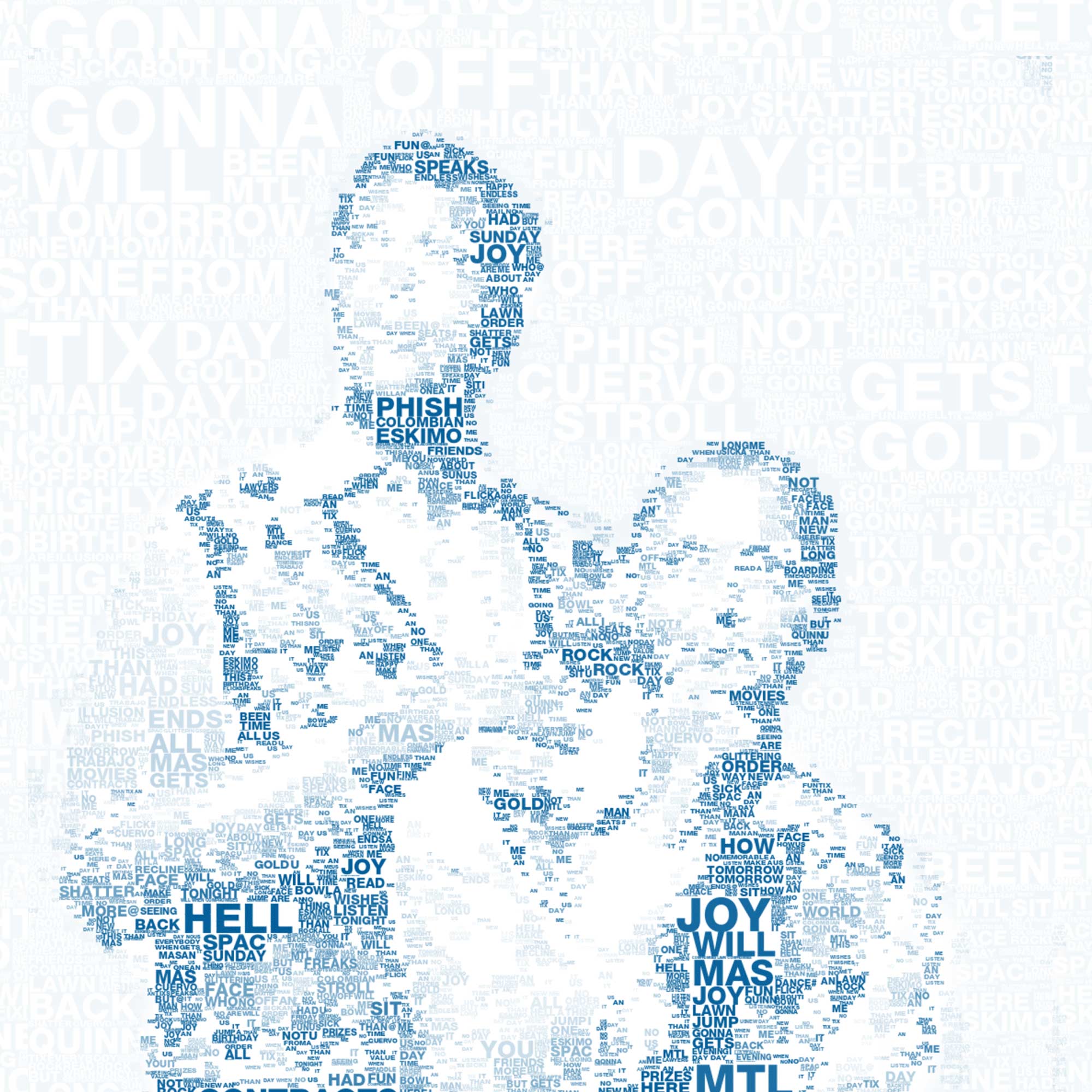
The resulting grid had the right amount of randomness and produced visually appealing portraits
Despite how good they looked, we ran into a few problems - average computation time of 30 seconds in Chrome, and huge performance issues across a number of different platforms.
We discovered our process was flawed.
And the deadline was quickly approaching.
Moving To The Server
With no time to start over and in desperate need of a solution, we decided to attempt to quickly port our javascript from the browser to the server using a new open source project called Node.js. Node moves the computational weight of JavaScript from the client to a server. The task of porting the image segmentation routines written for the browser was relatively easy.
And it worked,
like magic.
Thanks to the node-canvas package from Learnboost, we were able to simply copy and paste the majority of our code.
Recreating the portrait generation process on the server meant that we could free the browser from any application level computation and focus it directly on UI. This was a huge deal. The browser experience became light and responsive to different devices and platforms. And since we had prototyped portrait generation into the browser, we could comfortably pass off a small JSON UI properties object along with the unaltered original image to the server. Bandwidth usage became much lighter - which was an important factor when accounting for mobile devices. We finally knew exactly what hardware the code was running, which allowed for a uniform performance metric. The performance variability problem had been solved.
Our decision to move image segmentation to the server
also meant we had some new powerful tools at our disposal.
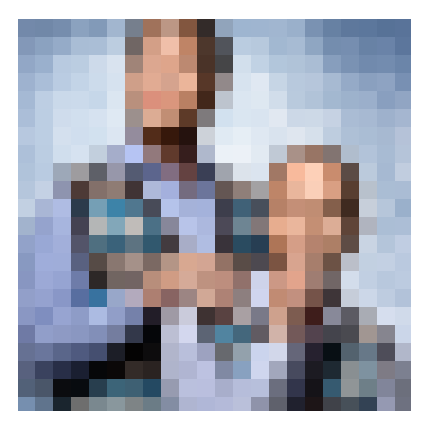
One of these was called imagemagick - a well supported graphics software suite that we could access through a child process. It allowed us to preprocess our input images with very little overhead. One technique we leveraged with imagemagick was down-up-sizing images before grid generation in order to produce a blocky canvas. This resulted in an easier image to fit rectangles on, which reduced noise and improved segmentation speed.
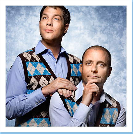
The real fix to our speed problem came from having the ability to write our own native programs in C++, specifically, the ability to use data structures that don’t exist in Javascript. When iterating over an array of active pixels, we had no way of skipping over elements that were already assigned to cells. We tried many tricks in Javascript including overly complicated dynamic lookup tables, and splicing arrays. Nothing worked well. Until we found dynamic_bitset from Boost C++ - a data structure that only contains bits (on/off), and more importantly, does not iterate over “off” elements. This meant that as cells got progressively marked unavailable, iterating over the active pixels array got faster. We rewrote our grid generation code as a C++ program and wrapped it in a Node child process. The result was a 10x increase in speed - an average of 3 seconds.
The Grand Unveiling
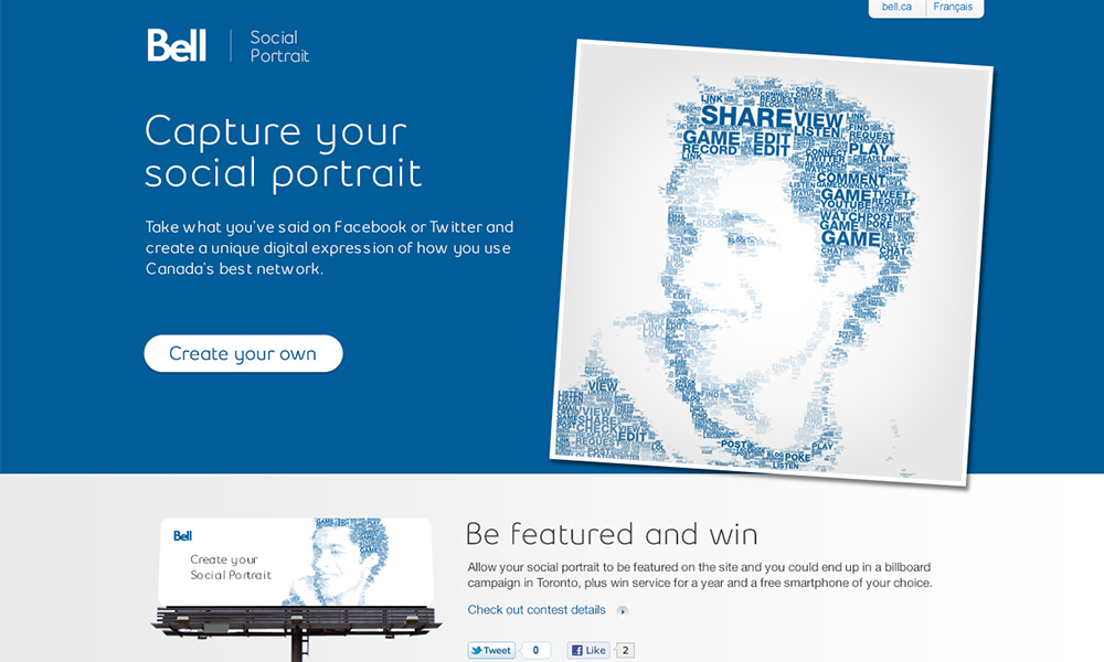
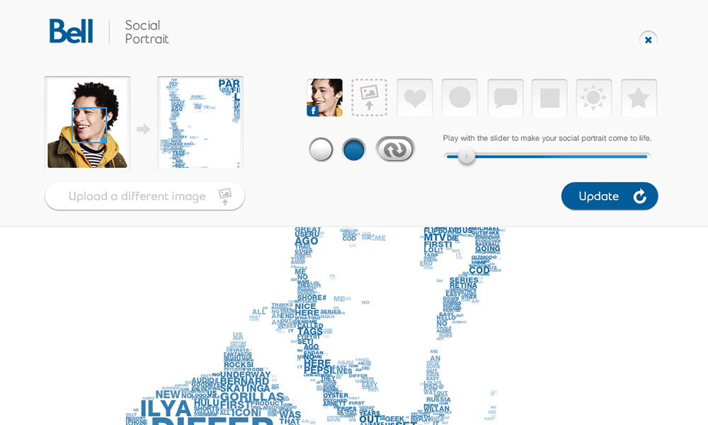
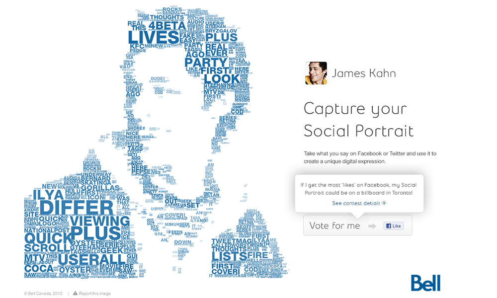
Our goal was to create an incredibly simple experience that made it easy to create a personalized typographic portrait. You simply connected your Facebook or Twitter account, and we automatically created a portrait using your avatar and the text you had previously shared. If you didn't have an avatar or chose not to use it, you could upload a custom image or simply select a basic shape to display your words. We also provided cropping and brightness controls so you could tweak your portrait if desired.
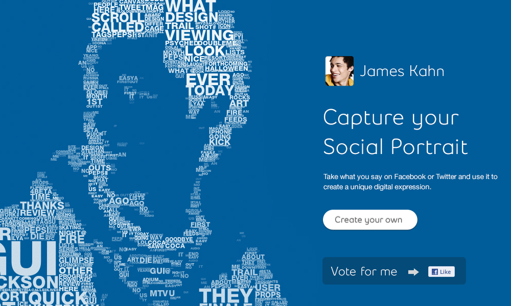
Once completed, your portrait could be easily shared back into your social networks, saved as a new avatar, downloaded as a wallpaper, or featured in the gallery. If you allowed your portrait to be featured in the gallery—and it received the most likes—it could end up on a billboard in the town or city you live in, and you would also be eligible to win a Bell Superphone of your choice, with free service for a year.

What We Learned
You can’t do everything in the browser. Don’t forget about the server.
 Peter Nitsch, Developer
We learned that cloud technology and the new breed of server-side environments are necessary tools to utilize in modern-day web applications. With the variability of devices and platforms users move between, we can no longer rely solely on client-side environments to deliver rich experiences. Frame your UI’s in the browser and let the cloud do the work.
Node.js isn’t well suited for static content. Stick with Apache or nginx.
 Jeremy Bell, Partner
Although Node was a very valuable tool in this project for a number of reasons - the ability to prototype directly on our drawing canvas and seamlessly port code over to the server, the access to a native environment that solved huge performance problems, and the access to powerful tools like imagemagick for preprocessing. If we could do it all over again, we may not have implemented our entire server environment in Node. Static web serving is better handled in tried-and-tested environments like Apache or nginx, and worker management for multiple CPU cores can be daunting.
Don’t be afraid to completely alter your approach mid-project.
 Chris Tanner, Designer
The ability and willingness to be able to make big decisions when faced with a problem, can potentially make or break the success of your project. Fearing change isn't worth risk of failure. In this case, we took risks, we pushed the boundaries and tried exploring new technologies, and when we realized our approach wasn't going to work, we jumped with both feet into Node.js to make it work.
