The Making of Teehan+Lax
The Story of Our Company
“That’s it. It’s over.”
It was June 19, 2002, and I was sitting in a hotel room in San Francisco when I got that news from my managing director. Modem Media, the company where I had served as Creative Director for the past 4 years, was shutting its Toronto office.
I was in San Francisco trying to convince the West Coast office of Modem that they should move work to Toronto. The Canadian dollar was depressed at the time, and staff costs were lower than San Francisco. I was making a last ditch attempt to pitch my creative team as a near shore resource. I hated it, but this was survival. I was en route to New York City where I would make the same pitch 24 hours later to the East Coast office. I was spared the indignity.
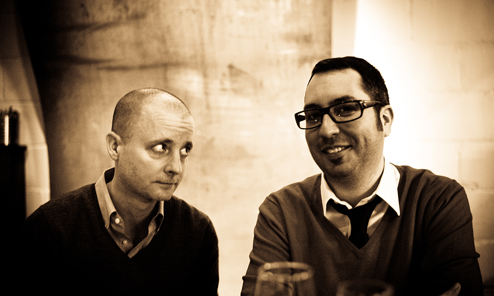
Geoff Teehan and I met in early 1999. At the time he had a small shop doing Flash work. He started doing some work for Modem, and joined on full time later in 1999. We worked together for 3 years at Modem forming a creative partnership. Like all successful creative partnerships, we filled out each other's shortcomings. His design skills complemented my conceptual skills. He could put on the screen what I was thinking.
In the summer of 2002, unemployed and asking “what next?”, Geoff and I started discussing working together. We had originally thought we could go to an agency as a creative team, so we lined up interviews individually and went to find jobs. We would regroup on Geoff’s back deck with a beer and debrief on our interviews.
What was this thing going to be
That summer of 2002 was the darkest days of the dot-bust. If there was ever a time to start a new digital agency, August 2002 was not it. The overhyping of the digital channel had burned a lot of clients. Our own previous employer was cutting offices in a bid to lower costs and ride out the storm.
Geoff and I started to talk about what kind of company we might like to create. There were a few things we immediately agreed on.
At Modem, Geoff and I were often brought in to pitch to a client, but as soon as the work started, we needed to move on and pitch the next thing. Our days were spent managing the work, rather than doing it. We wanted a place that would be more of a boutique than a big, full service digital agency.
We’d create a company where we could work closely with clients.
“That summer of 2002 were the darkest days of the dot-com bust.”
We wanted to specialize in “user experience.”
In 2002, the concept of user experience being its own discipline was unique. With the exception of Adaptive Path and 37Signals (pre Basecamp), there were few companies focussing on UX design. We were interested in solving complex UI and UX problems. We didn’t want to do banner ads or Flash sites. We wanted to work on highly functional systems that were pragmatic and solved real problems for real users. This was pretty revolutionary for the time.
Side Story
PVR Report
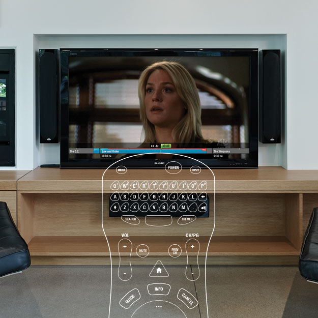
In Jan of 2004, Geoff and I attended CES for the first time. This was just before CES would became the over covered over hyped It conference so we didn’t really know what to expect. Every year at CES there is an emergent theme that defines the show. There is always one dominant technology trend that all the CE manufacturers are placing a bet on. In 2004 that theme was DVRs. Most of the CE industry had been caught off guard by TIVO’s sudden emergence in 2000 as the must have gadget of the time.
By 2004 every company had some sort of DVR/media centre at CES. If there is one thing CES is really good for, it is seeing everyone’s products in one room. You can easily identify trends and disparities in products just walking the show floor. The one thing Geoff and I instantly commented on, was how bad the UIs for these products were. Not just bad, but awful.
Prior to CES Geoff and I had often commented on bad the UIs on our own PVRs were. It was disheartening to see the upcoming models did nothing to improve the user experience of these devices.
When we started Teehan + Lax we had a vision that we would never just do browser based UI/UX design. We understood, even in 2002, that browser based interactions would decrease over time as new devices entered into our life. At CES we saw a huge gap in the user experience being delivered by DVRs and felt we had thoughts on how we could improve it.
But how do you get someone to hire you to redesign a DVR interface? We had no idea.
At the time, we offered an expert review service to clients where we reviewed their UX using a defined set of criteria and then suggested some recommendations on how to improve. We decided to offer some unsolicited advice to the CE industry.
At the time, the only DVRs we could get our hands on were the ones offered in Toronto. Rogers Cable, which at the time I was a subscriber, carried a Scientific Atlanta 8000 and Geoff had a satellite dish on the now defunct Bell ExpressVu which used a rebadged Dish Network DVR.
We went to the store and bought these as any customer would brought them home and reviewed the experience of using these devices. We wrote a 21 page report documenting down the experience and commenting on their strengths and weaknesses.
It is natural for designers, when they see things they perceive as broken, to want to fix them. We’ve all experienced seeing type that was improperly kerned or misaligned graphics. Your brain instantly knows how to fix it, but you can’t. It is an itch you can’t scratch.
Our experience reviewing these PVRs elicited this response. We ached to fix the UX of these devices. We began to write all our ideas but they weren’t adequately conveying the ideas we had in our heads. Geoff quickly began mocking up screens, to demonstrate, visually, the ideas we had. That was when things got out of control.
One screen led to another, which led to another. At one point it became clear that the input device, the remote control, was half of the problem. Geoff had some experience with 3D, began painstakingly modelling the remote “we” wanted. 2 designers, Hubert Lai and Jeremy Bell worked on screens. When we looked up, our little expert review which started as a blog post, then turned into a PDF had swelled into a 41 page report. It took over 2 months of work.
We put the the PDF on our site and went back to work. A few days later, Gizmodo picked it up and things went crazy. The PDF started getting downloaded tens of thousands of times. The fantasy remote that Geoff mocked up, became an object of technolust for many people. The UI we proposed was quickly copied by open source projects for media centre skins (namely for SageTV).
For us, it became the first thing we really got known for. Even to this day, many designers associate us with “the PVR” report. The report is part of the curriculum of an MIT course on product design. We even got a few calls from cable companies and CE manufacturers to discuss maybe working together (nothing ever happened). It would be many years later that the UI and UX of these devices would improve. Looking back, UX innovation for the 10ft interface has come from companies like XBMC, Plex and Boxee rather than the CE industry. Those innovations have trickled down to CE manufacturers but it is still an area for massive improvement... call us.
—
We saw a few things happening in 2002 that we thought required a new type of company.
The dot-com bust had provided a clean dividing line between the first generation of the Internet (1995-2001), and what we felt was a new chapter.
We saw technology commodifying. If you wanted to build a Web site in 1996, most corporate IT groups didn’t have the process, resources or capabilities to do it. Companies hired large consultancies and agencies to do this.
By 2002, things had changed. Web technology had become operationalized inside corporate IT. They were no longer looking for large end to end help, but rather specialized help on the thing they still couldn’t do, front end design.
We saw the value shifting from the back end to the front end. We wanted to create a company that could meet this new demand with a speciality service.
Eventually, the term Web 2.0 would come to define this new time period.
We wanted to offer an alternative to large agencies
We wanted to strip away the bureaucracy and what we saw as an inefficiency in the industry. We wanted a company where there was as little friction as possible between the client and the people doing the work. We had witnessed that most agencies put a series of gatekeepers between the people doing the work and the client. Account managers and project managers were used to "manage the client" while designers and developers were left in the office to "be creative".
There was a misconception that creative people couldn't speak to clients, that we were somehow incapable of communicating. This led to cultures where politics and broken telephone were common. We hated this.
From day one we wanted clients to work closely with the people doing the work. We encouraged clients to speak directly to the person actually designing, not someone managing that person. We had no account managers and no project managers.
Early on I told this to a president of a large ad agency and he looked confused. It took him a while to even consider this to be possible. It was as if what I had suggested was impossible.
The lack of a large hierarchy meant there were clients we couldn't work with. Some clients need reciprocal hierarchies just to get things done. While other firms pursued large AOR relationships that would require large numbers just to manage all the work, we looked for a division inside a company who didn't want to work this way. We looked for assignments rather than retainers. We looked for people inside companies who wanted to work differently.
It would be three years until we hired our first project manager and 10 years until we hired our first account person.
Another thing Geoff and I knew we wanted to do was move away from regimented and predictive project management philosophies like PMP. We had experienced the wastefulness of spending 3 months creating a requirements document that everyone would interpret differently. We wanted to get to design as quickly as possible.
“We wanted to get to design as quickly as possible.”
While we didn’t know it at the time, we were coming to the same conclusions that the lean and agile movements would popularize over the next few years.
Coming to a name
If you were a digital agency in 2002, you had a name ending in “iant” or “ient”. Company naming at the time was very obtuse. We tried coming up with some nonsensical name we could imprint on but every one of them sounded so fake. We hated it.
We decided that given the type of company we wanted to create, it made sense to put our names on the door. We liked the idea that if a client wanted to hire us, they were literally hiring us, Geoff and Jon. At the time, digital agencies were not named after the founders, that was something law firms and Mad Men era ad agencies did. It felt right to name the company after us.

We both agreed, Geoff’s name just looked and sounded better first. Neither of us remember how the “+” came to be.
Getting off the ground
The first thing we did was try to land some clients. Modem had been working with Maritime Life in Halifax, and Geoff had personally been on the project for several months. The office closing left Maritime Life mid-project without an agency. We offered them this deal—give us the budget they had agreed to pay Modem for creative, and we would do the work. This represented a discount since we could exclude account management and project management fees. Maritime Life agreed.
This gave us 2 months of work and a nice profit.
The second call we made was to G.M. O’Connell, the founder and CEO of Modem Media. G.M. had been a mentor to us and we wanted to float this idea of a “company” by him. He immediately said, “I’ll give you work.”
We started in September of 2002 with two clients, Maritime Life and Modem Media.


The first 2 years
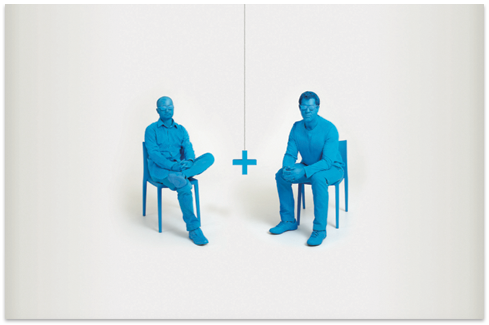
We shared office space with another small digital company called Fondu. The original office was a third floor walkup in Downtown Toronto. Our identity and logo was designed by Paulette Bluhm, who worked at Fondu. She had the idea to photograph Geoff and I, and create the blue silhouettes.
For the first two years, we worked almost exclusively on Maritime Life and the work Modem Media was feeding us from the U.S.
Despite having some clients, Geoff and I were convinced this wouldn’t last. I would always think of that line from Heat where DeNiro says, “allow nothing to be in your life that you cannot walk out on in 30 seconds flat if you spot the heat around the corner”. That was us. That is how we operated for the first year. We paid cash for everything, we didn’t take on any long term commitments. If we felt the heat, we could fold the tent, split the money and be gone in 30 seconds.
In our first year we were making so many trips to Kinko’s for colour print outs, we decided we needed to buy a colour copier. I had a friend who worked for Xerox at the time, who could get us a deal. The copier cost $16,000 and would require a 2 year commitment. Geoff and I agonized over the decision. Signing the lease would mean we couldn’t walk away clean from the business. In retrospect, it was wasted energy, but at the time it felt like the biggest decision we could make.
We slowly added staff, first as freelancers and then payroll. By the end of 2004, we had 9 people working in the company. By this time we had added a few clients, most notably Telus, who we would work with for the next 5 years.
Growth 2004–2009
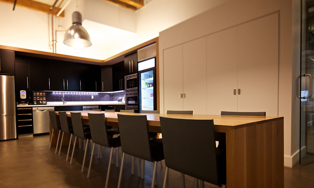
We moved to a larger office in 2005. We took a five year lease, which now eclipsed the printer as our biggest commitment. The office was 4000 sq ft. We spent $50,000 to build out the office, which now included a boardroom (something we previously didn’t have) and a kitchen.
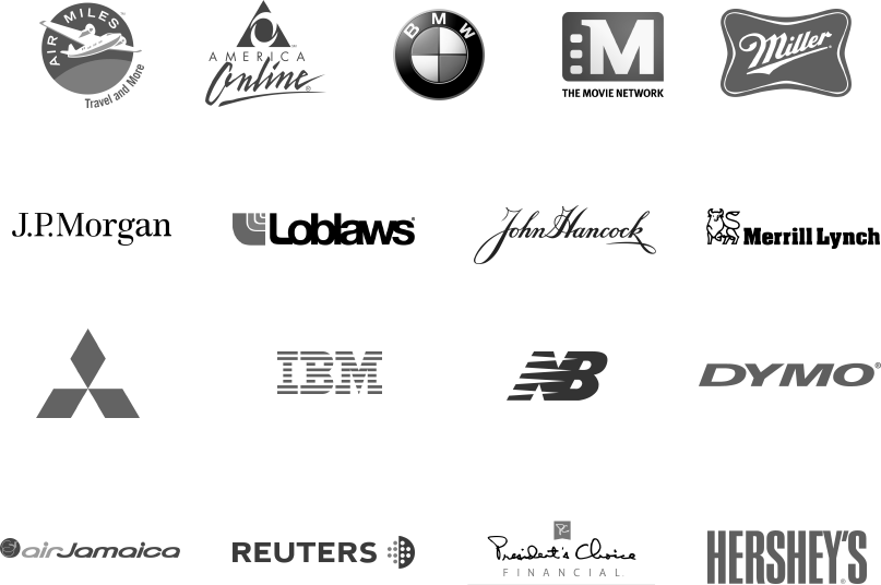
During the 5 year period between 2004-2009, the company went from about 9 people to over 30. Our work became increasingly sophisticated over that time period. We worked for clients like Air Miles, AOL, BMW, The Movie Network, John Hancock, JP Morgan, Loblaws, IBM, Merrill Lynch, Mitsubishi, Miller, Harrisbank, Dymo, Hersheys, Air Jamaica, Reuters, PCFinancial, and New Balance.
Platforms and Programs
Since we began we saw all work in the digital channel breaking into two distinct buckets of work: Platforms and Programs.
Platforms are large scale applications or sites where customers come to do something with companies. It is where the digital channel solves real problems for real customers. This is typically a company’s .com or app. This was the work that most interested Geoff and I. It was where significant user experience work was being done at the time.
Programs are activities that create demand. They are typically paid media and are designed to send people to a company’s platform. This is easiest thought of as advertising (e.g. banners, microsites etc.). This was the work we were less interested in.
Geoff and I also believed (and we still do) that the kind of creative person who wants to wake up and come up with a world class program like Burger King's Subservient Chicken, is not the same creative person who wants to wake up and solve complex UI problems for a large scale corporate Web app.
So we avoided pitching or going out of our way to get program work. Despite not pursuing it, we were increasingly asked to do program work.
In 2005, we had an increasing amount of program work making up our revenue. It was work we had taken on to fill out our revenue, but could see problems forming. Ad agencies were still lagging behind in digital. As a result, companies like us were able to take on this program work. As far as we were concerned, traditional ad agencies were the heirs to program work, they just didn’t have their act together… yet. We could see the program work we were getting was increasing in revenue every year. The money for this was coming from traditional budgets, it just wasn’t large enough for the agencies to feel it. We knew eventually the advertising agencies were going to be incentivized to fight for this revenue. Losing hundreds of thousands of dollars to a 15 person digital company was going to be unacceptable. They weren’t going to be bad at digital forever.
We chose option B. We hired an amazing Partner named Dave Stubbs who had a deep background in advertising and digital. We hired a team of copywriters and designers to work in our Programs group.
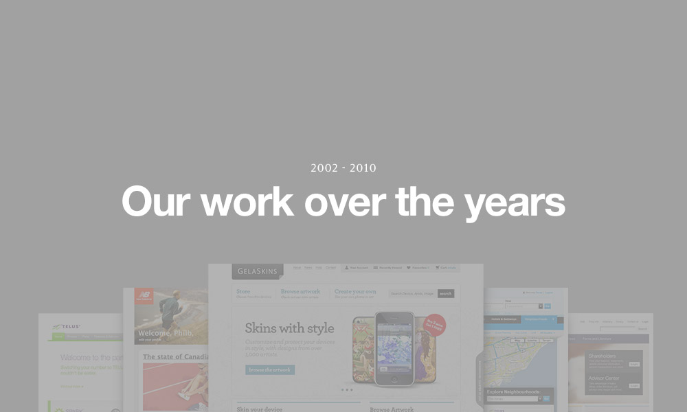
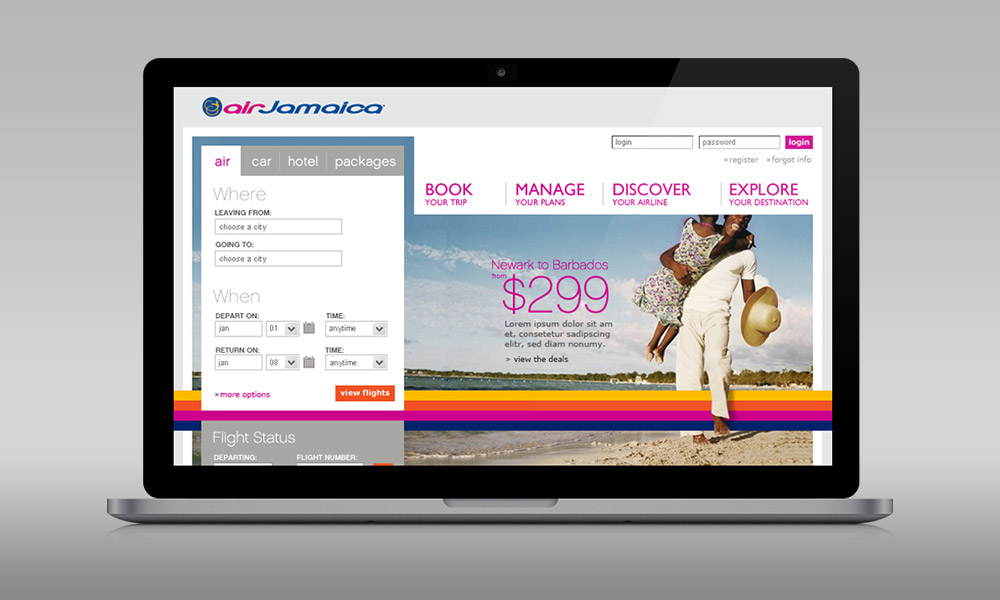
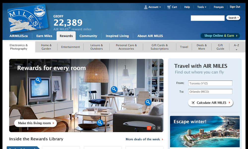
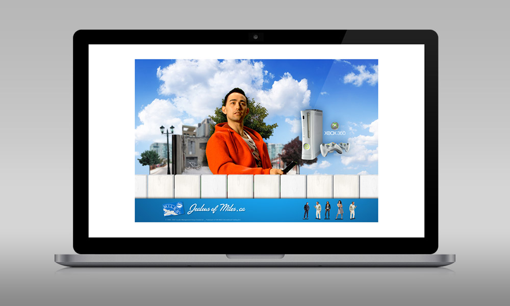
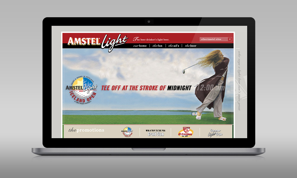
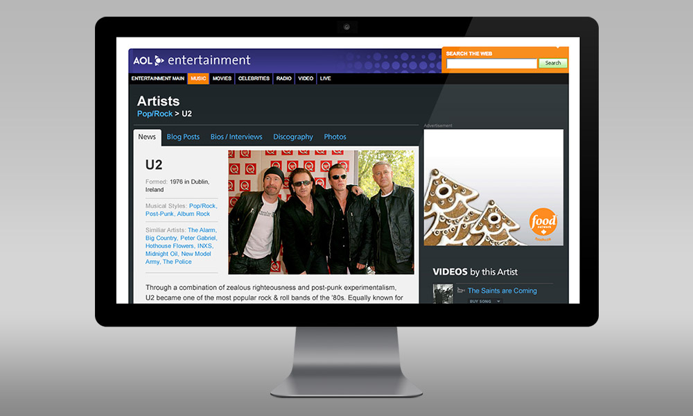
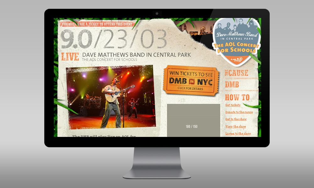
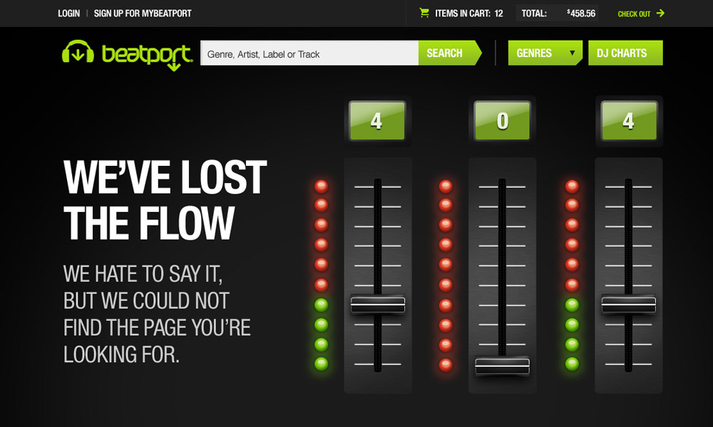
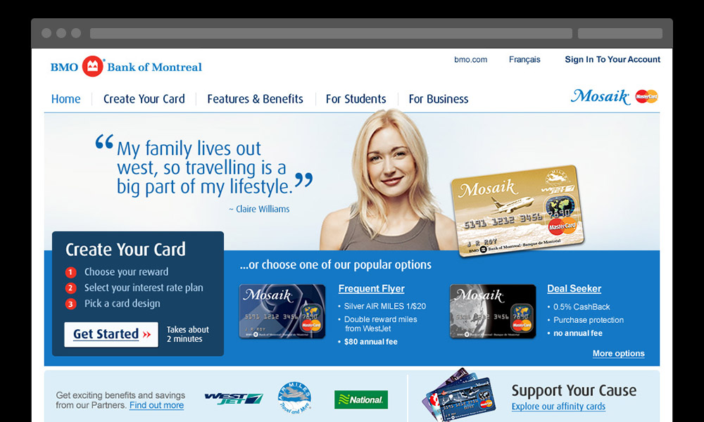
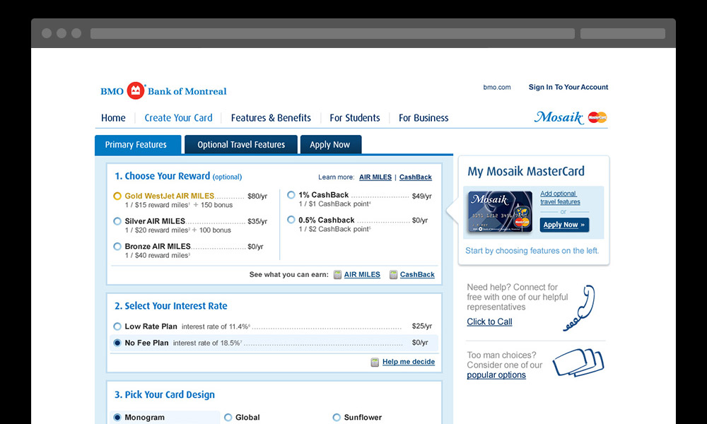
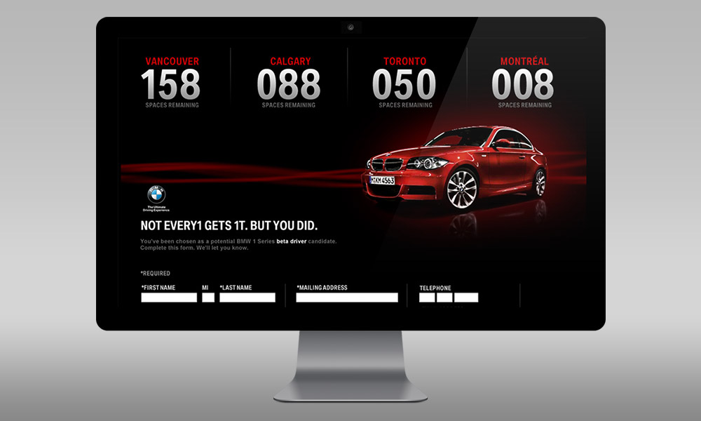
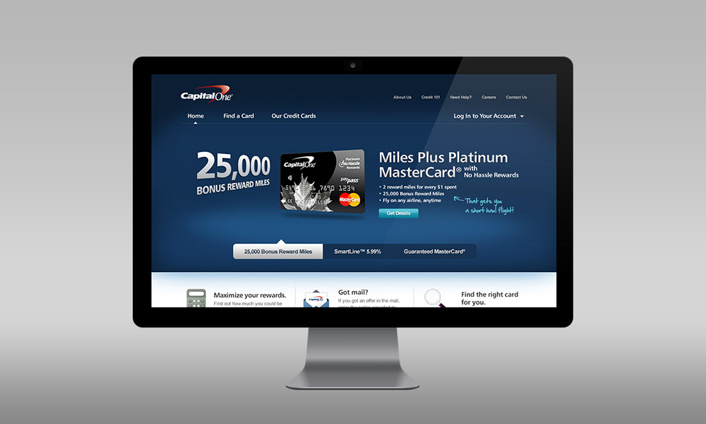
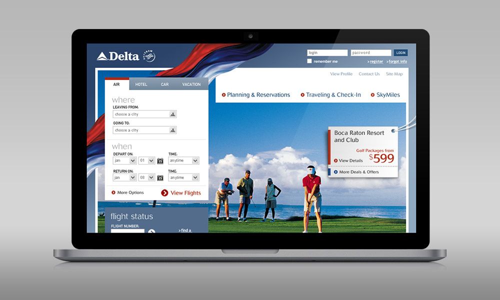
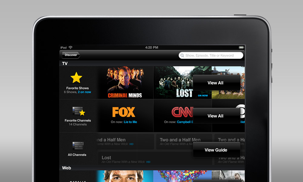
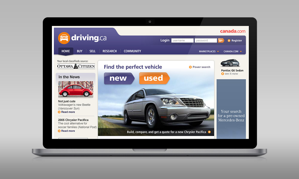
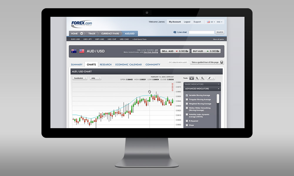
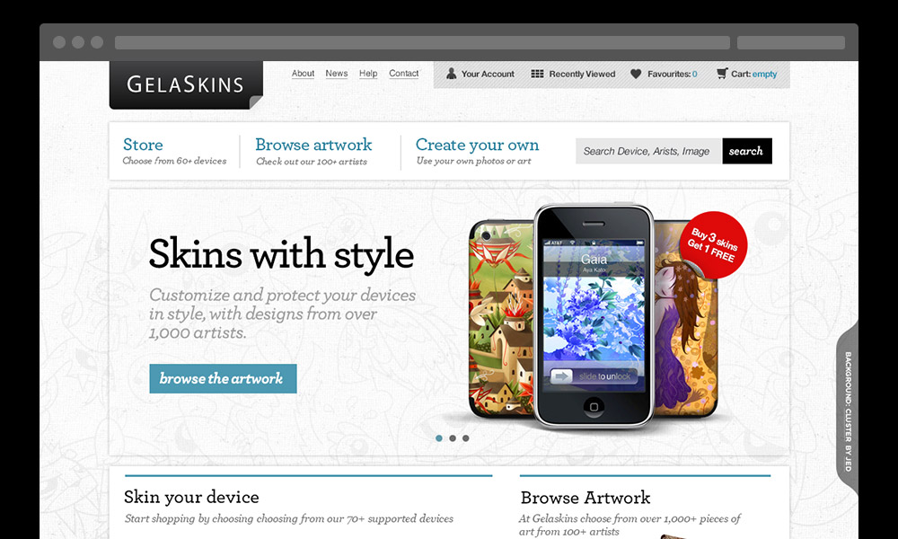
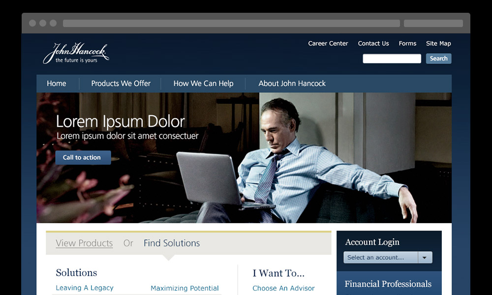
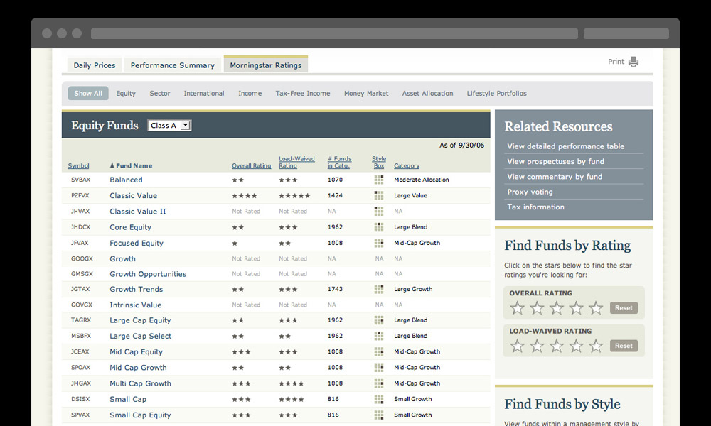
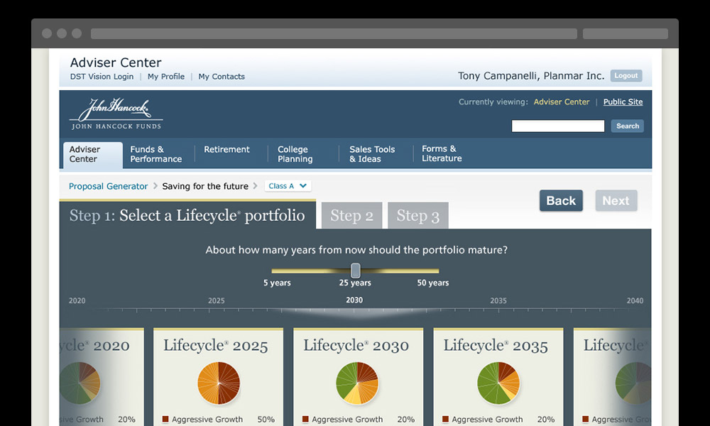
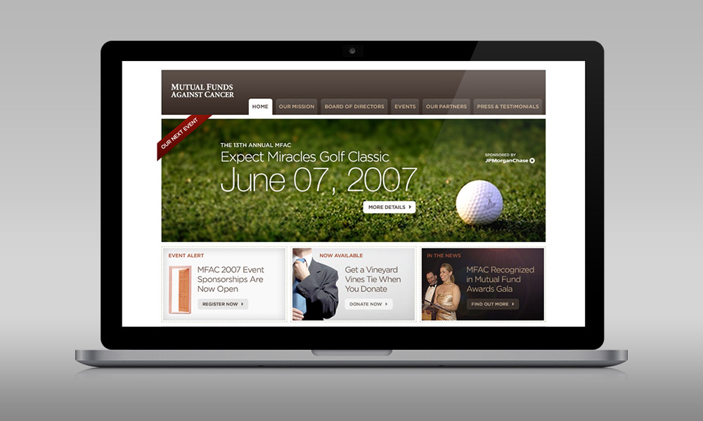
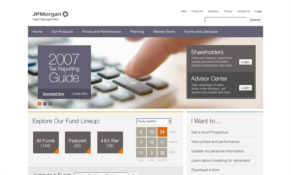
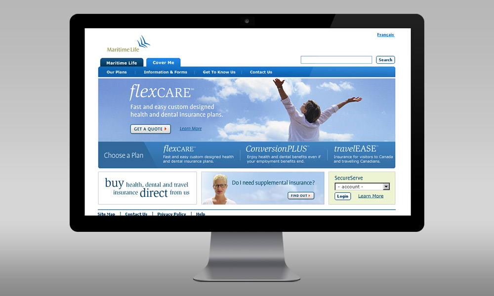
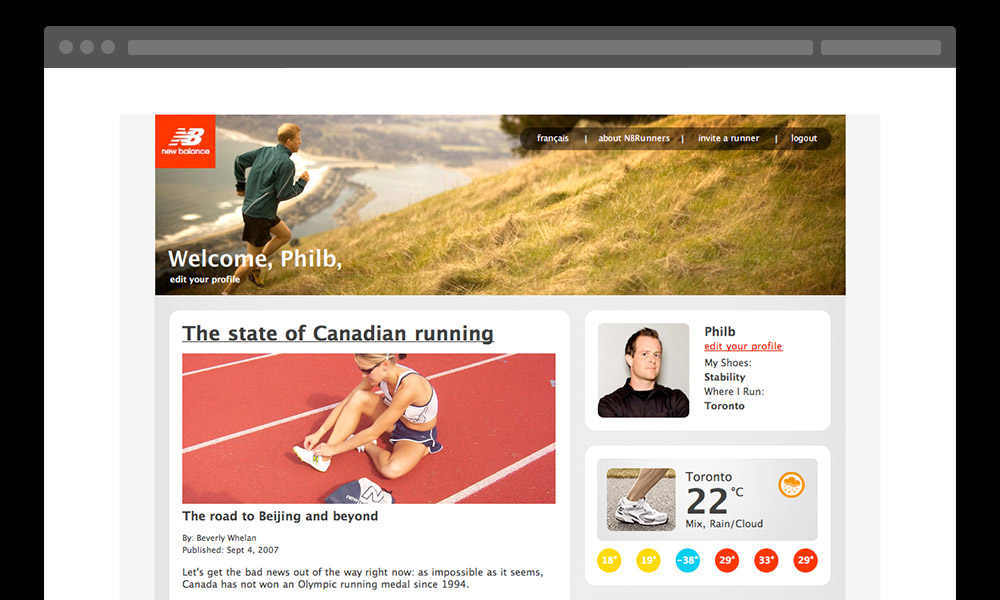
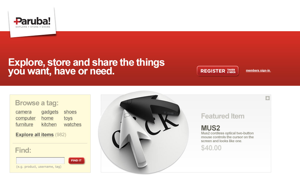
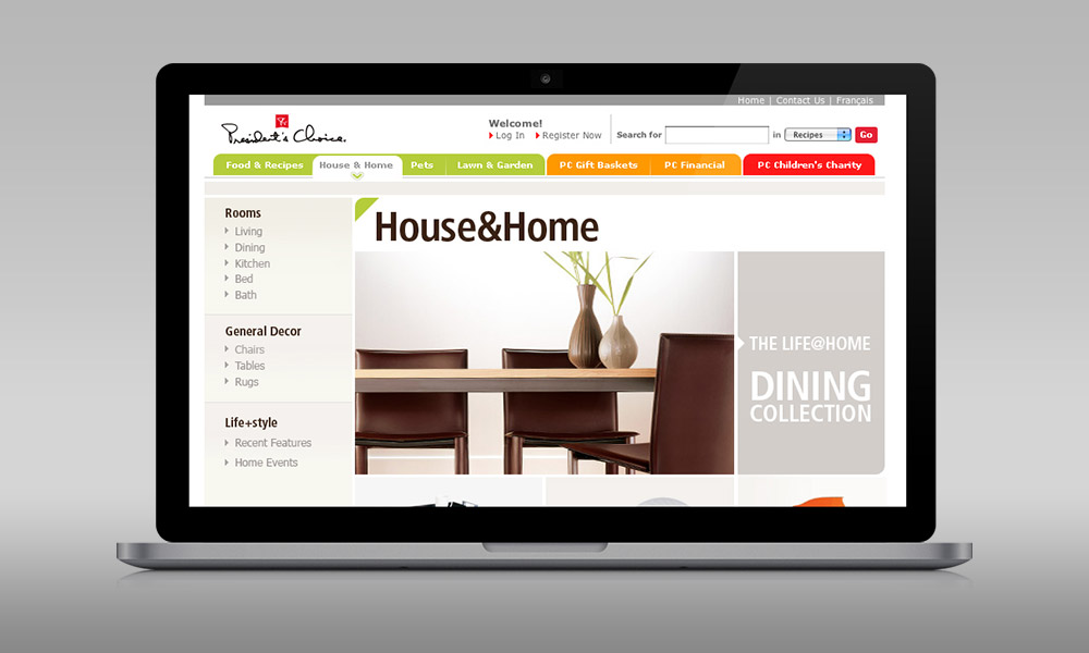
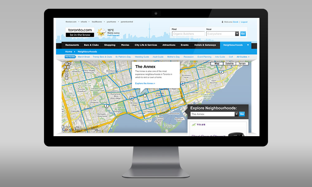
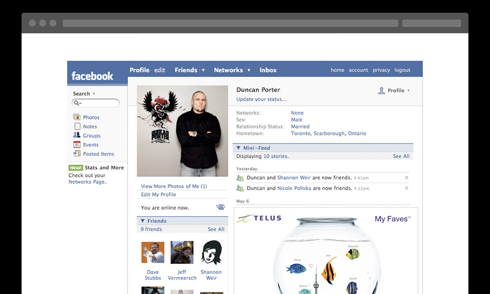
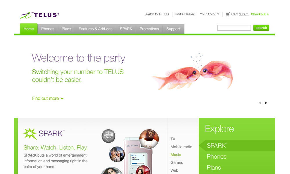
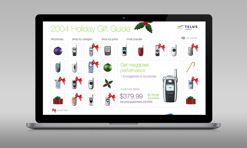
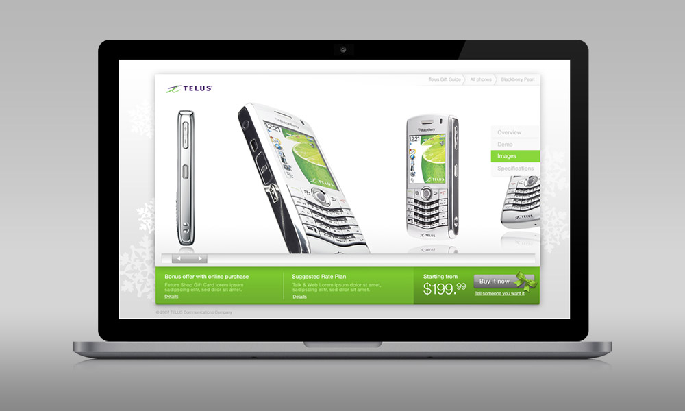
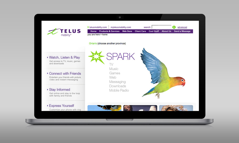
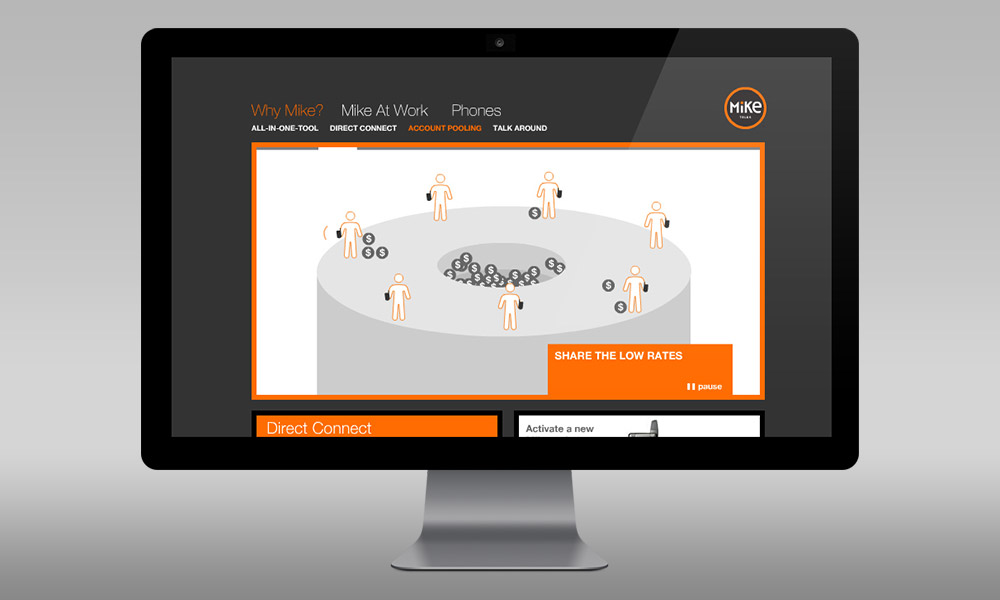
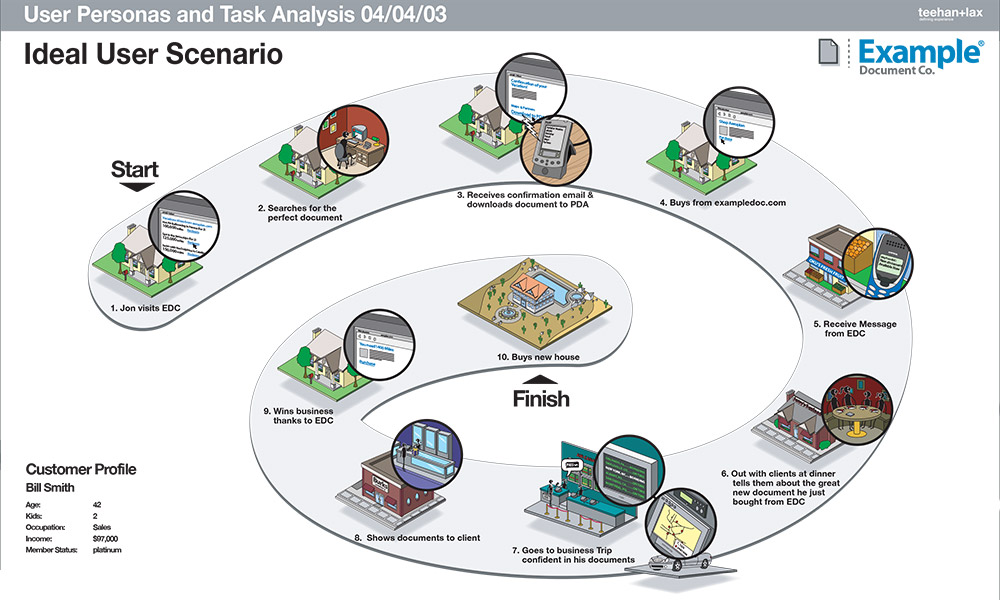
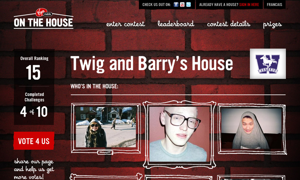
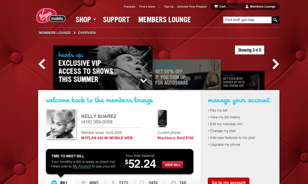
Between 2005–2009, the Program group accounted for 50% of staff and revenue. Working with clients like BMW, Telus, New Balance, Sun Chips and Quaker they produced some amazing award winning work.
Sadly, what we predicted was going to happen, happened. Our largest program client, Telus, decided they wanted to consolidate their work with their advertising agency, Taxi. In 2009, we lost our largest client.
Losing your largest client
We had never really “lost” a client before. Most of our client engagements were assignments. When we started the company, we wanted to be easy to buy, so we never asked for AORs or retainers. We wanted to earn our keep on every assignment, and this approach had served us well. Despite not being contractually bound, we had long client tenures of repeat engagements.
The loss of Telus was crippling. We had to let some people go, which was an incredibly difficult decision, but we learned a few things from the experience.
“The loss of Telus was crippling… but we learned a few things…”
1) All clients leave.
This is the sad fact of services business. The day you start working with a client is the day they start leaving. Ideally, no one client should be more than 20% of your revenue so that you can manage the day they decide to move on.
2) Don’t use client tenure as an excuse to over bill a client.
I see a lot of agencies who take this attitude, like it’s their job to bill as much as possible in the time they have. Your job is to do the best possible work and give them the best possible advice. Your job is to create value for them, not just send a monthly invoice.
3) Be passionate, but not emotionally invested.
We took it very personally when clients moved on since we would emotionally invest ourselves in the work. It is part of our nature to be very passionate about what we do. A client once said they appreciated us because “we wanted to do the job right, not just get it done”. But there is a difference between passion and emotionally investing yourself in a client’s business.
Clients will make decisions that counter your advice. We used to get very upset when this happened. It was as if they were trying to hurt us. The fact is, clients have many things to consider and weigh when making decisions, our counsel is only one dimension they look at. If they decide not to work with you or listen to your recommendation, you can’t take it too personally.
Tough Times
Starting in 2009 we went through some difficult times. We experienced something we hadn’t experienced in our first 8 years. Attrition. While a handful of people had left the company in the first 6 years, most people stayed. In 2009, we saw a number of loyal long time employees leave the company. When we asked them why they were leaving, the number one reason was they didn’t understand where the company was going.
In our first 5 years we were this scrappy start up. People came to Teehan + Lax because they were often refugees from larger companies. They didn’t fit in. They saw the same things Geoff and I did, the inefficiencies, the politics and wanted to work somewhere that was different. Just as we were an alternative for clients, we were an alternative for the people who worked here.
We had grown to this incredibly awkward size. We never had much respect for process, we felt it just got in the way. This applied to both internal and external process. This works great when you are 12 people. It works less great at 35.
“One of our founding ideas was to only have 2 titles Partner and Associate”
Internally, we were a mess. We had prided ourselves on having no titles. Geoff and I had come from a company where there were a lot of titles (Jr. Graphic Designer, Graphic Designer, Jr. Art Director, Art Director, Sr. Art Director). This ladder of titles had a corresponding rate card that was confusing and often manipulative to clients. One of our founding ideas was to only have 2 titles, Partner and Associate. This simplification had a number of benefits, one being that we could just focus on the work and not managing people’s titles. We could also have a rate card that was super simple to manage.
This worked great for the first chapter of our company. People who joined, couldn’t care less about titles, they just wanted to do good work. But by the time we had grown to 35 people, this structure was just too loose. Employees didn’t understand how their career advanced.
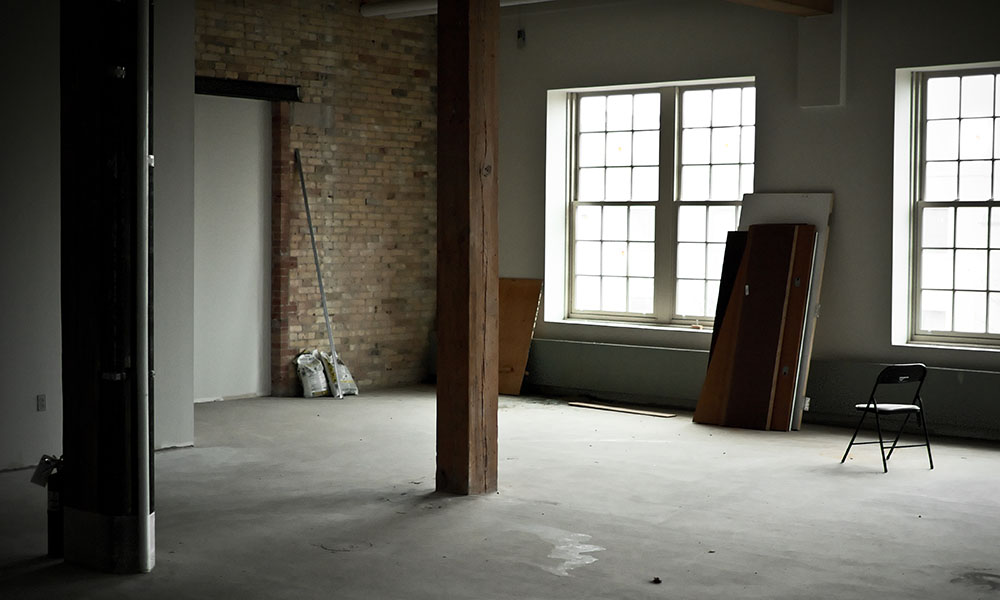
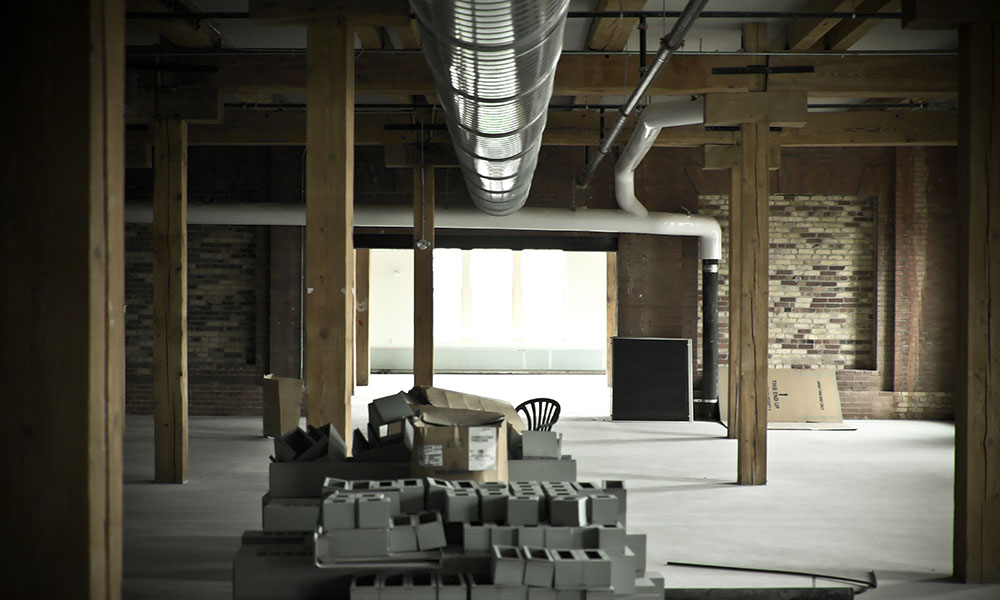
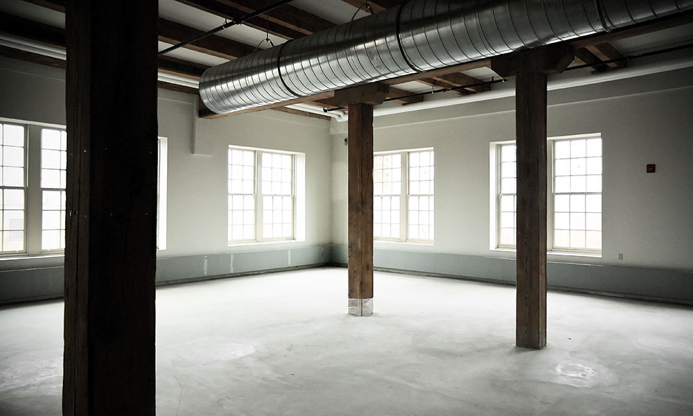
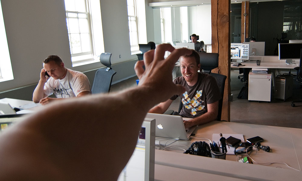
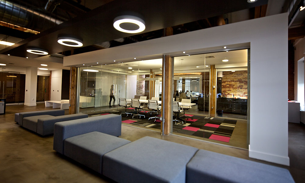
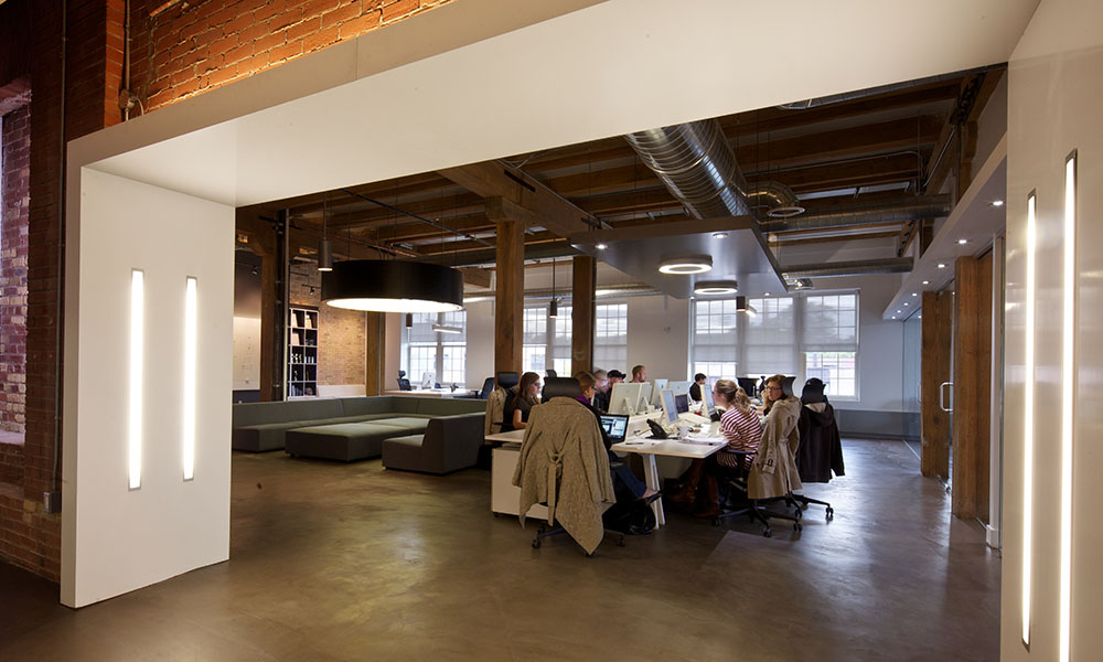
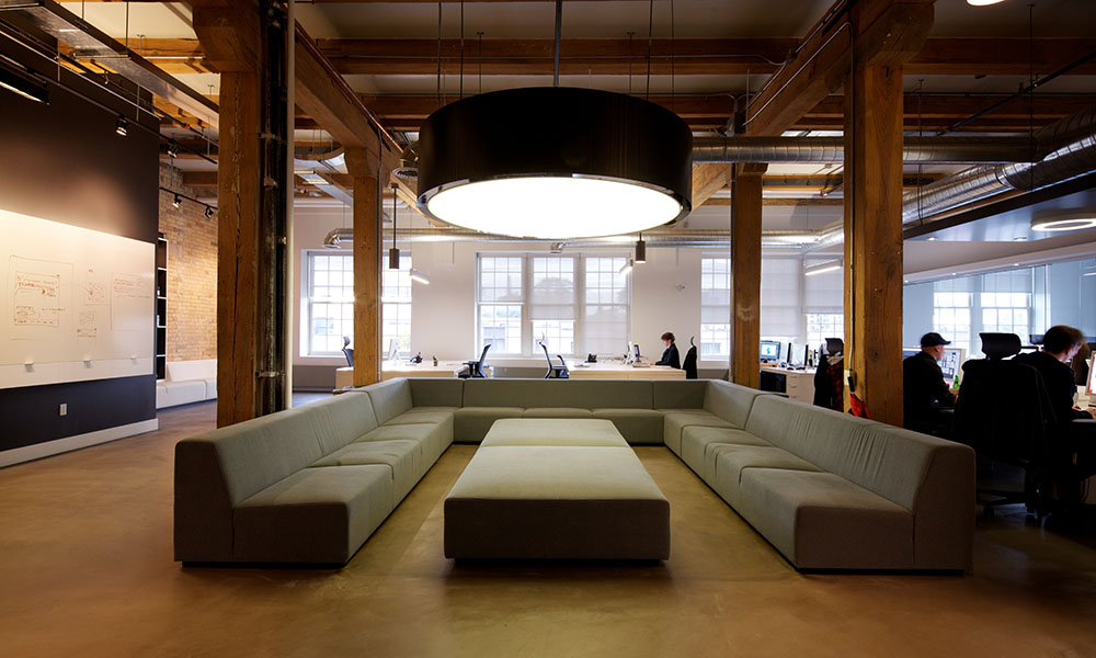
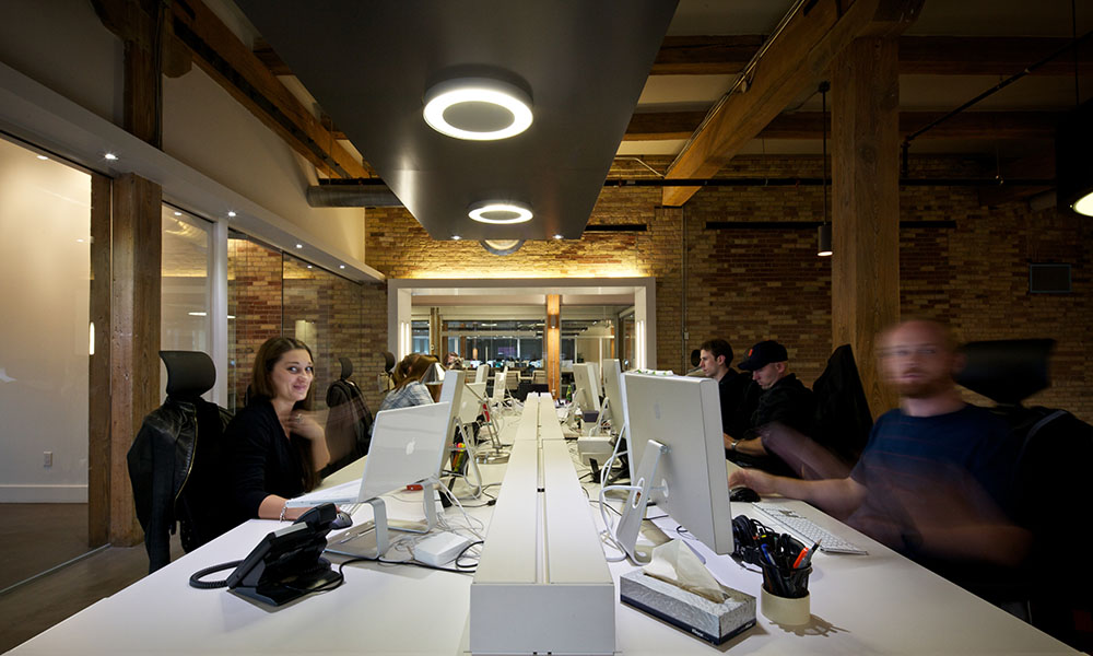
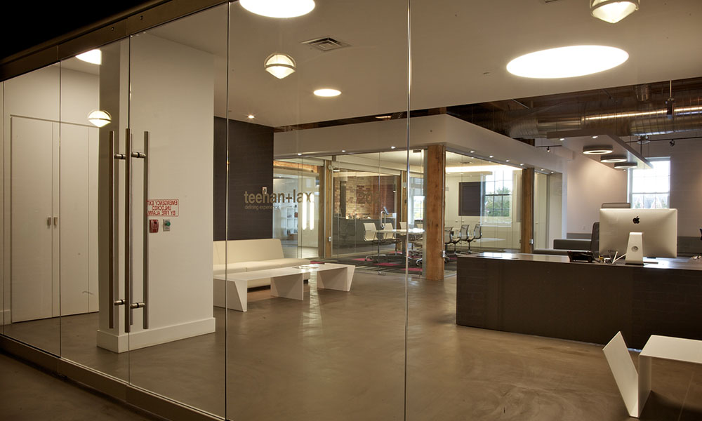
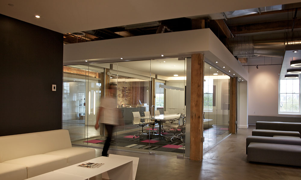
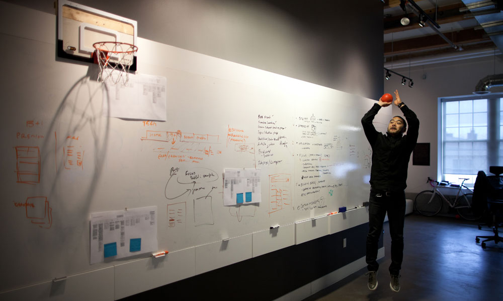
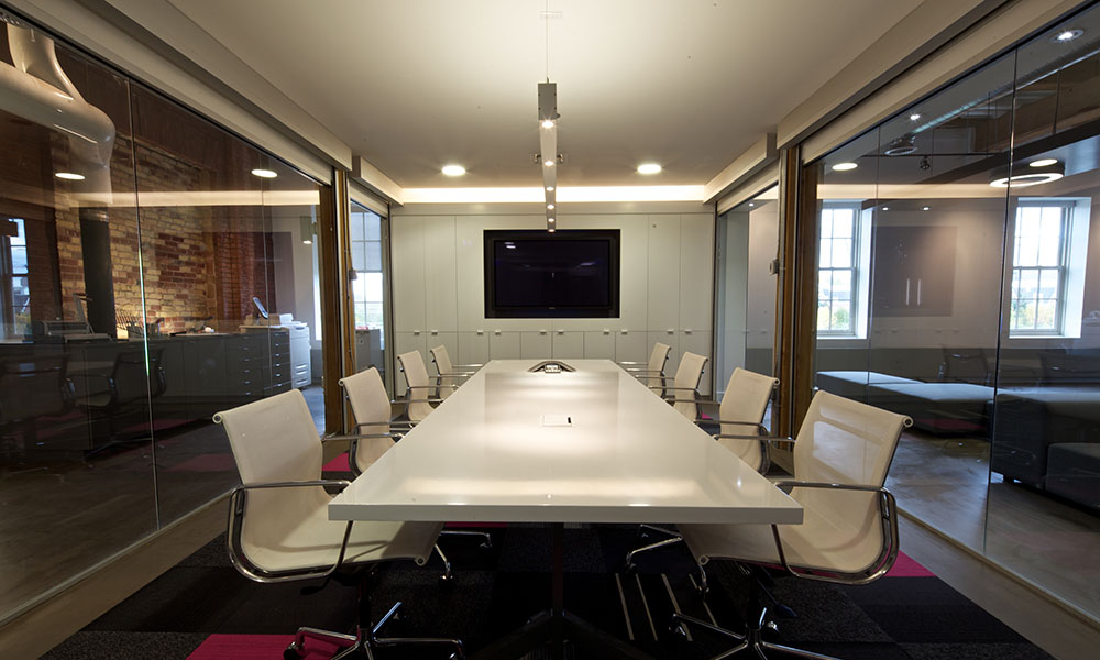
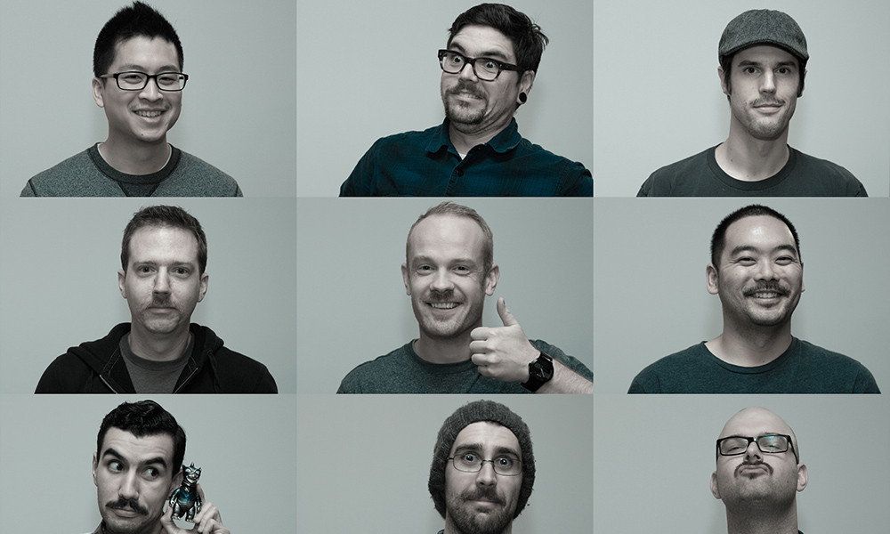


We had also lost our sense of purpose. In 2010 we were moving into a new 8600 sq ft office. We had also added 2 new Partners, Jeremy Bell and Dave Gillis.
We were no longer this scrappy start up, we had “made it”. The ideas that we founded the company on, we had accomplished.
Finding our way again
We needed to get our house in order. The first thing we realised is that no one was running the company.
Geoff and I had started the company on the premise that we wanted to work closely with clients. In 2010, all the Partners were working with full client rosters. HR, company vision, and finance were things we did when we had some time, or not at all.
I decided to remove myself from client work and focus on running the company. We reorganized the company into 3 Partner led teams. Teams were multidisciplinary and got rid of a discipline based organizational structure (i.e. design, development, project management). This allowed staff to understand their career in the context of their team. It gave them a specific Partner to report to.
“…find your mojo by remembering why you started doing this.”
I went and spoke to some founders of agencies for advice, all of whom told me this was completely normal. They told me their own experiences of losing their way. It felt good to know we weren’t alone. They all suggested that what we needed to do was go back to basics. As one of them said, “find your mojo by remembering why you started doing this”.
I hired HR consultants who did interviews with all our staff to understand what their frustrations were. One of the biggest problems, was that people no longer understood what Teehan+Lax stood for.
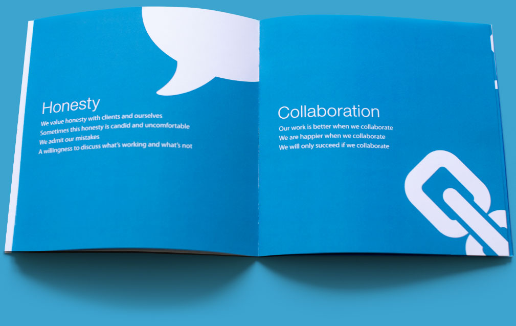
Geoff and I had always been skeptical of things like mission statements and other business jargon. They felt hollow and cliched. But after reading Netflix’s Company Culture document that had just been leaked, I got a better understanding how you could create a values document that was honest and meaningful.
One of our HR consultants suggested we try doing an exercise called “Mountains and Valleys”. She also setup a call with Dave Logan, the creator of the exercise. Both were very helpful.
The Mountains and Valleys exercise asks you to simply write down events in your life that were “milestones”. These were both positive and negative milestones.
You then try and understand what values or qualities were present in the positive milestones, and which values or qualities were absent in the negative milestones.
For us, the most positive milestones revolved around creating or making things. Negative moments often involved dishonesty, or moments we felt we had been mislead.
What we learned from this whole thing was that while we were larger and the industry had changed in the 9 years we had been in business, what we loved to do was the same. We love making great stuff. We like making things people use. We love making epic shit!
This is what we are currently focussing all our energies on optimizing. Making a company that can perform exceptional work for clients that gets used and gets talked about. Work we are proud of, and that makes us all better.
’Tis The Season
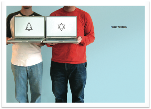
Since 2002, we’ve sent out a holiday card. Not an e-card, but an actual printed card. All of our work is digital, so we like the idea that every year we do one analog thing.
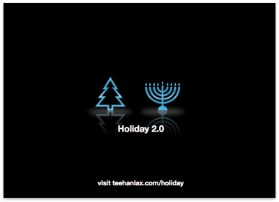
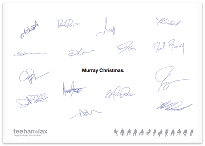
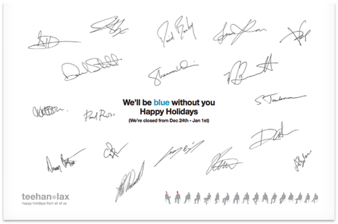
It began innocently enough. The first year’s card played off the silhouette’s, featuring Geoff and I holding laptops with holiday images. The next few years the cards didn’t feature us, but always attempted to be clever.
The cards were good marketing for us in the early days. Everyone we met went on the Holiday Card list. Because they were original, they always got noticed and we got positive feedback. Then in 2008, all hell broke loose.
Shannon Weir, a project manager, had been hassling Geoff and I to do a holiday card involving “Cosby sweaters”. There was nothing more to the concept than that… no copy line. It was a visual gag that went nowhere. Every year we would ask for ideas for the holiday card and Shannon would just say, “Cosby sweaters”.
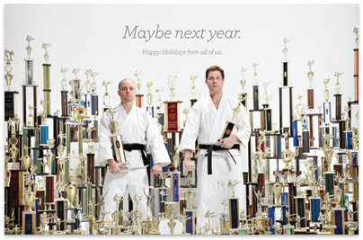
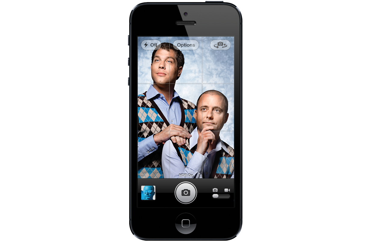
Finally, we relented. We said that if she bought the sweaters, Geoff and I would wear them. We called our friend, Finn O’Hara, who had previously photographed us for our Web site, and told him the concept was “Cosby sweaters”. He then sent back an email with the poster for the movie “Step Brothers”. We still didn’t really understand why this was a holiday card, but it seemed funny.
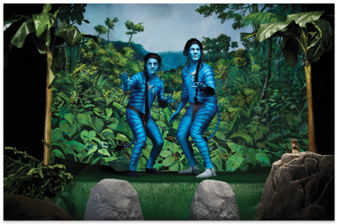
Since then, Geoff and I have “appeared” in the holiday card. We’ve been dressed in motion capture suits (not a good look), and have been spray painted blue to re-enact our silhouette logo.
The holiday card captures a lot of our personality and even the values of the company. We wanted to create a company where there wasn’t a lot of pretension or hiding the principles. The cards reflect our sense of humor, and clearly, we don’t take ourselves too seriously.
If we have one regret with the cards, it’s that they have taken on a life of their own. There is a pressure to “top” ourselves every year. I’ve talked about one year doing a card that is all white with the copy line “next year”. It would let us reboot the card on another creative path. One where we don’t have to be sillier and sillier.
The “Step Brothers” card became iconic for the comments. We still get comments on it from people 5 years later. But it really gained popularity after it became the background of our iOS PSD.
Paying it Forward
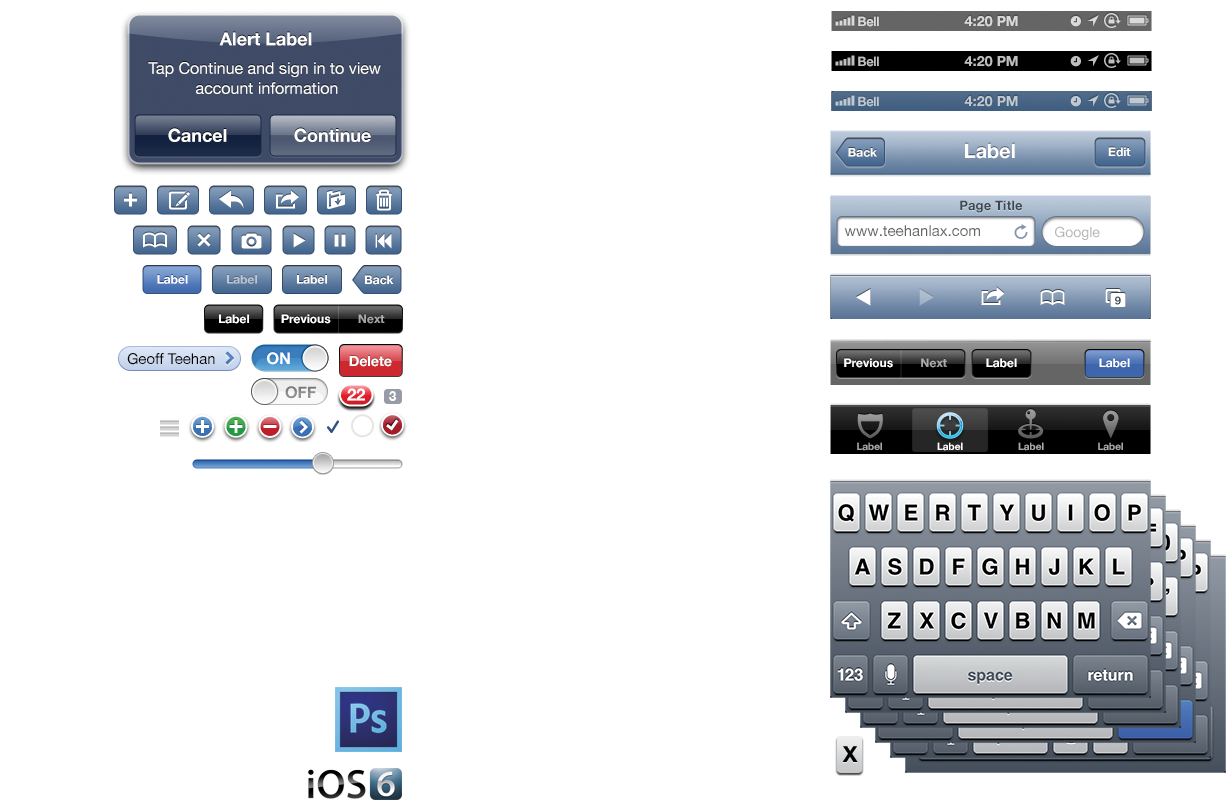
If there is one thing we’ve become widely known for, it’s our iOS PSDs. These files help designers mock-up iOS apps in Photoshop. They’ve been downloaded millions of times since we first posted them. They have been used by Fortune 500 companies, start ups, and we’ve even been told that a few people at Apple use them.
The story behind the PSD has a deeper history.
In the 90’s, Hotwired (Wired magazine’s online division) had a site called Web Monkey. Web Monkey offered tutorials on HTML and articles for Web builders.
They had a Photoshop file of browser form elements (pull downs, radio buttons, text fields). The file had a layer for each browser version at the time (IE Win, Netscape Mac etc.) with it’s corresponding UI widgets. Geoff and I were always fans of this file and found it incredibly valuable.
Web Monkey stopped making the file and we maintained our own version of the browser elements file internally for many years.
When Apple released the App Store we wanted to get experience designing for iOS. The problem was that none of us knew XCode/Interface Builder, and it was unnatural for our designers to design in an IDE. So we thought of the Web Monkey PSD - why not create one for iOS?
Geoff Teehan started taking screenshots from the actual iPhone, capturing every asset imaginable. He then recreated them, pixel by pixel in Photoshop using vector shapes and layer styles that would allow designers to use them for mocking up app designs.
The files take an incredible amount of work to prepare. Every time Apple releases a new version of iOS, it takes us a couple of weeks to create and release a new iOS PSD. We need to go through every iOS element and determine if it has changed from the previous version. Sometimes the changes are incredibly subtle, like a one pixel shift in a drop shadow. Sometimes the change is significant, like when the Retina display came out, the whole file had to be recreated.
We only start making the PSD after the official release. This is the only way to ensure we have final assets.
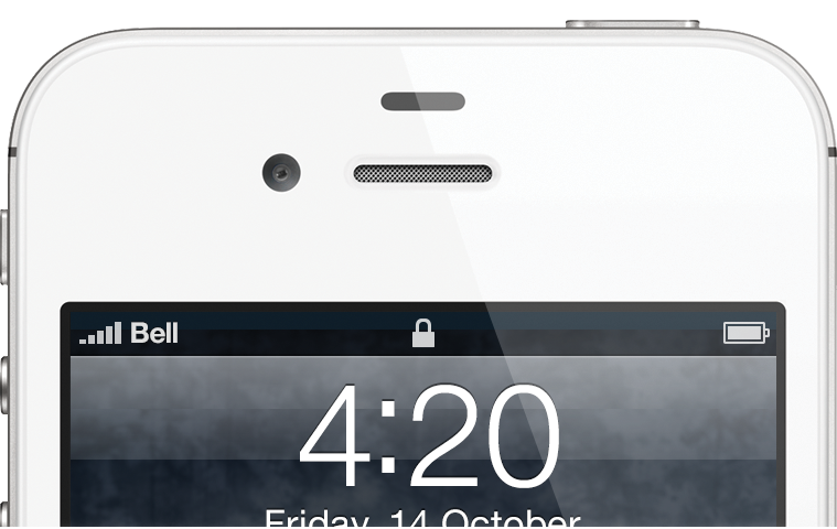
The time on the iOS PSD has always been 4:20. Geoff chose that time as a joke, not because of any personal habits, he or I have. There are a series of “jokes” in the file. One that people get a kick out of is, the “ugh linen” layer naming. Aside from obvious things like the time, there are also a number of “trap streets” in the PSD, which allow us to identify when people are using the file (or find people who copy the file and present it as their own).
Ten Things
We’ve Learned
1
Your job is to be unique.
The last thing the world needs is another digital agency. Since we started, we’ve always tried to be unique. Whenever a new client comes in, we ask ourselves “why are we uniquely qualified to do this work?”. We always want to be able to answer that question, honestly.
2Trust your instincts.
Learn to listen to your instincts. If something seems wrong, it probably is. Conversely, if something seems right, go for it. People try to look for evidence or data to support decisions, but understand there is no data about the future. Over time, you get better at listening to, and trusting those instincts. It takes time but is one of the best tools you have.
3It’s all about the work.
There is no magic to this business. If you do good work, you get good work.
4Being big is primarily about ego.
We could be a much larger company, but why? We believe that growth and scale is only necessary if the work demands it. Some work needs 100 people on it (most doesn’t). Many companies grow because their ego demands it. Being big comes with some advantages (mainly financial) but for us, we haven’t figured out how to be big and maintain rule #3.
5Figure out your values.
I used to dismiss things like “corporate values” as bullshit. But about 2 years ago, we sat down and went through an exercise of understanding and writing down our values. It was one of the best things we’ve done. By understanding our core values we look at our decisions and see if they are true to the things we hold dear. It is the clearest way we’ve found to validate instinctual decisions (see rule #2). I recommend using Dave Logan’s Mountains and Valleys exercise.
6Create more value than you capture.
This is Tim O’Reilly’s mantra and one we believe in. If you read our blog, you know that we share everything. If you’ve heard us speak, we try and be brutally honest. We share code, and we share our tools. In 2012, this sharing resulted in 1.2 million visitors to our site.
7Be prepared to change your mind.
Just because you did something one way yesterday does not mean it’s the right way to do something tomorrow. When Geoff and I first started, we used to believe that if someone left the company, we wouldn’t hire them back. We were so personally hurt that we would excommunicate them. We realized over time that this was stupid. We’ve welcomed back several alumni and we’re really glad we did. Over time you change and grow, keep your values but be prepared to change your tactics.
8Learn to say no.
I can’t explain it, but when you say “no”, new possibilities appear. Don’t ask me why, but it works. Saying no gives you focus and makes you unique. You can’t be great at everything, so pick what you are great at and say no to everything else.
9Slow down.
Because we exist in this real time world, we feel we need to respond to everything in real time. Some of the biggest mistakes we’ve made are because we reacted too quickly to something. Learning to slow down or even ignore certain things is a really important skill. There are times when responding quickly and decisively is important, but in general, slowing down is a good thing.
10You can never have enough reputation.
This is a line I stole from Warren Buffet and I love it. If you pursue reputation, profits follow.


