Pictures
Instead of Words
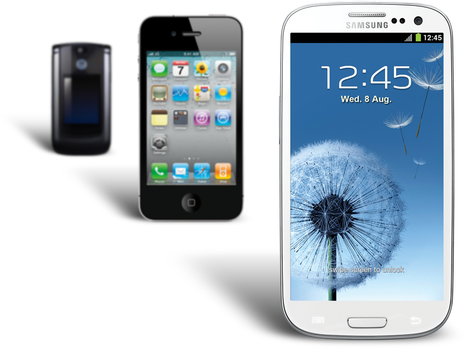
Today, almost everyone has a smartphone in their pocket. But when there are faster and more capable devices released to the market seemingly every week, yours is becoming more obsolete by the day. You constantly hear buzzwords like “LTE”, “Retina Display” and “Quad-Core,” and pretty soon you know it’s probably time to upgrade your phone again, but when you stop and look at what’s available, you quickly realize most of them look the same.
This is when you might stop and reconsider an upgrade altogether. Your current phone suddenly seems good enough and may not be worth the hassle of upgrading, or maybe if you can just wait a little longer the next generation of devices will be that much better.
This made things difficult for a company looking to introduce a lineup of devices that are significantly better than the one before it.
Making stackup.bell.ca
What’s Better Than Smart
?
Every quarter, Bell Mobility releases a new lineup of handsets that are faster and more powerful than the last. But the devices from this particular quarter leapfrogged the previous generation on the market, and Bell needed consumers to understand that these were more than just smartphones. So they were dubbed, “Superphones.”
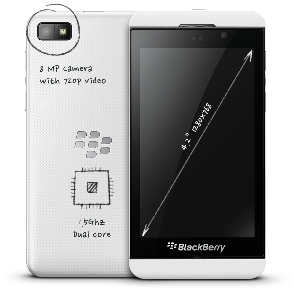
What makes a superphone
so super?
-
Super powerful
dual core processor -
Super fast
4G / LTE speeds -
Super sharp
HD camera -
Super stunning
large screen display
To introduce these new Superphones, our friends at Zulu Alpha Kilo created a mass campaign while we created the supporting digital destination, where we would delve deeper into the new features of each device. But during this process, we realized that a better place to reach potential customers was beyond just the desktop. We thought we could make a bigger impact by talking to people as they were standing in front of a billboard and asking themselves, “What the hell is a Superphone?”
“The devices from this particular quarter leapfrogged the previous generation”
More Show, Less Tell.
One thing we learned, is that current smartphone owners underestimated just how much better these new “super” phones actually were. They had no idea if a 1.5 GHz dual-core processor was fast, or what LTE really even meant.
Sure, we could just tell people how great these new devices were, but that didn’t help them contextualize how these new phones compared to their current devices. People still believed their current smartphone to be competitive.
“…smartphone owners underestimated just how much better these new Superphones were”
This posed an obvious challenge—people would remain skeptical no matter how many times we told them these new devices were “faster and better”. Instead, we needed to show them just how much better they really were. Since we couldn’t expect everyone to run to their nearest Bell store for a side-by-side comparison, we decided to make things easier. We would put the message right in the palm of their hand by using their current smartphone to demonstrate how it stacked up against these new devices.
Firstly, we would need to know what device they currently had. The simple solution would be to have the user simply select their phone from a list, but that isn’t a particularly great user experience. We needed this process to be as painless as possible. We needed it to automatically detect their device.
Similarly, we ruled out QR codes because they wouldn’t give us the data we’d need, and really, who uses QR codes?
After considering various approaches, we quickly ruled out an App, as it was impractical to quickly develop something that would support such a variety of aging devices and operating systems. Similarly, we ruled out QR codes because they wouldn’t give us the data we’d need, and really, who uses QR codes?
The obvious solution was a mobile-optimized site that could sniff their device using the user-agent string. After some preliminary testing, this proved to be a little less reliable than we originally anticipated. It was at this point that we considered walking away from this idea entirely, because if we weren’t able to detect their device automatically—and reliably—we weren’t going to do it at all. But before we scrapped it, we had one last idea: EXIF.
Exchangeable Image File Format
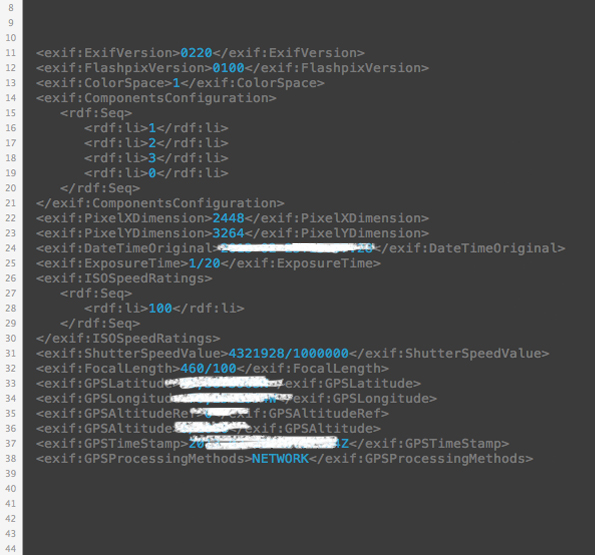
The vast majority of smartphones sold over the past 7 years have a camera. What most people don’t realize, is that every photo taken with that camera contains a variety of metadata about that camera, including the make and model, which is then collected as part of the Exchangeable Image File Format (EXIF). This information would allow us to identify the smartphone someone was using. Of course, to actually collect this data, we would need the customer to send us a photo.
Building an Automated System For Parsing EXIF via Email

Step One
Snap and Send
The beauty of EXIF is that it doesn’t matter what you photograph, so long as it’s taken with your smartphone. Once the photo was taken, the customer was instructed to email it to an @bell.ca email address, which automatically forwarded all messages to us.

Step Two
Analyze this Email
We used Postmark to handle all incoming email (a service that makes it stupid simple to send and receive). In this case, we leveraged their Inbound API which parsed and processed incoming email, and delivered the contents via a JSON formatted web hook. Using this service allowed us to get everything up and running incredibly quickly.

Step Three
Extract The EXIF
Once we received the information from Postmark, we need to extract the EXIF data from the photo. Our initial expectation was that we’d need to build something custom for the task, but to our surprise, PHP has a native function for reading EXIF headers from a jpg, which worked just fine.
Step Four
Send a Comparison Email
Using the metadata extracted from the EXIF, we used the smartphone make and model identifiers as a lookup for our comparison email. We dynamically composed the HTML for the email and then sent it using Postmark’s send API.
A Fine-Line of Trust and Privacy
One big thing we needed to keep in mind when using EXIF and email data was privacy. Beyond the make and model of the smartphone, EXIF data can contain GPS information, which tells us exactly where the person was standing when they took that photo. Along with the photo, their email also contained their email address, full name, plus whatever data was in their signature (phone numbers, company info, etc). Going even further, we could inspect the header data to know if they were sending the email via a competitor's network (assuming they weren’t connected to wifi at the time).
With this, we could have signed them up or armed a hungry sales team with a tremendous amount of valuable information. Instead, we took what we needed to accomplish our comparison task and disregarded the rest.
Compiling Smartphone Data
Creating a system that allowed us to see which smartphone model people had was only part of the equation. We needed the detailed specs of every device that might be compared, which we defined as any smartphone sold in Canada over the past 5 years. Of course, there was no single source for this data, which meant we needed to compile it ourselves. With the help of the products team at Bell, we compiled a list of the various phones we were going to support. We then scoured various product-review sites for the detailed specs we needed for each handset, along with some sample photos taken with each device, from which we extracted the EXIF make and model identifiers. Needless to say, this was an incredibly important but time consuming exercise.
- Make & Model
- Network Speed
- Processor Speed
- Screen Size
- Camera
- Apple iPhone 3G
- Up to 3.6 Mbps
- 412 Mhz
- 320 x 480 px, 3.5"
- 2MP
Bringing it All Together
Once we overcame the hurdle of reliably identifying a device and building a system that handled email processing, we finally had all of the ingredients we needed for a simple yet effective experience.
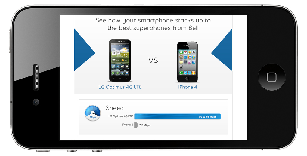
People who saw the supporting print ads in the newspaper or on bus shelters were encouraged to take a photo of it (or of anything else, really) and email it to Bell. Almost immediately, they would receive a personalized email that highlighted the differences between their current device and the latest ones.

Ongoing Iterations
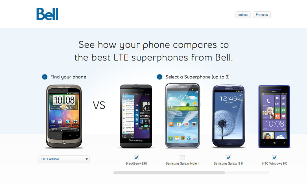
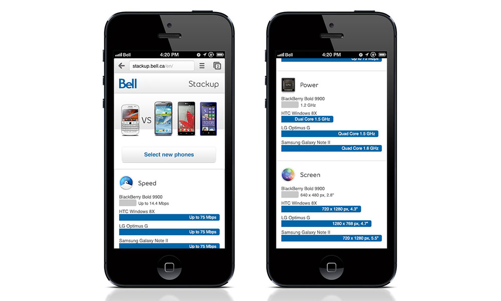
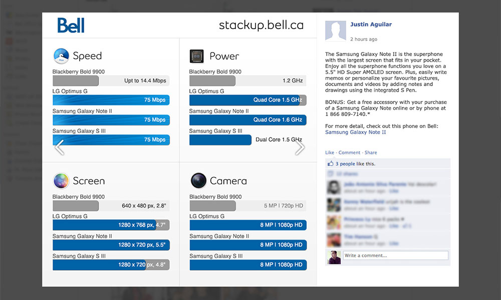
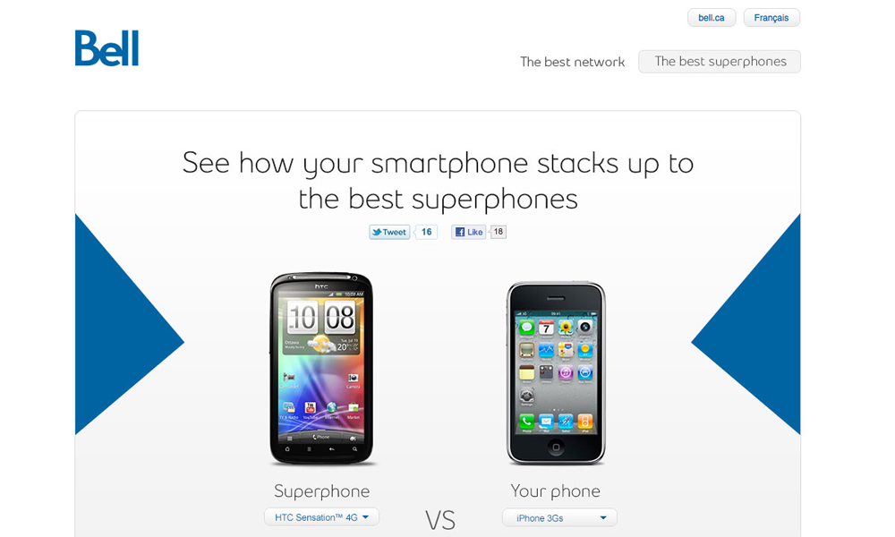
Over the past 3 years, the Stack Up site has seen a number of revisions. The initial version was quite limited, only supporting a handful of featured devices. It also supported the iPhone until Apple had asked for it to be removed (politely, of course). In subsequent versions, we continued to increase the number of supported devices, and added the ability to compare multiple devices against your own. We even added some social elements to help with your purchase decision.
What We Learned
Don’t Underestimate The Complexities Of Email
 Jeremy Bell, Partner
Creating a system that can reliably deliver email is quite difficult. Originally, we were using Sendmail directly from our servers, but more often than not, we found that emails were bouncing, getting caught in spam filters, or simply failing altogether. We had no idea at the time, but it turns out you need to worry about things like whitelisting, reverse DNS lookups, and ISP throttling to ensure your email reliably reaches its destination. And even if it is delivered successfully, you have to ensure it’s been designed and coded to render properly in the variety of email clients that might display it. So if you’re building a system sends email, consider using services like Postmark or Litmus to ensure everything actually gets delivered, and looks good.
Monitor performance and don’t be afraid to scrap ideas
 Nery Orellana, Senior Developer
From a technical standpoint, the Stack-Up site has been through a number significant iterations. The original version was a traditional multi-page site, which made setting up analytics quite easy. However, in a future revision we refactored everything into a single page that loaded content dynamically. This presented a number of technical challenges in respect to tracking behaviour, which we didn’t appreciate until we were well into development. With a single page design, we learned to really respect event tracking within Google Analytics.
It’s not uncommon for prospective customers to reach out to their social network when deciding between multiple handsets. So we enabled visitors to share their comparison through a personalized post on Facebook. This post contained photos and specs of the phones they were interested in, opening up the potential for discussion with their friends about the merits of each device. Or at least that was the intent.
Considering the variety of possible permutations, a tremendous amount of effort was spent creating an adaptable design for customers to share. But when we looked at the analytics, the feature was simply not used as much as we’d hoped. So we scrapped it. It was a difficult decision to make, but we learned to be as proud of the code we deleted instead of just the code we wrote.